- Jul 20, 2009
- 54
- 0
- 0
The sight of the new Astana kit  has prompted me to step back and take a look at some of the best and worst jerseys in the pro peloton over the past few years. As a graphic designer and athlete, I pay attention to team uniforms, logos, car graphics etc.
Cycling being one of the few sports that the teams can change their look season to season, I feel like the riders are a test canvas for some of the best and worst graphic layouts in sports.
Here's some of my favorites over the years in no particular order...
CSC 07
http://www.wiggle.co.uk/images/descente-team-csc-jersey-07.jpg
lots of shapes but a very controlled design
Disco 06
http://leesbikes.com/images/library/site/nike_06wmndiscjers280_06_p.jpg
simple, good color combo
f de jeux
http://www.wiggle.co.uk/images/nalini-francais-zoom.jpg
another simple one. they stick with what works
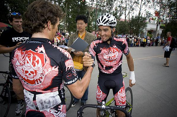
rock racing london
http://www.cyclesuk.com/images/Content/HARRODSKITS1.jpg
the rock racing london rocks kit. lots of detail very well done, and who doesn't like skulls!
cervelo test team
http://www.all4cycling.com/shop/images/cervelo_kit_aero_white_09.jpg
the black is cool too but im partial to the white
zoccoronese U23 07
http://www.amazon.com/gp/product/B000G01VF2/ref=cm_pdp_rev_itm_img_1
i like this one because i have it and it looks great on me
and some of the worst...
mapei
http://www.pelotonpeddler.com/images/products/large/11.jpg
huge mistake. who approved this!?
ISD 09
http://www.all4cycling.com/shop/images/isd_kitmc_09.jpg
http://www.all4cycling.com/shop/images/isdcipo_kit_09.jpg
yeah they both suck. and the second on was their premiere for the giro?
columbia HTC
http://img.artscyclery.com/product/HR9CHSJ.JPG
some kind of motocross look? kind of a rip of the 07 csc jerseys
ag2r 09
http://www.all4cycling.com/shop/images/ag2r_kit_tour09.jpg
this must actually hurt to put on
how bout it...some of your best and worst?


