- Jan 3, 2011
- 4,594
- 0
- 0
classicomano said:Tadaaa

Better than I expected.
That is really disappointing. At least they could come up with a different design model. It is so common these days.

classicomano said:Tadaaa
Better than I expected.
Watch the video above. No.Cimber said:This x1000
classicomano said:Tadaaa
Better than I expected.
screaming fist said:So, the stream works in Internet Explorer but not Firefix for me. What business field is Belkin in again?
")
screaming fist said:So, the stream works in Internet Explorer but not Firefix for me. What business field is Belkin in again?
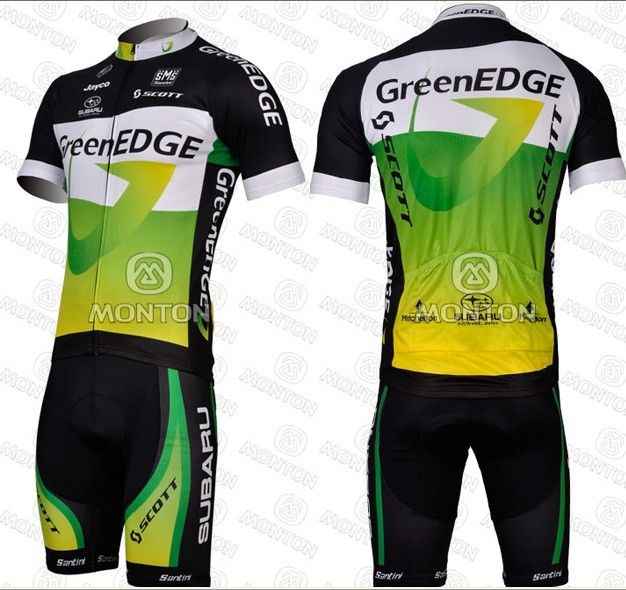
Pippo_San said:That Greenedge iteration was a MASTERPIECE compared to the total dullness of this new team kit.
Bodes well for the future. #ridethefutureFAIL
Pippo_San said:That Greenedge iteration was a MASTERPIECE compared to the total dullness of this new team kit.
Bodes well for the future. #ridethefutureFAIL