New Jerseys - 2013 Season - TeamKits-Maillots-Tricots-Tenues-and-Exotics

Page 17 - Get up to date with the latest news, scores & standings from the Cycling News Community.
Gloin22 said:
img-1357002008486.jpg

Above average. Actually a nice touch with the green. Big time visible as well.
 
hrotha said:
They ruined the front of the Sky jersey, iny my opinion. The back is better, but the front... Ugh.

And what's with those green thingies on the Lampre jersey.
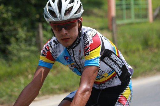
indeed the front is now a bit boring as unlike movistar's the "sky" doesn't come in florescent colours and giant weird font, the back looks cool tho.

about the lampre kit. . . i will have to learn how to live with the merida bands but other then that the kit looks, as always with the lampre kit, great.
 
May 6, 2011
451
0
0
Libertine Seguros said:
If we're talking Colombian jerseys, the best is 2011 Nectar Cundinamarca-Pinturas Bler:

Diego+Calderon.jpg

What do you like about it? It reminds me of a dillapidated London high street for some reason, cluttered and run down.
 
I'm liking the little tweak of green on the Lampre kit.
It's slightly unsettling and a bit of a free radical that makes the whole kit that much more interesting. :D

nice to see that things move away from the expected sometimes....
 
Jun 16, 2009
19,654
2
0
BMC kit (Daniel Oss)

proxy.jpg


Very few changes. Interestingly, Hincapie Sportswear is no longer sponsoring BMC or being the clothing provider.
 
Feb 15, 2011
2,886
2
0
durhamwasp said:

Wiggins' face looks like he's having his prostate examined in this picture.

Edvald does not look nice at all, he looks like he's wearing a red latex suit. Kind of like Britney Spears, minus the camel toe I guess.

brittany%20spears%20wearing%20tight%20red%20suit%20(1).jpg


And Stannard remains Dutch champion.

Poor.
 
Mar 10, 2009
6,158
1
0
Gloin22 said:

This jersey would fit in perfectly in the 70's and early 80's peloton, 2013, well unless they're trying to pull the NBA's or NFL's retro jerseys...

Somebody is trying to offend the color wheel.
 
Aug 18, 2009
134
0
0
ElChingon said:
This jersey would fit in perfectly in the 70's and early 80's peloton, 2013, well unless they're trying to pull the NBA's or NFL's retro jerseys...

Somebody is trying to offend the color wheel.

I agree completely...It always amazes me that many refer to the Lampre jerseys as *always* being great... really?

I understand there isn't much they can do about the colour choices (all sponsor-driven)... but can't they do something better with those colours? At least its easy to spot!
 
Mar 26, 2009
2,532
1
0
boomcie said:
Wiggins' face looks like he's having his prostate examined in this picture.

Edvald does not look nice at all, he looks like he's wearing a red latex suit. Kind of like Britney Spears, minus the camel toe I guess.

brittany%20spears%20wearing%20tight%20red%20suit%20(1).jpg


And Stannard remains Dutch champion.

Poor.

:D

10char
 
Ad Rock said:
I agree completely...It always amazes me that many refer to the Lampre jerseys as *always* being great... really?

I understand there isn't much they can do about the colour choices (all sponsor-driven)... but can't they do something better with those colours? At least its easy to spot!

In an increasingly monochrome péloton, standing out is good. All these black-white-and-blue kits look great in the photographer's studio and at the deluxe press launch with the bigwigs and the media... but they're hard to pick out on a poor quality image on a rainy day in Belgium, or from a helicopter at a distance in the mountains of the Basque Country.

Being neon pink erases this problem. You always know where the Lampre guys are. And that means that if they do something, it's easier for the commentator to spot, which means they get mentioned more often. This means that the sponsor is easier to see, and easier to remember. Therefore it is a big success for a sponsor, especially if their team isn't likely to be winning big otherwise. Remember Footon?
 
Jul 16, 2010
17,455
5
0
Libertine Seguros said:
In an increasingly monochrome péloton, standing out is good. All these black-white-and-blue kits look great in the photographer's studio and at the deluxe press launch with the bigwigs and the media... but they're hard to pick out on a poor quality image on a rainy day in Belgium, or from a helicopter at a distance in the mountains of the Basque Country.

Being neon pink erases this problem. You always know where the Lampre guys are. And that means that if they do something, it's easier for the commentator to spot, which means they get mentioned more often. This means that the sponsor is easier to see, and easier to remember. Therefore it is a big success for a sponsor, especially if their team isn't likely to be winning big otherwise. Remember Footon?

Lampre riding WT races is just a myth that has never been proven.
 

Latest posts