• The Cycling News forum is looking to add some volunteer moderators with Red Rick's recent retirement. If you're interested in helping keep our discussions on track, send a direct message to @SHaines here on the forum, or use the Contact Us form to message the Community Team.

    In the meanwhile, please use the Report option if you see a post that doesn't fit within the forum rules.

    Thanks!

New Jerseys - 2016 Season - TeamKits-Maillots-Tricots-Tenues

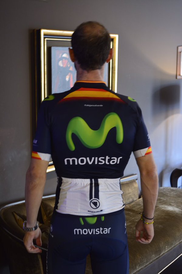
We start with Movistar, and a very questionable back.

@Movistar_Team
We're pleased to show you our new racing kit for 2016, made by @Endura! #YoSoyMovistarTeam
https://twitter.com/Movistar_Team/status/664110304066957312

CTdv6wPWsAA80fj.jpg

CTdv69JXIAAhNVo.jpg
 
It's average. But it's their jersey. Two years ago it was puristic and nice. Now it's probably still puristic and nice. But it ain't nothing special any longer.

Same can be said about Team Sky as well as most likely about Giant once again.

AG2R simply keeps showing an unique, flamboyant kit. Still very fancy and stylish. Best kit imho.

Too bad there ain't no more egocentric Italian jerseys around anymore. Except Lampre of course. One can still hope Farnese Vini is fixed to re-adapt it's fluo look.

Oh and I still want Lampre Merida to go full fuchsia-pistachio!
 
I liked the 2015-look. It was super classy.. this one, on the other hand, I dont like. The big M looks bad and and white part on the sleeves.. mh. Nah. Reminds of more of the first Movistar-jersey in 2011 than the last editions which looked a lot better imo.
 
Aug 16, 2011
10,819
2
0
Visit site
The M looks less like an M and more like a long green flattened and twisted noodle at that size. :p Not sure about the pockets either, they feel slightly out of place. Still the minimalist qualities to it are nice. "Meh" kit overall.
 
Mar 9, 2013
572
0
0
Visit site
I'm not one to wear a Pro Team Kit. I would have done it in my younger days. But now being an Old man (45) ;0)

I kinda think it is a classy kit. Looks like the title sponsors logo. Not to loud. I like the whit armbands and back panel. Kinda a clean look. IMHO
As a TS fan I cannot stand our Kit. But hey: AC makes it go fast! So I gotta like it!

Cheers
 
Re:

42x16ss said:
The bigger M may offend the style purists but it should make the riders easier to spot from the helicopter, which is always a plus.

Don't think it's bad even to the point of offending the style purists. I think it's an improvement. No need for the same template on every team, the same logo dimensions, the same standard look. Nowdays, the more bizarre the better. The more out of the box, the better. Iirc correctly one of the usual complaints about recent Movistar kits were for too much blue. Now it's greener. The pre-2013 kit was usually seens as a good kit. It had white.