
New Jerseys - 2022 Season - TeamKits-Maillots-Tricots-Tenues
Page 2 - Get up to date with the latest news, scores & standings from the Cycling News Community.
You are using an out of date browser. It may not display this or other websites correctly.
You should upgrade or use an alternative browser.
You should upgrade or use an alternative browser.


- Aug 9, 2021
- 6,053
- 6,565
- 17,180
Galaxy print lions. I can still die happyI think they're supposed to be lions.

- May 26, 2009
- 10,230
- 579
- 24,080
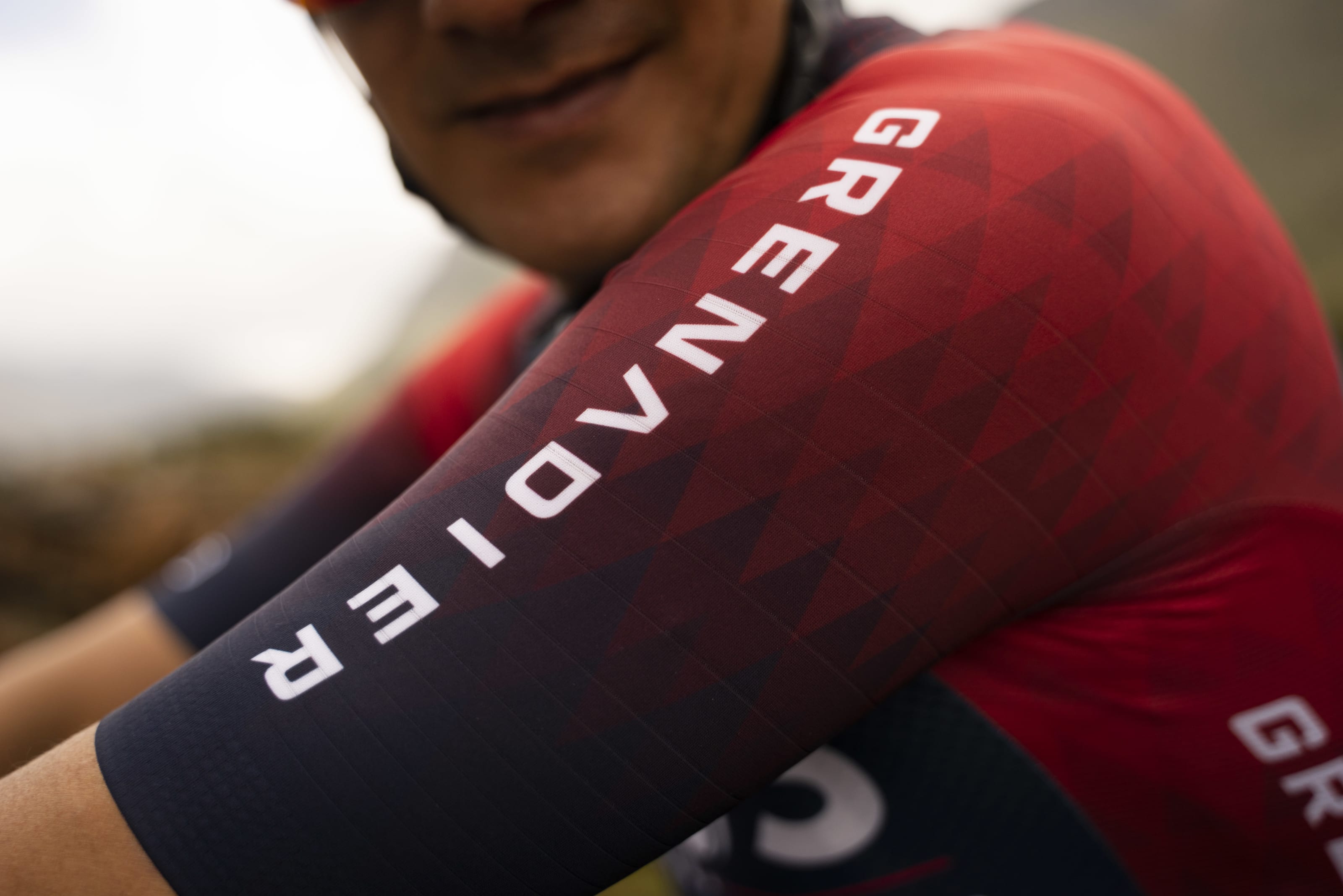
This closeup of the triangle fades on a small portion of the shoulder looks nice. Just a shame about the entire rest of the kit lol
- May 25, 2018
- 2,420
- 2,609
- 17,180
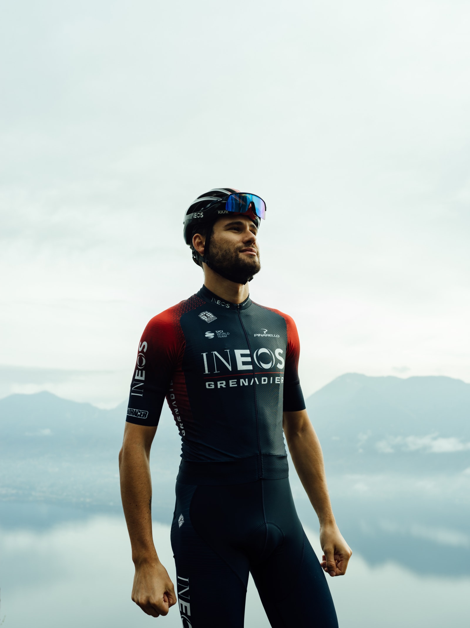
It's like the beautiful child of SDWorks and Evo Pro with added CarebearsLadies and Gentlemen, what a great way to start this legendary thread's 2022 edition:

(new Continental team from Spain)
A picture of someone wearing the jersey on the jersey is so beautifully meta.TBF they've been running an amateur team in Spain in the interim, but yes.
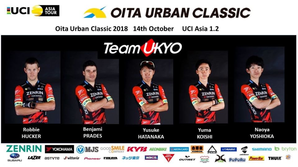
Takes me back to the glory days of Team Ukyo - team boss Ukyo Katayama (the former F1 driver and mountaineer) has a personal link (I believe through his wife) to the manufacturers of the popular Hatsune Miku vocaloid, essentially an anime girl embodiment of autotune software that has taken on a merchandising life of its own, resulting in some pretty absurd jerseys. 2018 started with them clad in this:

The riders are probably glad that Zenrin came on board as a secondary sponsor meaning that by the time most races came along they looked a bit more presentable:
...well, at least from the front. Helicams will have picked up the back of the jersey, which looked like this:
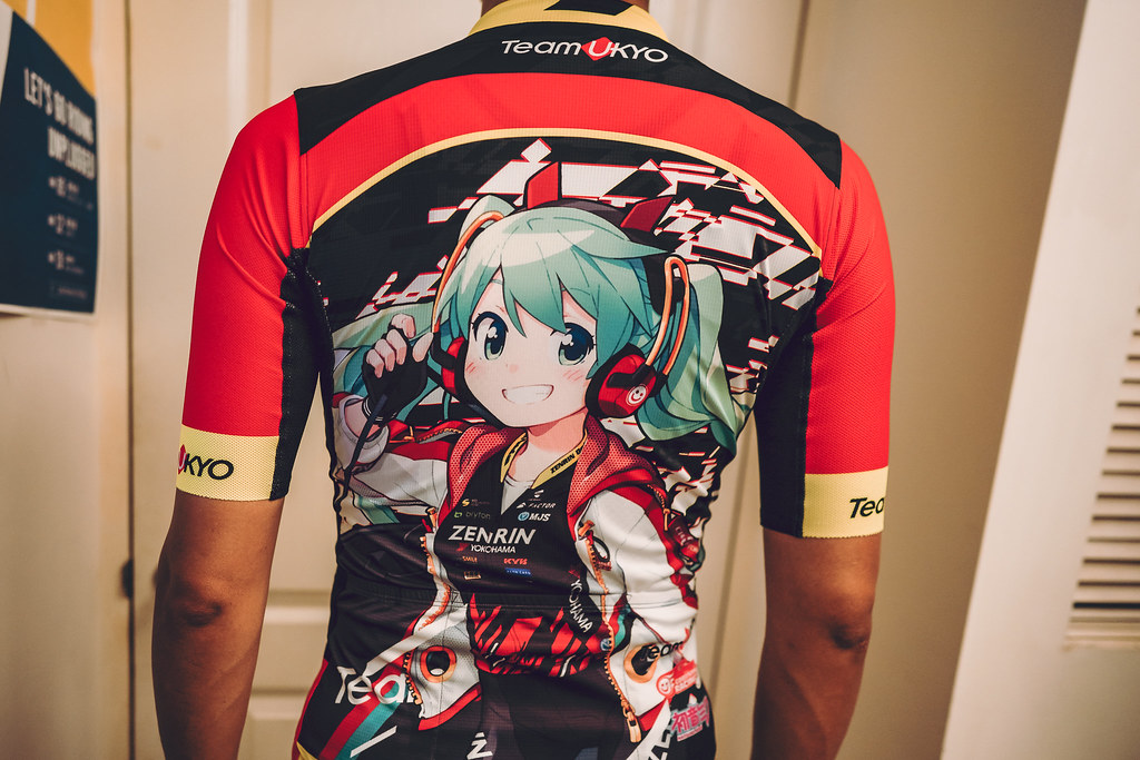
(I will give bonus points for the creative way to get Zenrin's sponsorship on the back while keeping the vocaloid).
Racing Miku is less of a thing now in terms of the jerseys. "Itasha" designs are a bit more presentable as a car wrap (see Goodsmile Racing in Super GT, also run by Katayama) than body-hugging lycra, so instead they have normal cycling team styled jerseys, and just sell figurines of Racing Miku with a bike and Team Ukyo kit.
How in god's name can a team change kit supplier 3 times and still end up with such similar jerseys
It reminds me of the argyle pattern Garmin/Canondale team was using until 2019.This closeup of the triangle fades on a small portion of the shoulder looks nice. Just a shame about the entire rest of the kit lol
- Mar 2, 2019
- 62
- 90
- 3,780
- Oct 13, 2021
- 2,572
- 3,318
- 11,180
Crazy thought: reverse white with brown
- Feb 20, 2010
- 33,157
- 15,611
- 28,180
- Feb 20, 2012
- 55,220
- 46,353
- 28,180
I didn't know those were a thing and now I won't be able to sleep tonight.Still the only thing I can think of with Ag2r:
Oh wow, love those. I wonder if there is any way to get them imported to Wales post-Brexit...Still the only thing I can think of with Ag2r:
Still the only thing I can think of with Ag2r:
When I was living where that is/was a thing I never knew what they were made of and tbh never bothered to ask. I just drowned them in
.
- Nov 16, 2013
- 27,193
- 28,451
- 28,180
Lol, at first I was wondering why Mads Pedersen has the Irish (or Ivorian) national colours on his sleeves.
- Jan 3, 2019
- 2,019
- 2,920
- 17,180
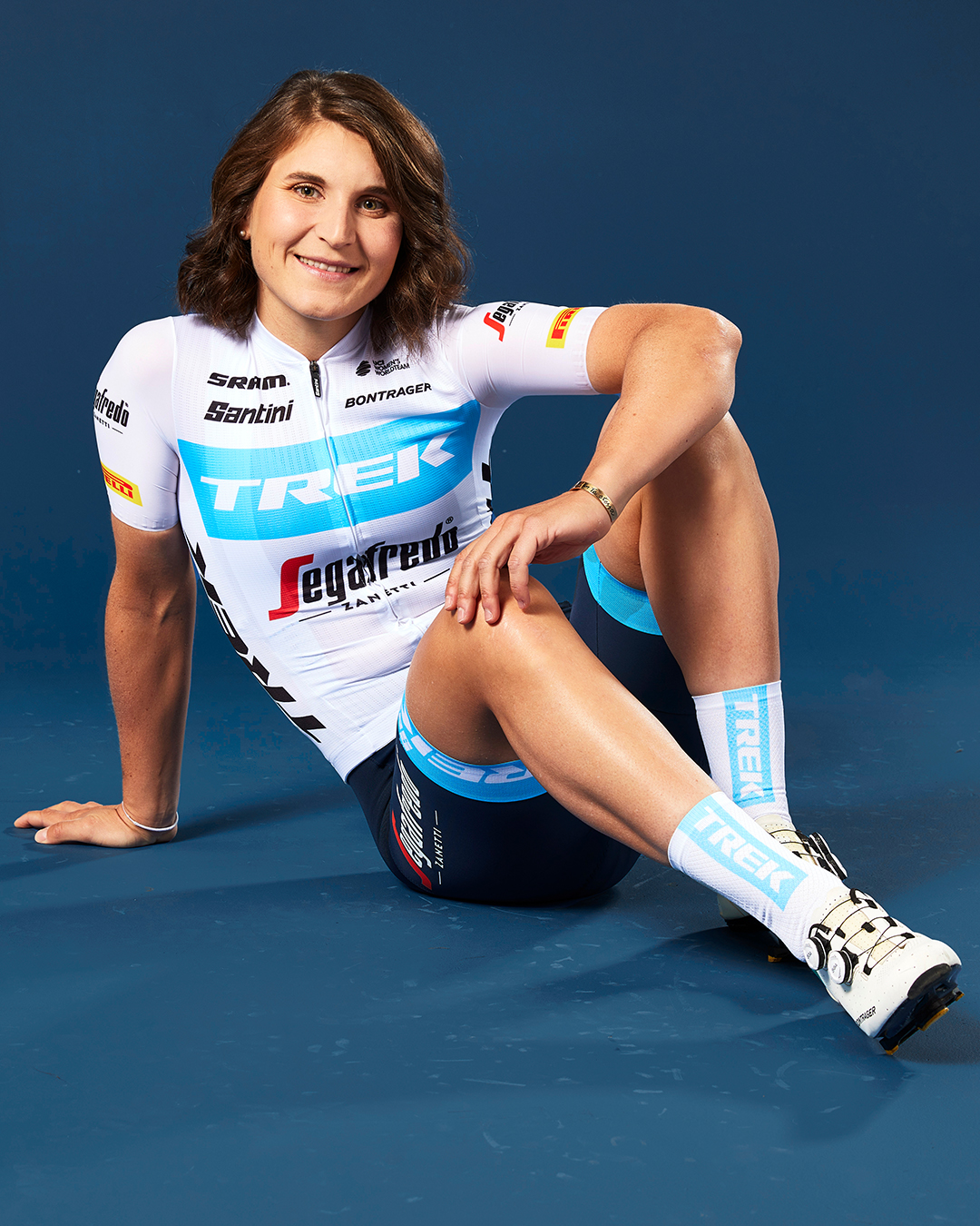
I like that the men's and women's teams have matching designs. On the other hand, the ladies squad had stellar outfits in previous seasons, the new one feels a bit underwhelming compared to those. But all in all it's alright.
- Nov 17, 2020
- 1,147
- 1,407
- 8,680
Hahaha, same here, I thought it was Mullen at the first look.Lol, at first I was wondering why Mads Pedersen has the Irish (or Ivorian) national colours on his sleeves.
Last season's kit was much better. This one looks like the graphic desginers wanted to do their job as fast as possible and go home. It's very similair to the one they had in '19 Tour or something.
Last edited:
- Jan 4, 2020
- 6,327
- 7,737
- 16,180


I like that the men's and women's teams have matching designs. On the other hand, the ladies squad had stellar outfits in previous seasons, the new one feels a bit underwhelming compared to those. But all in all it's alright.
Okay, but boring as **.
- Mar 7, 2013
- 627
- 1,216
- 13,180
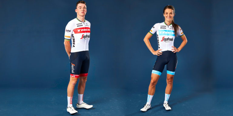
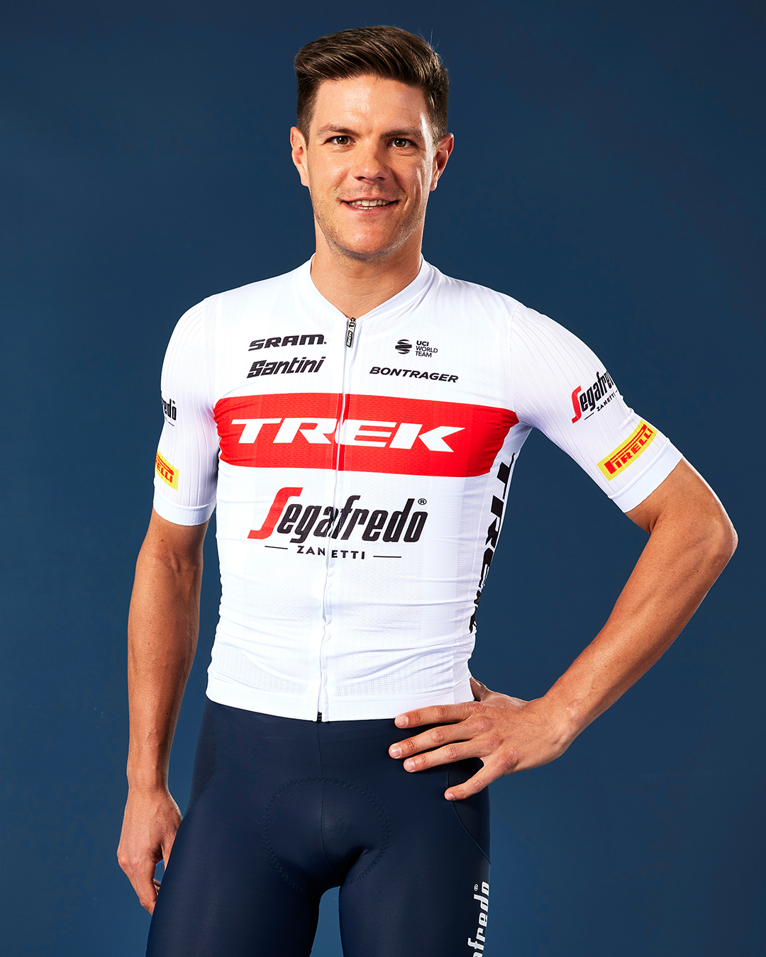
A bit too much white for taste. Luckily someone like Mollema has such a characteristic style, that he won't be mistaken for the wearer of the Best Young Rider jersey. Not so sure about some other, more generic Trek riders though.
- May 5, 2010
- 53,097
- 31,309
- 28,180
Lol, at first I was wondering why Mads Pedersen has the Irish (or Ivorian) national colours on his sleeves.
So glad I wasn't the only one...
- Jul 18, 2014
- 271
- 338
- 9,730
TRENDING THREADS
-
 Itzulia Basque Country 2026, April 6-11
- Started by Dazed and Confused
- Replies: 961
-
 Ronde van Vlaanderen 2026, monument, April 5 (men's)
- Started by Krzysztof_O
- Replies: 1K
-

-
 Teams & Riders The Remco Evenepoel is the next Eddy Merckx thread
- Started by DNP-Old
- Replies: 39K
-
 Teams & Riders Tadej Pogačar discussion thread
- Started by Lequack
- Replies: 43K
-
 Milan San Remo, March 21, 2026, 298 km monument
- Started by topcat
- Replies: 1K
-


Cyclingnews is part of Future plc, an international media group and leading digital publisher. Visit our corporate site.
© Future Publishing Limited Quay House, The Ambury, Bath BA1 1UA. All rights reserved. England and Wales company registration number 2008885.