I stopped taking it seriously after looking up the thread for the 2019 route, one of the best TDF routes (and, if it had run to completion, races) in recent memory, and seeing people call it a "three week Tour de L'Avenir route" and incredibly easy.

New Jerseys - 2022 Season - TeamKits-Maillots-Tricots-Tenues
Page 11 - Get up to date with the latest news, scores & standings from the Cycling News Community.
You are using an out of date browser. It may not display this or other websites correctly.
You should upgrade or use an alternative browser.
You should upgrade or use an alternative browser.
- Jul 18, 2014
- 271
- 338
- 9,730
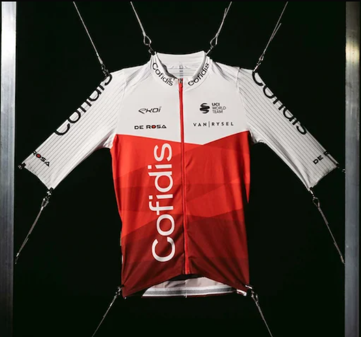
I like this much more than past Cofidis jerseys. This is a genuinely interesting design, with the pinstriping on the arms, the vertical Cofidas logo, and the two-tone red. I like.Decathalon leaked the Cofidis kit on their site, and it's a looker.
- Jan 4, 2020
- 6,327
- 7,737
- 16,180


I like this much more than past Cofidis jerseys. This is a genuinely interesting design, with the pinstriping on the arms, the vertical Cofidas logo, and the two-tone red. I like.
You're easy to please. I go back to figure skating.

- Jul 18, 2014
- 271
- 338
- 9,730
I'm not easy to please. I do a bit of design work, and I like this clean, modern, minimalist design. I think it works. Of course, I haven't seen the back.You're easy to please. I go back to figure skating.
It is way better than this:
- Jan 4, 2020
- 6,327
- 7,737
- 16,180
I'm not easy to please. I do a bit of design work, and I like this clean, modern, minimalist design. I think it works. Of course, I haven't seen the back.
It is way better than this:
But no quillings, no Svarovskys...
- May 5, 2010
- 53,220
- 31,449
- 28,180
But no quillings, no Svarovskys...
Svarovskys on a cycling kit... now that would be an interesting design choice!
Just conduct a study saying they give a slight aero advantage.
Armchair Cyclist
Moderator
- Mar 22, 2010
- 16,049
- 12,029
- 28,180


The acid test to me is whether I would choose it as a kit to buy and wear.
Imagine the kits If they were all the same price and quality, without all the sponsor names and logos (or with your club name), but with a generic shape rather than a logo where the logo is more integral to the design (eg Movistar): Maybe some Katherine Hamnett style phrase in the case of Ag2R Citroen.
If all of the kits were in your LBS/preferred internet dealer and at whatever price point in the market you normally shop at, which would you consider? (assume that they have your size and all kits are available for both genders)
I'm assuming none of us needs to buy more than 3 different jerseys a year.
I think I'll have a Kern, a Parkhotel Valkenberg and a Cofidis.
- Nov 16, 2013
- 27,291
- 28,591
- 28,180
The acid test to me is whether I would choose it as a kit to buy and wear.
Imagine the kits If they were all the same price and quality, without all the sponsor names and logos (or with your club name), but with a generic shape rather than a logo where the logo is more integral to the design (eg Movistar): Maybe some Katherine Hamnett style phrase in the case of Ag2R Citroen.
If all of the kits were in your LBS/preferred internet dealer and at whatever price point in the market you normally shop at, which would you consider? (assume that they have your size and all kits are available for both genders)
I'm assuming none of us needs to buy more than 3 different jerseys a year.
I think I'll have a Kern, a Parkhotel Valkenberg and a Cofidis.
Maglia Rosa, Rainbow jersey, EF Giro 2020 edition.
Nah, I think I'm on the Cofidis bandwagon too, even if it's a very weird way they have presented it. Good on them to see some change after many years of the same. Then probably Movistar and Ineos for the others.
- Jan 4, 2020
- 6,327
- 7,737
- 16,180
The acid test to me is whether I would choose it as a kit to buy and wear.
Imagine the kits If they were all the same price and quality, without all the sponsor names and logos (or with your club name), but with a generic shape rather than a logo where the logo is more integral to the design (eg Movistar): Maybe some Katherine Hamnett style phrase in the case of Ag2R Citroen.
If all of the kits were in your LBS/preferred internet dealer and at whatever price point in the market you normally shop at, which would you consider? (assume that they have your size and all kits are available for both genders)
I'm assuming none of us needs to buy more than 3 different jerseys a year.
I think I'll have a Kern, a Parkhotel Valkenberg and a Cofidis.
For me... Movistar, AG2R and one of those women's... I have lost track which one is now allowed and which isn't.
- Mar 2, 2019
- 62
- 90
- 3,780
View: https://twitter.com/cyclismactu/status/1479017569247969281?s=20I like this much more than past Cofidis jerseys. This is a genuinely interesting design, with the pinstriping on the arms, the vertical Cofidas logo, and the two-tone red. I like.
- Jul 18, 2014
- 271
- 338
- 9,730
- Sep 2, 2011
- 17,676
- 14,052
- 28,180
Love it. Indeed an upgrade compared to last year.Big upgrade for ISN kit: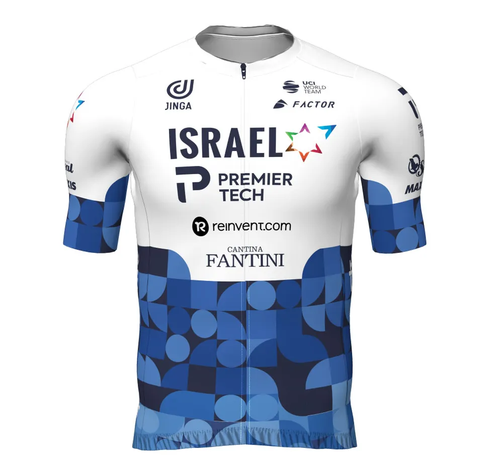
Armchair Cyclist
Moderator
- Mar 22, 2010
- 16,049
- 12,029
- 28,180
I think my aunt had bathroom tiles in that pattern in the 1970s
- Oct 13, 2021
- 2,572
- 3,318
- 11,180
Those tiles were in a relatives pool for me..I think my aunt had bathroom tiles in that pattern in the 1970s
- Sep 14, 2020
- 1,777
- 2,753
- 11,180
I think my aunt had bathroom tiles in that pattern in the 1970s
But in avocado?
Seems to be a few tops with white shoulders this year.
- Nov 16, 2013
- 27,291
- 28,591
- 28,180
But in avocado?
Seems to be a few tops with white shoulders this year.
Intermarché seems to be the opposite, and it looks terrible (sorry, I will issue an internal reprimand to myself for complaining).
View: https://twitter.com/amantes_cycling/status/1479086264796291076
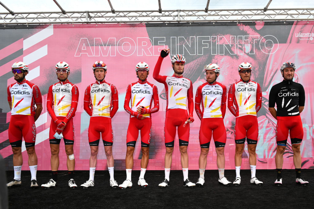
Also, Cofidis have black shorts. It looks really, really good, I think.
View: https://twitter.com/simongeschke/status/1479172378907262980
- Jan 4, 2020
- 6,327
- 7,737
- 16,180
Intermarché seems to be the opposite, and it looks terrible (sorry, I will issue an internal reprimand to myself for complaining).
View: https://twitter.com/amantes_cycling/status/1479086264796291076
Also, Cofidis have black shorts. It looks really, really good, I think.
View: https://twitter.com/simongeschke/status/1479172378907262980
A very clean design and with white shoulders and black shorts he even looks like he's got muscular upper arms.
- Sep 20, 2017
- 13,162
- 24,619
- 28,180
The Israel and Cofidis ones both look pretty good. The former blends the retro elements well with the team/country colours, the latter is definitely helped by the low number of sponsors as it wouldn't work as a clean, minimalistic design otherwise. Otoh Intermarché has done the incredible by somehow being worse than possible...
- Jul 18, 2014
- 271
- 338
- 9,730
Intermarché seems to be the opposite, and it looks terrible (sorry, I will issue an internal reprimand to myself for complaining).
View: https://twitter.com/amantes_cycling/status/1479086264796291076
Also, Cofidis have black shorts. It looks really, really good, I think.
View: https://twitter.com/simongeschke/status/1479172378907262980
LIke the black Cofidis shorts. And @Devil's Elbow is right--the small number of sponsors is necessary with that minimalist design.
As for InterMarche--their entire colling card, kit wise, was the fluorescent yellow. Toning it down just doesn't work. Now it is garden-variety ugly instead of oh--look at that--ugly.
- Aug 14, 2012
- 4,126
- 5,102
- 21,180
Intermarché looks like a kit from a 2009 continental french team.
Or from something I could buy in my local Intermarché if their white-label clothing brand made cycling jerseys to sale for 10€. I can't conceive someone buying that jersey on purpose.
And to think I am a bit let down to watch Alpecin ride again in the new year in that same old boring and bland design. Even that is more appealing than this.
- Sep 26, 2020
- 26,689
- 29,740
- 23,180
Wanty should continue to use the same design as the Tormans CX team, though their sponsor with the orange patches would still destroy it anyway.
- May 25, 2018
- 2,420
- 2,609
- 17,180
A really good example of keep it similar to before but also vastly improveBig upgrade for ISN kit:
- May 25, 2018
- 2,420
- 2,609
- 17,180
Looks like an off the shelf kit you would buy in a bike shop but in a really good way
Last edited:
- Aug 29, 2009
- 8,392
- 7,917
- 23,180
And to think I am a bit let down to watch Alpecin ride again in the new year in that same old boring and bland design.
they should definitely wear red helmets at least to look more like the shampoo bottle
TRENDING THREADS
-
 Paris-Roubaix 2026, one day monument, April 12
- Started by Lequack
- Replies: 2K
-
 Itzulia Basque Country 2026, April 6-11
- Started by Dazed and Confused
- Replies: 2K
-
 Ronde van Vlaanderen 2026, monument, April 5 (men's)
- Started by Krzysztof_O
- Replies: 1K
-

-
 Teams & Riders The Remco Evenepoel is the next Eddy Merckx thread
- Started by DNP-Old
- Replies: 39K
-
 Teams & Riders Tadej Pogačar discussion thread
- Started by Lequack
- Replies: 43K
-
 Milan San Remo, March 21, 2026, 298 km monument
- Started by topcat
- Replies: 1K

Cyclingnews is part of Future plc, an international media group and leading digital publisher. Visit our corporate site.
© Future Publishing Limited Quay House, The Ambury, Bath BA1 1UA. All rights reserved. England and Wales company registration number 2008885.