• The Cycling News forum is looking to add some volunteer moderators with Red Rick's recent retirement. If you're interested in helping keep our discussions on track, send a direct message to @SHaines here on the forum, or use the Contact Us form to message the Community Team.

    In the meanwhile, please use the Report option if you see a post that doesn't fit within the forum rules.

    Thanks!

2010 Jerseys Thread

Page 16 - Get up to date with the latest news, scores & standings from the Cycling News Community.
Aug 18, 2009
134
0
0
Visit site
lagartija said:
going out on a limb here.........but is it just me or do a couple of these ladies need to STEP AWAY FROM THE DINNER TABLE...........:D


I was thinking the same thing, BUT good on them for being comfortable with themselves.... beauty is 90% mental :D
 
Aug 18, 2009
134
0
0
Visit site
issoisso said:
actually they're quite similar to the front minus "the foot"

Nope...they're black and have the foot... See the pic of the day on Pez!
gallerypicget.asp


http://www.pezcyclingnews.com/cgi/gallerypicget.asp?pic=http://www.pezcyclingnews.com/photos/races10/tdu10/tdu10st03-up.jpg
 
Mar 18, 2009
156
0
0
Visit site
Steel4Ever said:
How prophetic you were!

(And the back of their jersey's are BLACK. Yet another great design idea!)

podium2a_600.jpg

I wonder how much the riders like the black back when the sun is beating down on them?

I still think their jerseys are horrible. Servetto is probably ****ed that their name is unreadable in podium shots. Plus, I saw a picture of the stage finish celebration and I couldn't recognize the jersey. At a distance the footprint doesn't stand out.
 
Aug 18, 2009
134
0
0
Visit site
md2020 said:
I wonder how much the riders like the black back when the sun is beating down on them?

I still think their jerseys are horrible. Servetto is probably ****ed that their name is unreadable in podium shots. Plus, I saw a picture of the stage finish celebration and I couldn't recognize the jersey. At a distance the footprint doesn't stand out.


Gotta say... I don't know how you could NOT recognize the jersey...there is only ONE tan jersey in the peloton! (Thankfully!)

Also, Servetto can't be ****ed...that's their logo on the front.... if they don't think its visable enough its their problem to redesign it. It looked the same on last year's jersey!
 
A

Anonymous

Guest
BMC best dressed Down Under

I have to say that after watching the first few stages of the tdu, bmc, without a doubt, are the most professional looking team in the peleton.

Their simple jersey of red with a black band/white writing 'bmc' looks so classy and shows up all other jerseys in the peleton.

Well done bmc and hincapie for a great jersey/bike combination colour scheme!!
 
craig1985 said:
What I like about the SKy jersey is that on the sides it has the riders name on it, great way of knowing which rider is which.

That IS a good idea. I've often wondered why this isn't done in cycling, when footballers have had their names on their back forever. Practical if you don't have the startlist at hand all the time.
 
Aug 18, 2009
134
0
0
Visit site
Mountain Goat said:
I have to say that after watching the first few stages of the tdu, bmc, without a doubt, are the most professional looking team in the peleton.

Their simple jersey of red with a black band/white writing 'bmc' looks so classy and shows up all other jerseys in the peleton.

Well done bmc and hincapie for a great jersey/bike combination colour scheme!!

Gotta agree!>... It really pops and looks super professional. Looks really great with the matching red bikes too!
 
A

Anonymous

Guest
couple of jersey comments reading through one of the cycle mags that amused me..

footon - they wanted fold with a bold brand statement.. they got beige thats going to go transparent at the first sign of rain, and a large foot.

Radioshack - red and grey is the kind of thing a teenager comes up with. and it looks like a strapless dress

AG2r - maybe its an incentive for riders to win the national championships so they dont have to wear them

BMC - unimaginative red/black combo with too much of the former and too little of the latter. weve all see the famous not for publication picture of the team wearing red shorts. BMC are dreading winning any team classifications..

Columbia - a great deal of consultancy fees spent swapping htc and columbia around

rabobank - the last time orange was cool was 1973 but rabobank are sticking to their guns in the hope that one day it is cool again.

astana - the one saving grace last year was the dark blue, with that gone it looks like a yellow and cyan television test card
 
Mar 11, 2009
748
0
0
Visit site
I like the Flaminia bike and the kit is good too.
Sky is not quite right .. not as classic as the old T mobile.
It will be good to really see all these in the peloton, then we can really get the picture.
 
Apr 1, 2009
228
0
0
Visit site
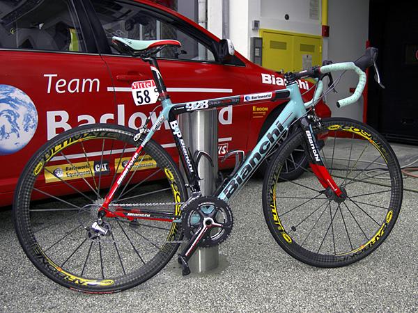
taiwan said:
For me this is the best finish on a team bike this season.

Flaminia_928sl_2010_01.jpg

Yep this works for me too. A mix of old and new. I said earlier I like the kit as well. I really should buy a bianchi one of these days!
 
Aug 18, 2009
4,993
1
0
Visit site
craig1985 said:
An Italian bike with Japanese groupset. No no no.

BroDeal said:
Red and celeste is not a good combination.

luckyboy said:
Yeah, that red really doesn't look good..

I think the red, black and celeste works, with so little red. Are these definitely built in Italy, anyway? Every carbon frame will have elements from the far east, It's not like it's 100% Italian. I don't go that far back with cycling traditions, but it doesn't bother me. The previous Barloworld bikes had boring graphics,and didn't go with their kit at all, but weren't that ugly, I don't think.
 
Aug 18, 2009
4,993
1
0
Visit site
Sorry double post.

Other team bikes (graphics, without checking):
Quickstep- not with that kit
Astana-quite like
Radioshack-nope
HTC-quite like
Milram-nice/conservative
Omega Pharma-still all white? meh.
Katusha-nice
Footon-like a lot
BMC-nice
Sky-no, Saxo-no, Garmin-yes, Caisse-no, Euskaltel-no, Lampre-no, Liquigas-no, Rabobank-no AG2R-probably yes, Androni Giocattoli-Diquigiovanni-yes, BBox-probably

But I would have Shimano on a Bianchi. It's a team bike, it's not a restoration project. They have their sponsorships, it doesn't matter.
 
Aug 18, 2009
134
0
0
Visit site
Not a fan of the Bianchi Celeste/red/black combo.... IMHO, the last nice Bianchi ridden in the Pro Tour was Jan Ullrich's Black Bianchi with celeste lettering and tape!.... In fact, those celeste jerseys were awesome too!

Taiwan, I agree with your other 'team bikes' critique, with the exception of:
-I think the HTC bike is too busy, although it matches their jersey
-The sky Pinarello is beautiful; possibly the nicest bike in the pro peloton at the moment
- Caisse d;Epargne Pinarello is also gorgeous !
- Liquigas bikes look bad from the front, but they look great when viewed side-on!... Also IMHO one of the 'best' bikes in the peloton in terms of weight and stiffness!
 
Jun 16, 2009
19,654
2
0
Visit site
taiwan said:
Sorry double post.

Other team bikes (graphics, without checking):
Quickstep- not with that kit
Astana-quite like
Radioshack-nope
HTC-quite like
Milram-nice/conservative
Omega Pharma-still all white? meh.
Katusha-nice
Footon-like a lot
BMC-nice
Sky-no, Saxo-no, Garmin-yes, Caisse-no, Euskaltel-no, Lampre-no, Liquigas-no, Rabobank-no AG2R-probably yes, Androni Giocattoli-Diquigiovanni-yes, BBox-probably

But I would have Shimano on a Bianchi. It's a team bike, it's not a restoration project. They have their sponsorships, it doesn't matter.

WTF???:eek:
 

TRENDING THREADS