- Aug 18, 2009
- 4,993
- 1
- 0
Clemson Cycling said:how do bathroom breaks work in one of those.
That's one of the technical secrets that gives Sky that race-winning advantage.
Clemson Cycling said:how do bathroom breaks work in one of those.
issoisso said:They don't. Which is why they're never used....except in a very short race. Like a time trial or a criterium. Which was the case.
ak-zaaf said:So does the RS kit get better or the BMC kit uglier from a distance?
Clemson Cycling said:how do bathroom breaks work in one of those.
issoisso said:They don't. Which is why they're never used....except in a very short race. Like a time trial or a criterium. Which was the case.
Big_Blue_Dave said:I have thought about this over the past couple of days and have come up with the following.
Favourite Pro Tour kit = Francaise des Jeux, because its simple, clean and provides a neutral easy to spot jersey.
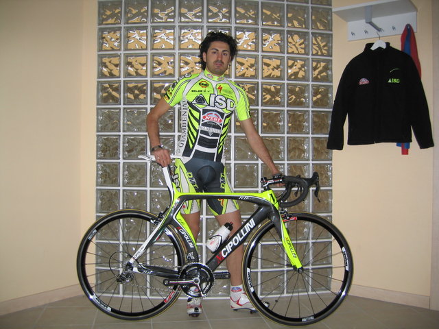
Worst Pro Tour kit = Liquigas, now there are a few contenders here including AG2r and Milram (looking like a cow on a bike is just wrong) but I go for Liquigas as the lime green is just too harsh for me to look at any point in time.
Favourite Pro Continental/Continental kit = Cervelo Test Team in that again like the Francaise des Jeux kit its simple and elegant, plus as seen last year interchangable colours with the seasons.
Least favourite Pro Conti/Conti kit = Due to the numbers this was a really tough one to pick but overwhelmingly and considering (if i remember correctly) that they have lost their Pro Tour status it is Footon-Servetto look a little better in the peloton, somehow! However, it still looks like someone has stood in a pile of vomit with a muddy foot, and i'm afraid that is just completely off the scale in bad kit design.
Tugboat said:Or unless you're Dave Zabriskie and someone dares you to do Paris-Tours in a skin suit and riding the Zipp 1080's.
taiwan said:Is that not the one they wore at the Giro, that Cipollini helped design?


Cozy Beehive said:Contribute away.
Here's mine. Appeared today in CN. To this, someone said on Twitter that the design brief for the kits must have been "accentuate rider's package"
(as a side note,they'd better not wear hydration bags on their backs lest they'll want to be seen like camels).

issoisso said:I wish


afpm90 said:They didn't lose their Pro-Tour status
Big_Blue_Dave said:I think it is because it stands out better in still images and on television pictures. Companies pay a lot of money to work out the best shades of a colour that will stand out for the two.
dimspace said:I think the Sky kit will stand out very clearly, even in black and white newspaper reports, they are the most media savvy team.. And the rider names down the sides of the kits from a media point of view is a touch of genius.. readers and passing fans will get to recognise the riders much much quicker..
goggalor said:Ceramica Flaminia looking cool...euro cool.
http://www.cyclingnews.com/news/photos/ricco-shrugs-off-cavendish-criticism


