• The Cycling News forum is looking to add some volunteer moderators with Red Rick's recent retirement. If you're interested in helping keep our discussions on track, send a direct message to @SHaines here on the forum, or use the Contact Us form to message the Community Team.

    In the meanwhile, please use the Report option if you see a post that doesn't fit within the forum rules.

    Thanks!

Best and Worst National Champs jerseys

Page 70 - Get up to date with the latest news, scores & standings from the Cycling News Community.
Re: Re:

Zinoviev Letter said:
Mullen.png


Trek’s jersey for Mullen. Not sure about this one. It’s not a bad looking garment, but an Irish champions jersey is supposed to feature the shamrock prominently.
The green band feels a bit odd.
 
Re: Re:

RedheadDane said:
Nirvana said:
IMHO the classiest are the withe ones with the orizontal stripes on the chest in WC style, the jerseys made by Bora for example are the best. Anyway also something that fits in the team colours like Nibali is good for me.

Nope, sorry. Some national champion jerseys are meant to be full-jersey design. Take the Scandinavian ones, looks silly to attempt to make "stripes" out of such a flag design.
And Nibali isn't a national champion.
Nibali was national champion for two years in a row, the first version of the jersey was pretty bad with only a square on the abdomen but since the start of 2015 they changed to full chest and fit well with Astana light blue.

jpeg.jpg
 
Re: Re:

Zinoviev Letter said:
Mullen.png


Trek’s jersey for Mullen. Not sure about this one. It’s not a bad looking garment, but an Irish champions jersey is supposed to feature the shamrock prominently.
Is that written down anywhere? I know Nico had it in the past, but I don’t see any obligation to have it.

I don’t think it’s a great jersey, but I’m not sure that a shamrock or two would rescue that.
 
When the team kit is essentially the national flag, the way to make an NC jersey is apparently to omit chunks of colours from said flag (black sleeves and red cuffs)

Although I see that Mirza was also 2016 UAE NC, and didn't have (according to pictures at PCS) a distinctive jersey at all.
 
Re: Re:

Leinster said:
Zinoviev Letter said:
Mullen.png


Trek’s jersey for Mullen. Not sure about this one. It’s not a bad looking garment, but an Irish champions jersey is supposed to feature the shamrock prominently.
Is that written down anywhere? I know Nico had it in the past, but I don’t see any obligation to have it.

I don’t think it’s a great jersey, but I’m not sure that a shamrock or two would rescue that.

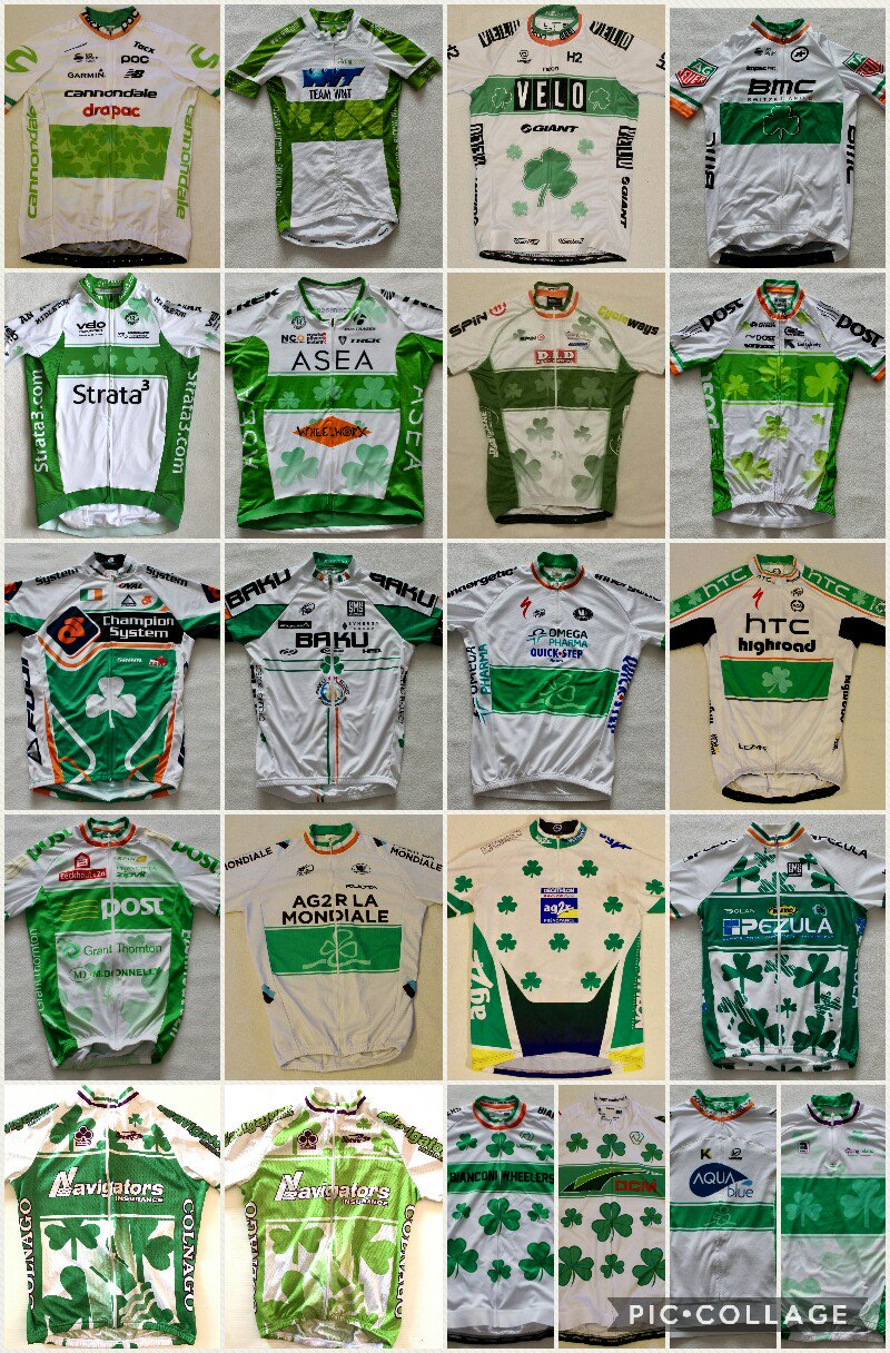
I don’t know if it’s written down in some Cycling Ireland rule book, but every champions jersey I can think of had the shamrock on the front in some form.

https://m.aliexpress.com/item/32428887565.html
http://www.stickybottle.com/latest-news/first-look-ryan-mullen-new-irish-champion-kit/
https://cycling-jersey-collection.com/browse-collection/pezula-irish-champion-santini-2008-pro-team-jersey

Etc etc
 
Paul50 said:
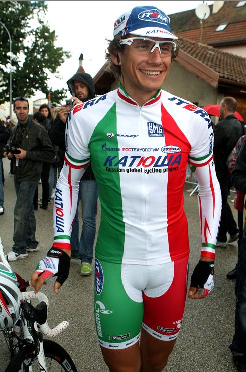
Fabio ARU
Italian Champion RR 2017 - 2018 Jersey

263tzz7.jpg
Better.

That said, I'm a bit disappointed they didn't play around with their own logo. After all it has three lines and the last of it is white text with a red background. I would have taken the normal jersey, erased the UAE flag from it, made the background for the UAE green, and keep the 2nd line ("TEAM") and the 3rd line ("Emirates") as they are. You would have an italian flag on the jersey, so now you just have to extend the 3 stripes around the whole jersey and you basically have the same jersey but with the team logo incorporated in the flag. Would look a bit cooler imo.
 
Aru's new champ jersey looks even more ugly now. It's still pathetic for an Italian champ jersey and now the flag doesn't add up with the jersey design at all anymore. Absolutely atrocious. Should've stayed with Astana. And Lampre better should've folded 2 years ago. What a useless team.
 
Apr 15, 2013
954
0
0
Visit site
Re: Re:

Jancouver said:
Netserk said:
Too much red.

I concur!

Geee guys, you are pretty harsh, compared to some horrible national jerseys we have been seing lately this is classy, sober, elegant. The red on the jersey is a bit bigger to give more overall balance with the black legs when standin, but from atop with the back curving the jersey will look really good. honestly a very solid design. We could only wish for the italian jersey to have a similar problem !
 
Well, except for Gilbert's red shorts, this is about as 'bad' as it can get for a Belgium champion's jersey. That's the benefit of a national federation with proper standards. Even RadioShack Leotard had to do a proper one! As such, we should have higher standards as well.
 
Apr 15, 2013
954
0
0
Visit site
Re:

Netserk said:
Well, except for Gilbert's red shorts, this is about as 'bad' as it can get for a Belgium champion's jersey. That's the benefit of a national federation with proper standards. Even RadioShack Leotard had to do a proper one! As such, we should have higher standards as well.

Honestly the "bad" there.. This a really solid national champ jersey.
 

TRENDING THREADS