New Jerseys - 2011 Season - TeamKits-Maillots-Tricots-Tenues-and-Exotics

Page 44 - Get up to date with the latest news, scores & standings from the Cycling News Community.
DAOTEC said:
galeria34967-001.jpg


from the team complete

Great looking kit!
 

DAOTEC

BANNED
Jun 16, 2009
3,171
0
0
scaled.php


The fresh World Champ in her new flashy Ladies team outfit presented this morning, now that's how we want to see it > 'give it a 10'
icon14.gif
 
Oct 29, 2010
145
0
0
Barrus said:
that shoe looks terrible and ridiculous

this.

I realize the team is facing immense pressure from Geox for not getting a TdF nod but caving like this on a jersey design is ridiculous. Jeez. It's like someone threw spaghetti at the wall and went with what stuck.
 
Oct 31, 2010
172
0
0
GEOX.. hmmm.. kinda like it, nope I like it except the pic in the middle which looks too dark and blurred to actually see what it is. Even when I blow the image up I still can't really understand what it is. If they were hoping to show off some design of a shoe in there, then it's lost in the murk and won't look very good on TV n'eithers.
But I like the change of colour scheme, it's fresh and open, I think the yellow looks great on the upper shoulders and neck. It'll look good in the bunch where you'll be able to pick the lads out. It kinda reminds me a little of the early ISD kits.. hey ho. Carlos'll look good in his anyhoo's.
 
Buffalo Soldier said:
Has this ever been done before in pro cycling? Using a real photograph on a jersey?

I hope this doesn't become a trend...
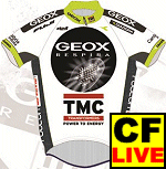
I haven't been able to think of an example yet. Certainly there have been some highly detailed illustrations, such as the Lotus watches. However even these tend to be background elements.

Such designs tend not to work very well because we cannot process this sort of image on objects (or people) moving at speed.

As a result, I find it difficult to believe that this will indeed be the jersey the team wears, so amateurish is the design.

[EDIT: there's another image making the rounds in which the shoe graphic is not a photo:
2011_geox-tmc_jersey.gif
]
 
Finbouy said:
GEOX.. hmmm.. kinda like it, nope I like it except the pic in the middle which looks too dark and blurred to actually see what it is. Even when I blow the image up I still can't really understand what it is. If they were hoping to show off some design of a shoe in there, then it's lost in the murk and won't look very good on TV n'eithers.
But I like the change of colour scheme, it's fresh and open, I think the yellow looks great on the upper shoulders and neck. It'll look good in the bunch where you'll be able to pick the lads out. It kinda reminds me a little of the early ISD kits.. hey ho. Carlos'll look good in his anyhoo's.

I can see the image just fine. It's plainly the sole of a shoe with air or something coming out of it. It's a bit distinctive and will standout among most of the other kits. I don't hate it but it's not one of my fav's. I'd much rather see it on one of the riders or while in action (training ride). I agree, it reminds me of the ISD kits too.