
New Jerseys - 2011 Season - TeamKits-Maillots-Tricots-Tenues-and-Exotics
Page 42 - Get up to date with the latest news, scores & standings from the Cycling News Community.
You are using an out of date browser. It may not display this or other websites correctly.
You should upgrade or use an alternative browser.
You should upgrade or use an alternative browser.

DAOTEC said:and what to think about this beauty

Kolo is Kroo, Kro is Kol, KroKol is KolKro
Kroon is wearing skinsuit made for Kolobnev?
- Jun 16, 2009
- 3,171
- 0
- 0
Jancouver said:Kroon is wearing skinsuit made for Kolobnev?
You've got it dude

Saur Sojasun TT

All: [http://cyclingnews.com/photos]
- Feb 25, 2010
- 3,854
- 1
- 0
DAOTEC said:
extreme looking bike
 now is it just me or does it look like the Trek speed concept?
- Jun 16, 2009
- 3,171
- 0
- 0
Atenciones > 'amigo es muy importante'
Ora Hotels - Sign - Carrera (CT) '11 - (HUN/ITA)

venerdì 23 gennaio 2011 | Line-up:
Gianfranco Visconti (27)
Roberto Richeze (29)
Ruslan Ivanov (37)
Istvan Cziraki (24)
Gabor Fejes (21)
Gianluca Coletta (29)
Zoltan Tisza (43)
Marco Carletti (27)
Tamas Lengyel (30)
Krisztian Lovassy (22)
Zoltan Madaras (30)
Rida Cador (29)
Alessandro Malaguti (23)
Luca Fioretti (26)
Walter Proch (26)
Ferenc Stubán (19)
David Puskas (22)
Emanuele Rizza (26)
Peter Simon (19)
Adriano Angeloni (27)
GM: Zsuzsana Horvath,
DS: Germano Pierdomenico
Bici - Carrera F2

Ora Hotels - Sign - Carrera (CT) '11 - (HUN/ITA)
venerdì 23 gennaio 2011 | Line-up:
Gianfranco Visconti (27)
Roberto Richeze (29)
Ruslan Ivanov (37)
Istvan Cziraki (24)
Gabor Fejes (21)
Gianluca Coletta (29)
Zoltan Tisza (43)
Marco Carletti (27)
Tamas Lengyel (30)
Krisztian Lovassy (22)
Zoltan Madaras (30)
Rida Cador (29)
Alessandro Malaguti (23)
Luca Fioretti (26)
Walter Proch (26)
Ferenc Stubán (19)
David Puskas (22)
Emanuele Rizza (26)
Peter Simon (19)
Adriano Angeloni (27)
GM: Zsuzsana Horvath,
DS: Germano Pierdomenico
Bici - Carrera F2
La Pandera said:I hadn't seen the back of the new Garmin kit. HMMMM. That does alter my opinion. I was giving Garmin the benefit of the doubt but now it does seem questionable. At the same time they were probably offered several designs options, felt that this particular one was the best one regardless of the obvious similarities to SKY. Also if you go to garmin.com, you would see that the colors chosen are an accurate reflection of the company's colors. Can they be helped that their primary sponsor has similar colors to SKY?
Using more red in the design wouldn't be an accurate reflection of the hierarchy of the team's sponsors. Last year with Cervelo the primary and Castelli and Rotor Rings below them, red was acceptable. The inclusion of the white back panel has to be the primary arguing point but in deciding between perceived rider comfort and offending one of your opponents I'm not surprised which route they chose.
And yes, the designer couldn't help to have known that the design was similar to SKY but since SKY's is a retro design it's not like they were breaking any new ground like the CTT kit which was in my opinion one of the more original kit designs that I've seen.
I give you that the horizontal band has been used for decades, and the white back may improve rider comfort, but it's just the overall similarity which must have been totally clear when they combined the elements. It doesn't really matter, but a bit more concern for individuality would have been nice.
How about this ('scuse the quality, I'm obv. not a pro)?

I'm not sure Kaale Kriit (sp.) would like that much though.
- Aug 18, 2009
- 4,993
- 1
- 0
La Pandera said:I hadn't seen the back of the new Garmin kit. HMMMM. That does alter my opinion. I was giving Garmin the benefit of the doubt but now it does seem questionable. At the same time they were probably offered several designs options, felt that this particular one was the best one regardless of the obvious similarities to SKY. Also if you go to garmin.com, you would see that the colors chosen are an accurate reflection of the company's colors. Can they be helped that their primary sponsor has similar colors to SKY?
Using more red in the design wouldn't be an accurate reflection of the hierarchy of the team's sponsors. Last year with Cervelo the primary and Castelli and Rotor Rings below them, red was acceptable. The inclusion of the white back panel has to be the primary arguing point but in deciding between perceived rider comfort and offending one of your opponents I'm not surprised which route they chose.
And yes, the designer couldn't help to have known that the design was similar to SKY but since SKY's is a retro design it's not like they were breaking any new ground like the CTT kit which was in my opinion one of the more original kit designs that I've seen.
Just overall a bit too close IMO. They weren't obliged to use the retro band or the white back (are it's benefits proven?).
[edit] Oops, ****ed that up. Ah well.
- Aug 18, 2009
- 4,993
- 1
- 0
A
Anonymous
Guest
La Pandera said:I hadn't seen the back of the new Garmin kit. HMMMM. That does alter my opinion. I was giving Garmin the benefit of the doubt but now it does seem questionable. At the same time they were probably offered several designs options, felt that this particular one was the best one regardless of the obvious similarities to SKY. Also if you go to garmin.com, you would see that the colors chosen are an accurate reflection of the company's colors. Can they be helped that their primary sponsor has similar colors to SKY?
Using more red in the design wouldn't be an accurate reflection of the hierarchy of the team's sponsors. Last year with Cervelo the primary and Castelli and Rotor Rings below them, red was acceptable. The inclusion of the white back panel has to be the primary arguing point but in deciding between perceived rider comfort and offending one of your opponents I'm not surprised which route they chose.
And yes, the designer couldn't help to have known that the design was similar to SKY but since SKY's is a retro design it's not like they were breaking any new ground like the CTT kit which was in my opinion one of the more original kit designs that I've seen.
telling them apart in the tdu wasnt the easiest from the front, and from above combined with the fact the columbia kit is predominantly white telling them apart was a complete headache. Throw in Lay-o-pard with their white back invisible blue stripe and black shoulders and this year is going to be a headache for fans.
DB hit it right on the head. He was actually very forthright in both webchats.
TeamSkyFans said:telling them apart in the tdu wasnt the easiest from the front, and from above combined with the fact the columbia kit is predominantly white telling them apart was a complete headache. Throw in Lay-o-pard with their white back invisible blue stripe and black shoulders and this year is going to be a headache for fans.
DB hit it right on the head. He was actually very forthright in both webchats.
I found Roulston's All Black kit the most deceiving. Should be ok once I get used to seeing him in it.
- Mar 10, 2009
- 9,245
- 23
- 17,530
taiwan said:Just overall a bit too close IMO. They weren't obliged to use the retro band or the white back (are it's benefits proven?). How about this variant(bad quality, but you get the idea)?
I couldn't view it. What was it?
- Apr 12, 2009
- 2,364
- 0
- 0
Michielveedeebee said:extreme looking bike
It just took Trek 4 years to copy it.
- Jun 16, 2009
- 3,171
- 0
- 0
It's close in 2-way
Why not wait until tomorrow morning?

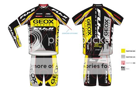
This was last Saturday Presentation at the litt Asian bro Fuji-Cyclingtime.com

( Roster: Tjarco Cuppens (NED), Takeshi Igarashi (JAP) Chris Lintaman (CAN), Shusaku Matsuo (JAP), Lee Rodgers (GBR), Tzu Pei Yang, ), Chih-Wei Lin, Han Yu Lin, Mei Hsing Lin, Shen Che Lin)

Why not wait until tomorrow morning?
This was last Saturday Presentation at the litt Asian bro Fuji-Cyclingtime.com
( Roster: Tjarco Cuppens (NED), Takeshi Igarashi (JAP) Chris Lintaman (CAN), Shusaku Matsuo (JAP), Lee Rodgers (GBR), Tzu Pei Yang, ), Chih-Wei Lin, Han Yu Lin, Mei Hsing Lin, Shen Che Lin)
- Aug 18, 2009
- 4,993
- 1
- 0
DAOTEC said:
Why not wait until tomorrow morning?
Finally it came out! thanks.
- Aug 18, 2009
- 4,993
- 1
- 0
jaylew said:
I don't get why that should be uci legal. Shouldn't the seattube allow a straight line to be drawn through it?
- Sep 9, 2009
- 58
- 0
- 0
taiwan said:I don't get why that should be uci legal. Shouldn't the seattube allow a straight line to be drawn through it?
I know Kestrel had to ad that seat tube to their TT bike t make it legal, I think the only rule otherwise is 3:1.
Why are they using Kestrel TT bikes if Fuji is a co sponsor?

- Jan 3, 2011
- 26
- 0
- 0
xnobrakesx said:I know Kestrel had to ad that seat tube to their TT bike t make it legal, I think the only rule otherwise is 3:1.
Why are they using Kestrel TT bikes if Fuji is a co sponsor?
Because Advanced Sports ( the huge conglomerate that owns both Fuji and Kestrel ) wants to make things as confusing as possible.....
As if those paint jobs weren't enough....
Oh and they also own Oval Concepts ( wheels ).
If i was a rider on that team i would feel like i've been sold out.
- Sep 9, 2009
- 58
- 0
- 0
Hunter Grant said:Because Advanced Sports ( the huge conglomerate that owns both Fuji and Kestrel ) wants to make things as confusing as possible.....
As if those paint jobs weren't enough....
Oh and they also own Oval Concepts ( wheels ).
If i was a rider on that team i would feel like i've been sold out.
The Kestrel is obviously for Triathlons, and they are ugly. I was happy Rock folded simply for that reason.
Armchair Cyclist
Moderator
- Mar 22, 2010
- 16,054
- 12,039
- 28,180


Hunter Grant said:Oh and they also own Oval Concepts ( wheels ).
The marketeers who came up with the suggestion of Oval Wheels are equalled for incompetence only by those who decided to name a fizzy drink "Vimto" without realising that it was an anagram of Vomit.
- Feb 23, 2010
- 2,114
- 19
- 11,510
jaylew said:Not sure if DAOTEC already posted this:

xnobrakesx said:I know Kestrel had to ad that seat tube to their TT bike t make it legal, I think the only rule otherwise is 3:1.
Why are they using Kestrel TT bikes if Fuji is a co sponsor?
Supremely hideous! Who do they employ to do this stuff? Xzibit?
- Feb 25, 2010
- 3,854
- 1
- 0
L'arriviste said:Supremely hideous! Who do they employ to do this stuff? Xzibit?
I love the FUJI
the Kestrel is fugly indeed- Nov 2, 2009
- 1,112
- 0
- 0
TeamSkyFans said:telling them apart in the tdu wasnt the easiest from the front, and from above combined with the fact the columbia kit is predominantly white telling them apart was a complete headache. Throw in Lay-o-pard with their white back invisible blue stripe and black shoulders and this year is going to be a headache for fans.
DB hit it right on the head. He was actually very forthright in both webchats.
Interestingly, I found it MUCH easier to tell them apart when I was roadside watching a Jayco Bay Crit than when I watched the TDU on TV.
In person the differences seemed pretty clear (the Adidas stripes on Sky, the "é" symbol for Garmin-Cérvelo) and there was NO confusing the two.
I think as the season progresses we'll find it a lot easier to differentiate.
I found Hayden Roulston's kit confusing too, although I really like it.
TRENDING THREADS
-
 Paris-Roubaix 2026, one day monument, April 12
- Started by Lequack
- Replies: 2K
-
 Itzulia Basque Country 2026, April 6-11
- Started by Dazed and Confused
- Replies: 2K
-
 Ronde van Vlaanderen 2026, monument, April 5 (men's)
- Started by Krzysztof_O
- Replies: 1K
-

-
 Teams & Riders The Remco Evenepoel is the next Eddy Merckx thread
- Started by DNP-Old
- Replies: 39K
-
 Teams & Riders Tadej Pogačar discussion thread
- Started by Lequack
- Replies: 43K
-
De Brabantse Pijl 2026, April 17
- Started by Dazed and Confused
- Replies: 155


Cyclingnews is part of Future plc, an international media group and leading digital publisher. Visit our corporate site.
© Future Publishing Limited Quay House, The Ambury, Bath BA1 1UA. All rights reserved. England and Wales company registration number 2008885.