• The Cycling News forum is looking to add some volunteer moderators with Red Rick's recent retirement. If you're interested in helping keep our discussions on track, send a direct message to @SHaines here on the forum, or use the Contact Us form to message the Community Team.

    In the meanwhile, please use the Report option if you see a post that doesn't fit within the forum rules.

    Thanks!

New Jerseys - 2011 Season - TeamKits-Maillots-Tricots-Tenues-and-Exotics

Page 41 - Get up to date with the latest news, scores & standings from the Cycling News Community.

DAOTEC

BANNED
Jun 16, 2009
3,171
0
0
Visit site
Atenciones RealCyclis.com
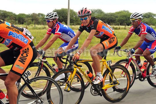
'PACO' for '11

RCPCT-Kit-Reveal.jpg

168720_193916377287234_149253171753555_752445_3491854_n.jpg


RealCyclist.com Unveils 2011 Pro Cycling Team Kit13-rider U.S.-based UCI Continental squad will race in cutting-edge, orange and white Louis Garneau kits01.20.2011– PARK CITY, UTAH — Less than a month away from their training camp in Georgia, the RealCyclist.com Professional Cycling Team today reveals their official 2011 Louis Garneau racing kits.

Studying how wind resistance specific to a cyclist’s position plays into performance, Louis Garneau re-engineered their Custom Mondo Jersey worn by the RealCyclist.com Pro Cycling Team kit by incorporating superior design and technology. The use of Speed Tech in the shoulder panels helps reduce frontal pressure and cut wind resistance, while seam placement and panels have been engineered with precision to offer a streamlined impenetrable fit. An underarm cooling zone of PowerMesh enhances comfort required so Team riders remain competitively focused.


What a beauty hey
spook.gif


Team Pres.: http://www.facebook.com/event-Friday-February-11/18:30 -21pm

Twit: http://twitter.com/otrmgt
 

DAOTEC

BANNED
Jun 16, 2009
3,171
0
0
Visit site
Jersey-Gate

from a Sky-chat on CyclingWeekly

Are you bothered by the number of black, blue and white jerseys in the bunch this year?

Dave Brailsford: It's more disappointing than anything else as with all new teams there's an opportunity to create a completely new and different identity. The key thing is that it is important for fans and everyone else to differentiate clearly between each team when the racing is fully on. Confusion in identifying riders will lead to less enjoyment.

Why Garmin dropped their fantastically unique Argyle and got as close as you can possibly get to our jersey, I will never know.
 
Jul 18, 2010
707
0
0
Visit site
DAOTEC said:
from a Sky-chat on CyclingWeekly

Are you bothered by the number of black, blue and white jerseys in the bunch this year?

Dave Brailsford: It's more disappointing than anything else as with all new teams there's an opportunity to create a completely new and different identity. The key thing is that it is important for fans and everyone else to differentiate clearly between each team when the racing is fully on. Confusion in identifying riders will lead to less enjoyment.

Why Garmin dropped their fantastically unique Argyle and got as close as you can possibly get to our jersey, I will never know.

I must have missed where SKY had a patent on black, blue and white kits. The argyle is still present just not as prominent. Additionally the argyle was Vaughters thing all the way back to TIAA-CREF (sp). His influence on the kit design apparently didn't hold as much sway after Cervelo came on board. The new design IMO is a natural evolution of the joining of Garmin and Cervelo. Garmin lost the orange and a bit of the argyle and Cervelo lost the red that complimented the Castelli logo.
 
La Pandera said:
I must have missed where SKY had a patent on black, blue and white kits. The argyle is still present just not as prominent. Additionally the argyle was Vaughters thing all the way back to TIAA-CREF (sp). His influence on the kit design apparently didn't hold as much sway after Cervelo came on board. The new design IMO is a natural evolution of the joining of Garmin and Cervelo. Garmin lost the orange and a bit of the argyle and Cervelo lost the red that complimented the Castelli logo.
Come on, for all practical purposes the Argyle is gone.
 
Jul 18, 2010
707
0
0
Visit site
hrotha said:
Come on, for all practical purposes the Argyle is gone.

Since I wasn't fond of the argyle in the first place, what is still there is too much. It's still present in the collar and on the band of one leg. I think people like to create drama where none exists. I really doubt that it was Garmin-Cervelo's intention to "copy" SKY's design, and for those that believe that is the case, for what gain? Makes no sense.
 
Aug 18, 2009
4,993
1
0
Visit site
La Pandera said:
Since I wasn't fond of the argyle in the first place, what is still there is too much. It's still present in the collar and on the band of one leg. I think people like to create drama where none exists. I really doubt that it was Garmin-Cervelo's intention to "copy" SKY's design, and for those that believe that is the case, for what gain? Makes no sense.

Well you have to admit there are strong similarities (almost identical colours, horizontal band on chest, white panel on back), and whoever designed the jersey definitely saw the Sky jersey first: Sky had been showing it off for a year. Why? I imagine a scenario where one of the sponsors saw Sky and said "that's how we want to look" and insisted. I think it would have been good if they'd used some red there as well, like in the '09 CTT kit.
 
Jul 18, 2010
707
0
0
Visit site
taiwan said:
Well you have to admit there are strong similarities (almost identical colours, horizontal band on chest, white panel on back), and whoever designed the jersey definitely saw the Sky jersey first: Sky had been showing it off for a year. Why? I imagine a scenario where one of the sponsors saw Sky and said "that's how we want to look" and insisted. I think it would have been good if they'd used some red there as well, like in the '09 CTT kit.

I hadn't seen the back of the new Garmin kit. HMMMM. That does alter my opinion. I was giving Garmin the benefit of the doubt but now it does seem questionable. At the same time they were probably offered several designs options, felt that this particular one was the best one regardless of the obvious similarities to SKY. Also if you go to garmin.com, you would see that the colors chosen are an accurate reflection of the company's colors. Can they be helped that their primary sponsor has similar colors to SKY?

Using more red in the design wouldn't be an accurate reflection of the hierarchy of the team's sponsors. Last year with Cervelo the primary and Castelli and Rotor Rings below them, red was acceptable. The inclusion of the white back panel has to be the primary arguing point but in deciding between perceived rider comfort and offending one of your opponents I'm not surprised which route they chose.

And yes, the designer couldn't help to have known that the design was similar to SKY but since SKY's is a retro design it's not like they were breaking any new ground like the CTT kit which was in my opinion one of the more original kit designs that I've seen.