
New Jerseys - 2016 Season - TeamKits-Maillots-Tricots-Tenues
Page 21 - Get up to date with the latest news, scores & standings from the Cycling News Community.
You are using an out of date browser. It may not display this or other websites correctly.
You should upgrade or use an alternative browser.
You should upgrade or use an alternative browser.
- May 23, 2009
- 10,263
- 1,461
- 25,680
Re: New Jerseys - 2016 Season - TeamKits-Maillots-Tricots-Te
Rather than the argyle being close shades of green, they needed to use much more contrasting shades IMO. A few more sponsor logos wouldn't hurt either.
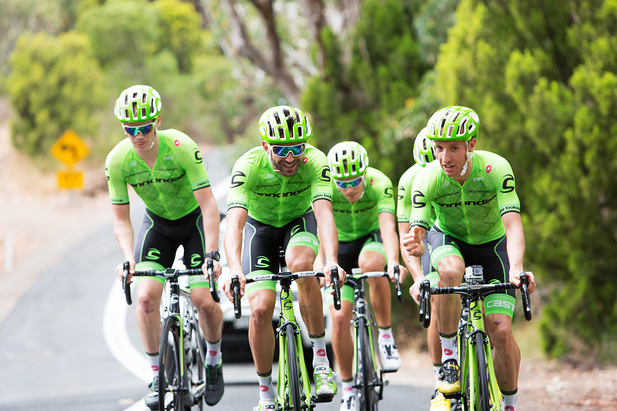
Nope, not quite. I saw Clarke's on the road at nationals and it looks even worse on TV, really bland.Anderis said:New Cannondale kits on the road.
Rather than the argyle being close shades of green, they needed to use much more contrasting shades IMO. A few more sponsor logos wouldn't hurt either.
- May 9, 2010
- 11,144
- 2,666
- 28,180
classicomano
BANNED
- May 5, 2011
- 2,965
- 0
- 11,480
Re: New Jerseys - 2016 Season - TeamKits-Maillots-Tricots-Te
Best kit so far.Bye Bye Bicycle said:
Best. Jersey. Ever.

Re:
")
Christina Watches/Jewelry don't really have a corporate ID beyond the font of the logo.
"That blue circle on black" was the logo of co-sponsor Onfone.Armchair cyclist said:Michael Rasmussen's favourite jewellers return to sponsorship, but seem to have abandoned their corporate ID (that blue circle on black, and retain the colours of the team's previous incarnation, Team Stuttgart.
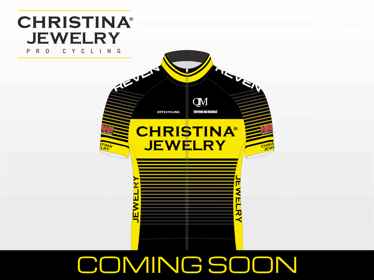
Christina Watches/Jewelry don't really have a corporate ID beyond the font of the logo.
- Mar 10, 2009
- 732
- 50
- 10,080
Re: Re:
Like the one from last year's Tour?
RedheadDane said:I'm still waiting for that "Garmin blue" + "Cannondale green" completely argyle-patterned jersey!
Like the one from last year's Tour?
Re: New Jerseys - 2016 Season - TeamKits-Maillots-Tricots-Te
https://www.twitter.com/AuDeloittian/status/687822465507065856

https://www.twitter.com/AuDeloittian/status/687822465507065856
- May 23, 2009
- 10,263
- 1,461
- 25,680
Re: New Jerseys - 2016 Season - TeamKits-Maillots-Tricots-Te
Marginal improvement...pastronef said:https://www.twitter.com/AuDeloittian/status/687822465507065856
- May 15, 2011
- 45,171
- 617
- 24,680

Re: New Jerseys - 2016 Season - TeamKits-Maillots-Tricots-Te
Good god, that's dull!
pastronef said:https://www.twitter.com/AuDeloittian/status/687822465507065856
Good god, that's dull!
- Mar 10, 2009
- 732
- 50
- 10,080
Back:

Still a bit bland, but much better than the front. They will be really easy to spot in helicopter shots which is a big plus for me. It also shows how little it would haven taken to make a much better front.
Still a bit bland, but much better than the front. They will be really easy to spot in helicopter shots which is a big plus for me. It also shows how little it would haven taken to make a much better front.
Re:
Ok, yep, that's a lot better.
Still utterly uninspiring, but easy to spot in the bunch, which is a big plus.
screaming fist said:Back:
Still a bit bland, but much better than the front. They will be really easy to spot in helicopter shots which is a big plus for me. It also shows how little it would haven taken to make a much better front.
Ok, yep, that's a lot better.
Still utterly uninspiring, but easy to spot in the bunch, which is a big plus.
- Oct 21, 2012
- 3,942
- 3,292
- 19,180
Re: New Jerseys - 2016 Season - TeamKits-Maillots-Tricots-Te
Terrible. Looks like my social calendar
pastronef said:https://www.twitter.com/AuDeloittian/status/687822465507065856
Terrible. Looks like my social calendar
- Sep 28, 2010
- 3,364
- 329
- 14,180
Re: New Jerseys - 2016 Season - TeamKits-Maillots-Tricots-Te
It's getting presented right now. Pictures should be online soon.
Mitcholo said:Any news yet on Direct Energie? I've seen some mock ups online but nothing looks quite right- also, getting rid of Colnago?
It's getting presented right now. Pictures should be online soon.
- Feb 10, 2015
- 5,995
- 899
- 19,680
Re: New Jerseys - 2016 Season - TeamKits-Maillots-Tricots-Te
It's coming very soon.
Mitcholo said:Any news yet on Direct Energie? I've seen some mock ups online but nothing looks quite right- also, getting rid of Colnago?
It's coming very soon.
- Mar 10, 2009
- 732
- 50
- 10,080

- Feb 10, 2015
- 5,995
- 899
- 19,680
- Feb 20, 2010
- 33,223
- 15,729
- 28,180
Dimension Data's jersey is one of the worst I can remember.
At least with the other stupendously dull, boring corporate jerseys you can at least see the thinking of the sales of replicas (Sky, Bora, Trek, Giant) even if the jerseys themselves are nothing interesting, they're more likely to sell to Freds because while boring they can at least look halfway classy when done right. This is not that. This is something you'd put back on the shelf in Decathlon or not bother picking up because it's so bland you didn't even notice it.
The back is a crappier version of the Geox kit from 2011, and the front is so boring it actually offends me. It makes Leopard Trek look like FDJ.
- Aug 18, 2010
- 11,435
- 3,594
- 28,180
The Direct Energie jersey is in theory a dull corporate jersey, but it's saved by the corporate logo being ideally suited to a cycling kit - simple, striking, bright and easily recognisable whether shown as a whole or in part. So it ends up looking great. From a designer's point of view, being handed that bright yellow circle is approximately one billion times better than being handed the, also bright yellow, Lidl logo to integrate into a jersey.
Dimension Data's one is absolutely woeful. It is almost beyond comprehension that professional designers were paid for it.
Dimension Data's one is absolutely woeful. It is almost beyond comprehension that professional designers were paid for it.
- Sep 28, 2014
- 3,639
- 1,608
- 16,680
It's probably just me, but this kit reminds me of the Cervelo Test Team. I don't know why though!
classicomano
BANNED
- May 5, 2011
- 2,965
- 0
- 11,480
Re:
Thank you Lord in heaven, now we finally dont have to look at the hideous Europcar jersey anymore.screaming fist said:
TRENDING THREADS
-
 Paris-Roubaix 2026, one day monument, April 12
- Started by Lequack
- Replies: 2K
-
 Itzulia Basque Country 2026, April 6-11
- Started by Dazed and Confused
- Replies: 2K
-
 Ronde van Vlaanderen 2026, monument, April 5 (men's)
- Started by Krzysztof_O
- Replies: 1K
-

-
 Teams & Riders The Remco Evenepoel is the next Eddy Merckx thread
- Started by DNP-Old
- Replies: 39K
-
 Teams & Riders Tadej Pogačar discussion thread
- Started by Lequack
- Replies: 43K
-
 Milan San Remo, March 21, 2026, 298 km monument
- Started by topcat
- Replies: 1K
Cyclingnews is part of Future plc, an international media group and leading digital publisher. Visit our corporate site.
© Future Publishing Limited Quay House, The Ambury, Bath BA1 1UA. All rights reserved. England and Wales company registration number 2008885.