Maybe they meant to make the laundry connection—does Bora make washing machines as well as stoves?The kit not the ride.
I like the Bora kit but for some reason it reminds me of laundry liquitabs
New Jerseys - 2020 Season - TeamKits-Maillots-Tricots-Tenues
Page 9 - Get up to date with the latest news, scores & standings from the Cycling News Community.
You are using an out of date browser. It may not display this or other websites correctly.
You should upgrade or use an alternative browser.
You should upgrade or use an alternative browser.
- May 25, 2018
- 2,420
- 2,609
- 17,180
I don't know. The important thing I suppose is that it stands out. You want to be able to look at the aerial shots and sayMaybe they meant to make the laundry connection—does Bora make washing machines as well as stoves?

"That's Bora"
- Mar 13, 2015
- 6,554
- 256
- 17,880
I thought there was a thread for fantasy jerseys, but cannot find it. Anyway, here's this - https://www.cyclingnews.com/news/designer-creates-fantasy-worldtour-collaboration-jerseys/
- Sep 26, 2020
- 26,576
- 29,525
- 23,180
But who on earth came to the conclusion, that the DQS kit didn't have enough Lidl logos on them already?
Last edited:
- Jun 22, 2014
- 666
- 13
- 10,010
But who on earth came to the conclusion, that the DQS kit didn't have enough Lidl logos on them already?
Honestly? It actually makes the Lidl logo work. It looks out of place on the actual jersey (and has for years), but it doesn't look as bad this way. Also love the couture-style list of locations on the front, though it really should be "SANREMO" instead of "MILAN" if we're being consistent...
Bunch of gems on there. If I had to name a favorite it'd be between the Astana x Balenciaga and Jumbo x Versace collabs. The former wouldn't even be that out of place on the current peloton, but the Jumbo one...Wow. On a more classy note...The AG2R x OVO one is pretty mint.
- May 2, 2011
- 71
- 20
- 8,730
The EF kits stand out. I like that they have more colors in it in this year.
I agree, but 3 colors should never be used. Pink, Yellow and Red...at least not this much. Seeing that is the leaders Jersey for the 3 GTs. I think they were not allowed or something for using them in the Giro.
- May 25, 2018
- 2,420
- 2,609
- 17,180
JV were a joke at the Tour this year so I'm glad EF changed even if the kit is awfulI agree, but 3 colors should never be used. Pink, Yellow and Red...at least not this much. Seeing that is the leaders Jersey for the 3 GTs. I think they were not allowed or something for using them in the Giro.
- May 5, 2010
- 53,091
- 31,296
- 28,180
- Feb 20, 2010
- 33,157
- 15,608
- 28,180
I don't get it. A lot of those fantasy ones are terrible.
Some are genuinely great - NTT, Ag2r, Mitchelton, Sunweb (though this really can't have taken much design work to come up with...), Arkea; some are great in the retro-hideous kind of way à la CSF-Navigare or something - Jumbo, CCC, Bahrain; and some of them are just like, what's the point - Trek, Groupama, Lotto, Astana, Ineos. Also very confused as to why the sole WWT team they decided to do a re-draw for is the one team that really doesn't need it as they've been putting forward solid creative designs ever since the rebirth as Specialized-Lululemon eight years ago.
Some are genuinely great - NTT, Ag2r, Mitchelton, Sunweb (though this really can't have taken much design work to come up with...), Arkea; some are great in the retro-hideous kind of way à la CSF-Navigare or something - Jumbo, CCC, Bahrain; and some of them are just like, what's the point - Trek, Groupama, Lotto, Astana, Ineos. Also very confused as to why the sole WWT team they decided to do a re-draw for is the one team that really doesn't need it as they've been putting forward solid creative designs ever since the rebirth as Specialized-Lululemon eight years ago.
- May 25, 2018
- 2,420
- 2,609
- 17,180
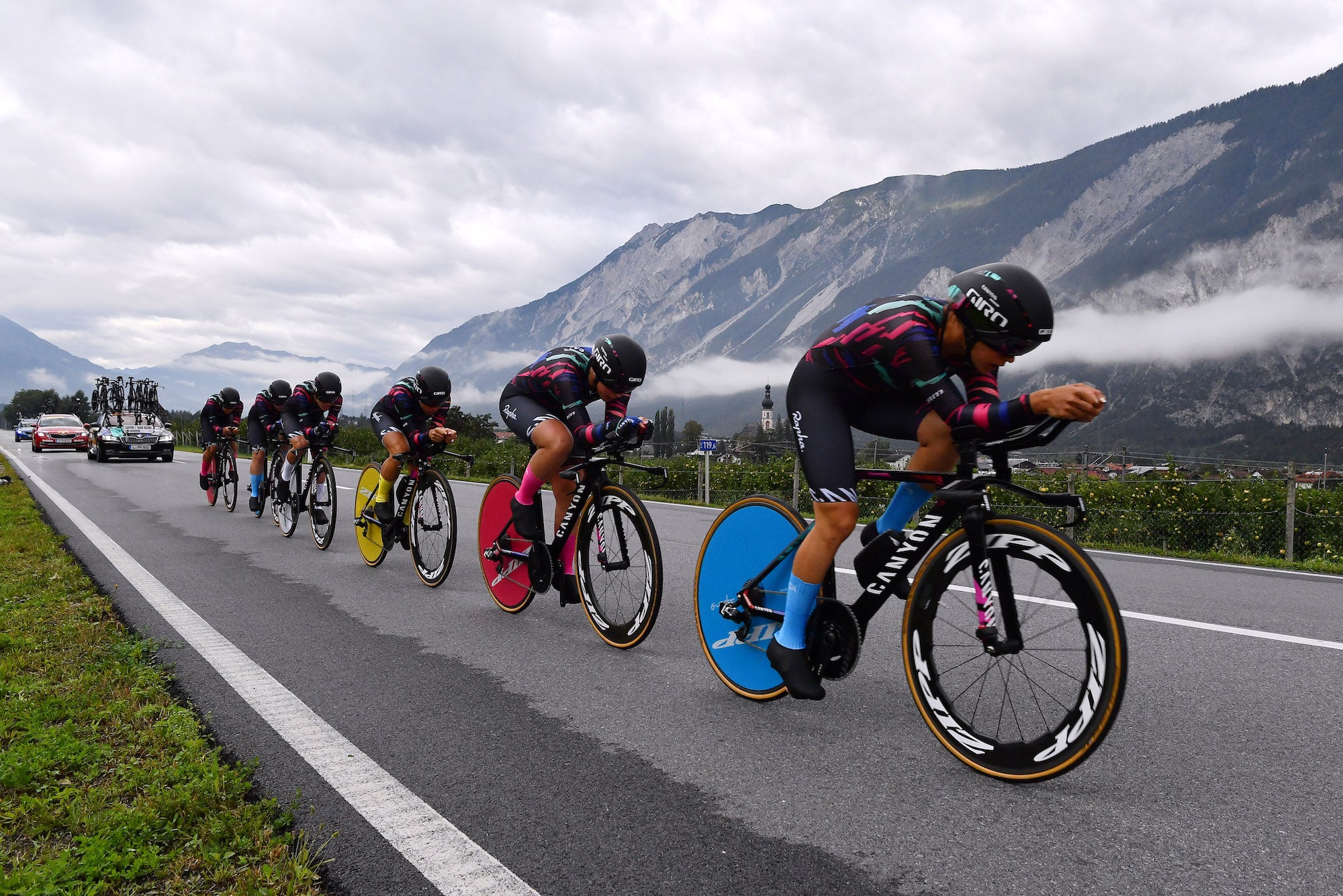
The synched bikes and socks was one of the best things I've seen in a TTTI know Canyon SRAM are one team that doesn't need to make changes to stand out but that's a cool jersey IMO.

TRENDING THREADS
-
 Itzulia Basque Country 2026, April 6-11
- Started by Dazed and Confused
- Replies: 754
-
 Ronde van Vlaanderen 2026, monument, April 5 (men's)
- Started by Krzysztof_O
- Replies: 1K
-

-
 Teams & Riders The Remco Evenepoel is the next Eddy Merckx thread
- Started by DNP-Old
- Replies: 39K
-
 Teams & Riders Tadej Pogačar discussion thread
- Started by Lequack
- Replies: 43K
-
 Milan San Remo, March 21, 2026, 298 km monument
- Started by topcat
- Replies: 1K
-


Cyclingnews is part of Future plc, an international media group and leading digital publisher. Visit our corporate site.
© Future Publishing Limited Quay House, The Ambury, Bath BA1 1UA. All rights reserved. England and Wales company registration number 2008885.


