- Sep 2, 2011
- 17,703
- 14,101
- 28,180
No?Don't people always say that every year?
It's a plethora of uninspiring designs.

No?Don't people always say that every year?
No?
It's a plethora of uninspiring designs.
If they sign Papi Rebellin I'm actually cool with the jersey.Gerolsteiner are back!
Well the fact you don't see it doesn't mean everybody shouldn't see it. That's exactly what personal taste is about. You like things that others don't.When they don't change their kit, it's wrong, and when they do, it's wrong too.
I guess it's not the same people who complain about both, though.
I really don't see what's wrong with kits like Ineos, Movistar, BikeExchange, FDJ female, Jumbo, Bahrain for example.
Well the fact you don't see it doesn't mean everybody shouldn't see it. That's exactly what personal taste is about. You like things that others don't.
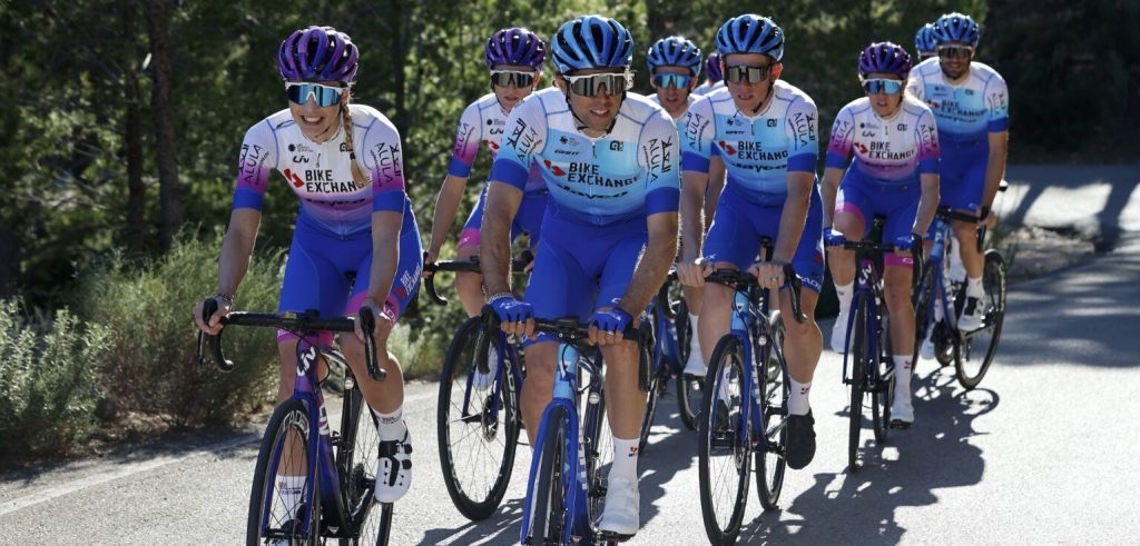
To me for example the BikeExchange kit is terrible, I hated Gerolsteiner and I don't think that bringing back such a displeasing combination of colors has any sense in 2022.
Bora destroyed a very cool kit. QS is very unispiring compared to previous years.
Movistar and Ineos are cool, but that doesn't mitigate the fact three teams got a lot worse than last year.
I understand the constant complaining can be tiresome, but sometimes the complainers have a point. It's not just for the sake of it.
")
Was gonna respond the exact same thing if someone else hadn't yet.Gerolsteiner are back!


It's also the moving of goalposts that's annoying. One year, a new kit is supposedly terrible when it's introduced, then apparently it gets okay, and when it's changed it's terrible because the kit stood out in the peloton.
I know I'm not the most fashion-oriented person in the world, so I wouldn't presume to be an expert on this and cannot talk for others, but some times I just wonder why people feel the need to complain about everything all the time. I have the same thoughts of plenty of my colleagues.
I just then choose to complain about people complaining, and here we are
Don't people always say that every year?
January, the month where route design critique is not the favourite thing on the CN forum.
Why? It's maybe not subtle, but it's not in your face either, whilst still clearly signalling that it's two different jerseys and which is which.Also they can fk right off with their blue for boys pink for girls stuff
Why? It's maybe not subtle, but it's not in your face either, whilst still clearly signalling that it's two different jerseys and which is which.
Where else can you find experts in such unrelated fields of knowledge as geography and fashion design?Maybe we need a moaners and complainers thread for Team kits and GT routes.
Lidl logo disappearance is another improvement, with the years its inclusion improved a bit but was still an odd presence.I like this one so much better than the last two ones!!
It's not spectacular, but at least it's not that plain anymore.
But what's that? Are the lidl buttons gone?
BEx mens kit is boring but the more colourful womens kit is really nice.
Also they can fk right off with their blue for boys pink for girls stuff
It’s 2022 and everything that reflects gender differences is accused of being normative.because its annoying, pink it & shrink it has been a affliction of the bike industry for far too long, and is such a gender normative stereotype thing, its 2022 ffs arent we beyond that nonsense by now. Trek showed how you can produce kits for both womens and mens team to the same design and signal the differences, and the womens kit is blue.
it wouldnt have been so bad if theyd gone back to an update of the old Jayco kit style of the Adelaide sunset colours with the pinks & reds fading into the blue that would have made some sense. But this is literally oh just stick some "pink" (they claim its aubergine) on it, and pretend it matches the Liv brand (it doesnt).
I used to like the Gerolsteiner kit, but I really dont like this, I know BEX were accused of being boring last year but Id prefer boring than this.
Is blue the "Giant colour" I dont ever remember them having a brand colourYou have to complain to Giant/Liv about that, cause blue and purple (though BEX call it aubergine by mistake) are the colours of the two different brands.
A bit sad that no big teams will be riding on Bianchi bikes this year.
Is blue the "Giant colour" I dont ever remember them having a brand colour


