
New site design: Post all feedback here
Page 10 - Get up to date with the latest news, scores & standings from the Cycling News Community.
You are using an out of date browser. It may not display this or other websites correctly.
You should upgrade or use an alternative browser.
You should upgrade or use an alternative browser.
- Sep 1, 2019
- 2
- 1
- 15
Accordign to the news article they are receiving feedback via email, which seems kind of weird give that they have a forum specifically for this.

Do they even read the forums?
Also there are already a lot of comments on that article.
There's feedback via the forum, Twitter replies, comments, emails..
All of them are saying similar things about: the mobile site, results, ads. These are the most complained-about things I've seen so far.
Dan Benson has said that the results and mobile issues are being worked on.
https://www.cyclingnews.com/news/cyclingnews-new-look/#disqus_thread
View: https://twitter.com/dnlbenson/status/1167835045555593216

- Mar 17, 2009
- 472
- 7
- 9,295
New forum says that I have been awarded a bunch of trophies. Will they be sent to me or is there someplace I need to go to pick them up?
Thanks in advance,
Thanks in advance,
- Jul 6, 2014
- 1,645
- 318
- 11,180
I'm sorry to say: definitely a regression.
A stage happens and it is difficult to find the results. This is important information that should be easy and simple to access.
A stage happens and it is difficult to find the results. This is important information that should be easy and simple to access.
- Mar 21, 2015
- 593
- 536
- 11,180
The CN live ticker page used to remain on the spot I leave my page/curser whenever it updates (i.e. - at the top). Now, if I don't check it for awhile, I'll come back and find it on the bottom of the page - the first post, a bit of a PITA to have to always bring the page back up to the spot of the latest updates. Firefox on Mac.
- Sep 16, 2010
- 7,617
- 1,054
- 20,680
An update: Page load times back to normal on my mobile.Dan Benson has said that the results and mobile issues are being worked on.
https://www.cyclingnews.com/news/cyclingnews-new-look/#disqus_thread
View: https://twitter.com/dnlbenson/status/1167835045555593216
This new design is terrible to use on my laptop due the massive font on each headline.
It requires endless scrolling to see each article
this page is just horrible to use
https://www.cyclingnews.com/news/cyclingnews-new-look/#disqus_thread
It requires endless scrolling to see each article
this page is just horrible to use
https://www.cyclingnews.com/news/cyclingnews-new-look/#disqus_thread
Regarding live reporting:
It seems to me that the previous format was much more easier to read and follow. With the new format I must literally fight through the screen with my eyes to pick up text of the updates. In particular the time stamp in bold font seems to be too prominent - why is the least important information bolded? And why is there even the date? Could you please try removing date and maybe play with the font of the time stamp so that it is not more prominent than the actual text?
It seems to me that the previous format was much more easier to read and follow. With the new format I must literally fight through the screen with my eyes to pick up text of the updates. In particular the time stamp in bold font seems to be too prominent - why is the least important information bolded? And why is there even the date? Could you please try removing date and maybe play with the font of the time stamp so that it is not more prominent than the actual text?
- Jul 10, 2014
- 15,099
- 26,203
- 28,180

Using Chrome on a Windows laptop, the font on Primož Roglič's name appears to bold the accented characters: Primož Roglič.
I noticed that as well. The OpenSans font they're using doesn't seem to support special characters so they're rendered as Arial.
- Jul 10, 2014
- 15,099
- 26,203
- 28,180
Also another bug, today's very popular stage report, and there is no way to comment or view the comments!
 www.cyclingnews.com
Shame, I wanted to read some opinions.
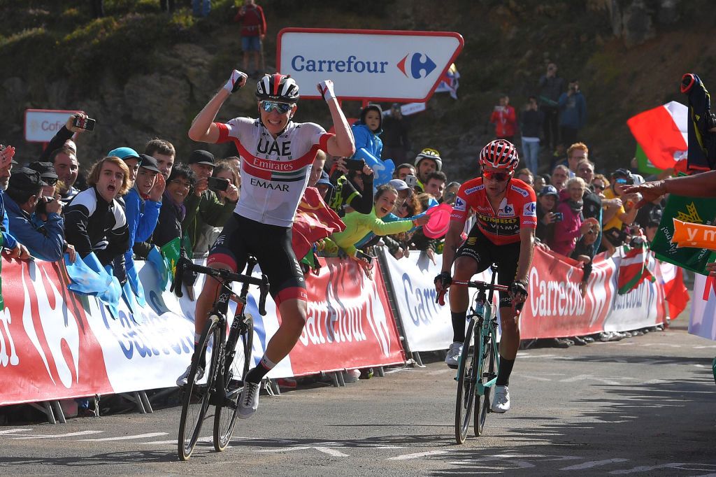
Vuelta a España: Pogacar wins stage 13
Slovenians slay Los Machucos summit finish as Roglic takes second
www.cyclingnews.com
Shame, I wanted to read some opinions.
- Sep 16, 2010
- 7,617
- 1,054
- 20,680
Makes it a bit of an unfortunate choice for a site that writes about people and races and places with accented characters in their names.The OpenSans font they're using doesn't seem to support special characters so they're rendered as Arial.
Techie solution: change the style guide and get rid of the accents - Primoz Roglic is good enough for him ;o)
Looking at the Stage 13 Live Report, 8 hours after the finish, and you scroll down a page or two, only to have the page refresh, and take you back to the top, find where you were and scroll down some more, and then another refresh, and back to the top again. It took about 6 refreshes before i got to the bottom...and I did give it plenty of time to load at the beginning. Each report seems to be in a 'box' which I suspect has something to do with it.Regarding live reporting:
It seems to me that the previous format was much more easier to read and follow. With the new format I must literally fight through the screen with my eyes to pick up text of the updates. In particular the time stamp in bold font seems to be too prominent - why is the least important information bolded? And why is there even the date? Could you please try removing date and maybe play with the font of the time stamp so that it is not more prominent than the actual text?
- Mar 21, 2015
- 593
- 536
- 11,180
I agree with people saying the live report is considerably harder to read, more space between posts would be better, and I also agree that the refreshes are skewy. In my case on computer - it doesn't refresh to the page position I left it at, if I leave it at the top post and don't check it for a few minutes I find the page is open down the bottom. iOS is better, but still not as easy to decipher between posts as it used to be. Having the 'situation' info in a different font, or bolded, or italicized or different colour background would also help. Right now it looks like part of the live posts.
Yeah, refreshes of the live report - I have just tried going through today's Vuelta stage live updates on my mobile and it seems the page automatically refreshed every while. It was very distracting and after refresh I had to scroll to find where I ended reading. Could you please consider disabling automatic refresh entirely, or at least after you close the reporting for the day? It makes no sense to keep refreshing the page automatically if no updates are added any more.
- Sep 6, 2012
- 114
- 0
- 8,680
I just use firefox's "reader view" (toggled with F9 key) for the live reports. Much more legible, and no jumping around with the timed refresh. I just refresh now and again myself for updates.
- Jun 14, 2012
- 27
- 1
- 8,580
- Apr 3, 2009
- 12,859
- 8,921
- 28,180
Your answer makes sense, but it appears Open Sans does support special characters.I noticed that as well. The OpenSans font they're using doesn't seem to support special characters so they're rendered as Arial.
https://fonts.google.com/specimen/Open+Sans
- Jul 10, 2014
- 15,099
- 26,203
- 28,180
Your answer makes sense, but it appears Open Sans does support special characters.
https://fonts.google.com/specimen/Open+Sans
Obviously not the ones included on the webpage. I think the ones on the site are Latin only, but should be Latin Extend to support some additional languages. Here is a bit more:

Languages supported by "latin" vs "latin-extended" glyphs in fonts on Google Web Fonts?
Some fonts on Google Web Fonts support multiple "character sets". The thing is, if the web font I use only serves the "latin" glyphs, users who translate the page to a language whose glyphs aren't
- Apr 3, 2009
- 12,859
- 8,921
- 28,180
Understood–just seems easily fixable by using the linked font. Or I'm missing something, which is entirely possible.Obviously not the ones included on the webpage. I think the ones on the site are Latin only, but should be Latin Extend to support some additional languages. Here is a bit more:
Languages supported by "latin" vs "latin-extended" glyphs in fonts on Google Web Fonts?
Some fonts on Google Web Fonts support multiple "character sets". The thing is, if the web font I use only serves the "latin" glyphs, users who translate the page to a language whose glyphs aren'tstackoverflow.com
- Jul 10, 2014
- 15,099
- 26,203
- 28,180
Understood–just seems easily fixable by using the linked font. Or I'm missing something, which is entirely possible.
Yes it's an easy fix, but has to be done on their side.
TRENDING THREADS
-
 Ronde van Vlaanderen 2026, monument, April 5 (men's)
- Started by Krzysztof_O
- Replies: 1K
-
 Itzulia Basque Country 2026, April 6-11
- Started by Dazed and Confused
- Replies: 592
-

-
 Teams & Riders The Remco Evenepoel is the next Eddy Merckx thread
- Started by DNP-Old
- Replies: 39K
-
 Teams & Riders Tadej Pogačar discussion thread
- Started by Lequack
- Replies: 43K
-
 Milan San Remo, March 21, 2026, 298 km monument
- Started by topcat
- Replies: 1K
-
Dwars door Vlaanderen 2026, April 1
- Started by Dazed and Confused
- Replies: 392
Cyclingnews is part of Future plc, an international media group and leading digital publisher. Visit our corporate site.
© Future Publishing Limited Quay House, The Ambury, Bath BA1 1UA. All rights reserved. England and Wales company registration number 2008885.