• The Cycling News forum is looking to add some volunteer moderators with Red Rick's recent retirement. If you're interested in helping keep our discussions on track, send a direct message to @SHaines here on the forum, or use the Contact Us form to message the Community Team.

    In the meanwhile, please use the Report option if you see a post that doesn't fit within the forum rules.

    Thanks!

TdF Data Analysis

Jul 5, 2009
2,440
4
0
Visit site
Being unemployed has left me with some time on my hands to work on something that I've been thinking about for a while. What I've done is collect the final GC results for every rider since 1985 including their total finish time and average speed. Going year by year, I took each rider's speed and "normalized" it by the average for that year. So, for example, if you raced the Tour at the average speed, your normalized speed is 1.0, and if you raced it 1.5% faster than average, your normalized speed is 1.015.

I did this normalization so that data from different years could be compared, since each race is a bit different in course, weather, etc. I then took this normalized data and looked at the population distribution for each year. My initial assumption was that the distribution of speeds would be gaussian (bell-shaped) and centered on the average. I also expected to at some point see a "two speeds" phenomenon due to EPO and other drugs. This would look like a distribution with two peaks instead of one.

What I actually saw surprised me. Even back in 1985 there was a two speed phenomenon, but the peaks were very close together, ~1% apart. This is true for every year, except there is a very linear (r^2 > 0.86) increase in the gap between those peaks of 0.1% per year. The gap between the fast and slow groups now stand at ~5%. This is puzzling because the average Tour speed has been flat since 1998, after the 50% hematocrit rule was in full effect. So this means that every year the fast riders are getting faster and the slow riders are getting slower, without an overall change in speed.

Even more bizarre is that as of 2003, there is an obvious third group in the middle of the population. So now you have, a fast group, an average group, and a slow group. This somewhat coincides with the introduction of the UCI's EPO test in 2001. And now in the last few years, the spread between fast and slow is large enough that the population distribution is fairly smeared out with indistinct peaks for the three groups (i.e., not enough riders/data).

One other interesting thing I noticed is the relative size of the groups. From 1985 to 1995, the ratio of slow to fast riders was steady at 2:1. From 1996 onwards, the ratio is very steady at 3:1 (the slow group includes the middle/average group).

I would love to post graphs, etc but attachments aren't allowed. I tried and got the "Sorry, the board attachment quota has been reached" message. If anyone would like an excel copy of the raw data, the cleaned data, the analysis, or graphs just let me know via message or email me at john@bikephysics.com

Also, if there's any specific analysis you'd like me to do, just say the word.

John Swanson
 
Does it all have to do with doping though? Perhaps there are other factors in play as well.

Surely there has been an evolution in the tactical and strategic use of riders, and also in race routes.

When you analyse average speed trend data for top riders in GTs and see humps in the residuals for the TdF we might conclude they coincide with significant doping eras, but then that doesn't explain the humps in other eras when "big dope" was not available or as prevalent, nor the different shape of the residuals of top rider speeds in the Giro that don't match the TdF.

See here for an example of what I mean:
http://alex-cycle.blogspot.com.au/2017/07/tdf-speed-trends-1947-2017.html


I made an attempt to do a historical TdF climbing meters analysis earlier this year but that became overwhelming when data on actual ride routes was difficult to get and my count of unique climbs used extended well past 700.
 
Jul 5, 2009
2,440
4
0
Visit site
Re:

Alex Simmons/RST said:
Does it all have to do with doping though? Perhaps there are other factors in play as well.

Surely there has been an evolution in the tactical and strategic use of riders, and also in race routes.

When you analyse average speed trend data for top riders in GTs and see humps in the residuals for the TdF we might conclude they coincide with significant doping eras, but then that doesn't explain the humps in other eras when "big dope" was not available or as prevalent, nor the different shape of the residuals of top rider speeds in the Giro that don't match the TdF.

See here for an example of what I mean:
http://alex-cycle.blogspot.com.au/2017/07/tdf-speed-trends-1947-2017.html


I made an attempt to do a historical TdF climbing meters analysis earlier this year but that became overwhelming when data on actual ride routes was difficult to get and my count of unique climbs used extended well past 700.
Absolutely, I and the data 100% agree with you. When analyzing the speeds in the pack, there haven't been any discrete changes that would mark unique eras, excepting the shift in overall speed between EPO introduction and the 50% rule.

What's changed is the distribution of speeds. Slowly, but steadily, One part of the pack is getting slower and one is getting faster. The rate of spread is a steady and consistent 0.106% per year and has been like this since the 80's!!

It would be fairly easy to do a multi-variate analysis, but what variables to use?? Television viewership? Number of UCI licenses worldwide? It particularly doesn't make sense because nobody in their right mind fights for a spot on a Tour team and then shows up with the intention to not ride to their capabilities.

John Swanson

edit: This is why I love science and data. Sometimes it goes off in directions that make no sense until you discover something really cool. The big question for me is, if it's not drugs that drive speeds in the Tour, then what does?
 
Jul 5, 2009
2,440
4
0
Visit site
Re: Re:

fmk_RoI said:
ScienceIsCool said:
nobody in their right mind fights for a spot on a Tour team and then shows up with the intention to not ride to their capabilities.
There is a vast gulf between what the front runners and the grupetto are fighting for.
ScienceIsCool said:
The big question for me is, if it's not drugs that drive speeds in the Tour, then what does?
Tactics.
For the first scenario, hasn't that always been the case? And if it's been changing, why in such a steady progression? In either case, I would have expected peaks and plateaus marked by things like team size, race radios, rule changes, etc. In other words, there doesn't appear to be a correlation, ergo no causation.

John Swanson
 
Re: Re:

fmk_RoI said:
ScienceIsCool said:
The big question for me is, if it's not drugs that drive speeds in the Tour, then what does?
Tactics.
Weather. Elevation gained/lost. Length of stages. Number of rest days. Number of time trials. Clockwise-versus-anticlockwise. Mood within the peloton and whether there was a strong Patrón.

But this differentiation of speeds seems interesting, especially the third peak.
 
Apologies for what’s going to be a long and slightly technical discussion, but I think it may be relevant here.

Athletic success depends, very generally, on two major factors: one’s genetic endowment, and the effect of training. Genetic endowment—which includes not only one’s baseline or untrained physical prowess, but also the extent to which it can be improved through training—is to a large extent normally distributed. Examples are provided by some of the most basic physical or physiological parameters, such as the heights of males, hematocrit, and (untrained) V02max and FTP. So are basic levels of physical performance, e.g., speed in a 100 m sprint or the amount of weight one can lift or throw. Without getting into a detailed discussion, I'll just say that this normal distribution of such parameters follows from their being the result of the interactions of several different genes.

If physical parameters were entirely responsible for success in any sport, one would therefore expect the results of competition to be normally distributed. But in addition to physical factors, there are social factors, of two very general kinds. First, at the highest levels of athletic competition, there is a selection process. Only the crème de la crème compete in the TDF, of course. That means that even if bike racing ability were distributed normally among the general population, we wouldn’t expect to see such a distribution in the pro ranks. Even the worst pro riders are on the leading edge of the normal curve, so the performance of all pro riders taken as a group is not normally distributed. It has a pronounced skew, such that there is an inverse relationship between ability or performance at any particular level, and the number of riders at that level. Rather than the majority of riders having a median or average level of ability, as would be the case in a normal distribution, the majority of riders have a very low level of ability, relative to that of the best riders. The lower the level of ability or performance, the more riders manifesting that level. This is true in most if not all pro sports, and can actually be precisely demonstrated in major league baseball, where modern analytics allows quantification of performance to a degree not possible in other sports.

There is a second very critical social factor, though, which results from training. The best riders may tend to be those who are most genetically gifted, but they are also those who train the hardest, and most efficiently. If you are an extremely gifted athlete, you will tend to be motivated to train as hard as possible to improve your basic level of performance. And to the extent that you’re successful, you will be given more opportunities to train.

While purely physical or physiological factors are generally distributed in a population more or less normally, social factors tend to have a very different distribution, referred to as scale-free. Social factors, unlike physical ones the individual is born with, result from interactions with other people, so their effects can be understood in terms of network theory, with each individual a node in the network, forming links with other individuals s/he is interacting with. And most, or at any rate, a very large number, of social interactions result in a scale-free network.

There are two basic criteria for a scale-free network to form: the network must be growing, that is, new nodes are constantly being added; and the probability of a node forming a new link with some other node is proportional to the number of links that node already has. The result turns out to be a structure in which a few nodes are very heavily connected with many other nodes, while most nodes are very sparsely connected with other nodes. The distribution is profoundly asymmetric, and while not bimodal--or really, any modal--it's possible to look at the distribution and make not entirely arbitrary groupings of elite and lesser.

One of best-known examples of a scale-free network is provided by the distribution of wealth. As we all know, the rich have been getting richer and the poor have been getting poorer. This always occurs in a laissez-faire society, and the trend can only be reversed in a society where some social programs are deliberately enacted to redistribute wealth. Why is it otherwise inevitable? Because accumulation of wealth depends predominately on social factors, which inevitably drive the formation of a scale-free network.

Consider a business, e.g. All businesses are interconnected into a gigantic network which we call the economy, which includes suppliers, sellers and consumers. If you have a business, you need connections with suppliers, either of materials you use to produce the products you sell, or of wholesale products you sell directly. You also need connections with buyers of your products. The more of these connections you have—i.e., the more suppliers and the more buyers—the more profitable your business becomes, which allows you to seek out more suppliers, and/or to make better deals with the ones you have, and to expand into new markets. This expansion is not necessarily limited to one or a few products, but of course can involve moving into other products (see Amazon). A growing business is constantly forming new links in this way, and the more successful the business is, the more opportunities for new links it will have.

There are many, many other examples of scale-free networks, not simply in our society, but in the brain--as a result of the "social" interactions of neurons--and even in single cells, illustrated, e.g., by enzymatic pathways. In all cases, the basic structure is the same. There are a few “stars”—nodes, whether they be molecules, cells, human beings or businesses—which have a huge number of connections to other nodes, the latter of which have relatively few. Most here have probably heard the phrase, “six degrees of separation”. It comes from scale-free networks, because the existence of stars, or heavily-connected nodes, forms a relatively short pathway of links from any single node in the network to any other link.

The existence of scale-free organization, along with the selection of elite performers, thus act as a counter-force to the tendency of physical performance to be normally distributed. As soon as society becomes serious about athletic performance, an effort is made to identify elite performers, whose performance is then further enhanced by training. The result, in effect, is to distribute performance towards a few highly select athletes, vs. the mass of lesser athletes.

I can’t say for sure, of course, that the bimodal distribution and growing gap between the two peaks that JS has found results from the kind of process that I’ve just described, but I’d be very surprised if it wasn’t at least a contributing factor. I’ve never thought that average speeds in a TDF are a very good way to evaluate performance historically, because there are so many factors that can impact these speeds. But they’re actually a better indicator than performance that is linked more closely to physical performance, like TT speeds, because social factors are more important in a stage race.
 
Re: Re:

StyrbjornSterki said:
fmk_RoI said:
ScienceIsCool said:
The big question for me is, if it's not drugs that drive speeds in the Tour, then what does?
Tactics.
Weather. Elevation gained/lost. Length of stages. Number of rest days. Number of time trials. Clockwise-versus-anticlockwise. Mood within the peloton and whether there was a strong Patrón.

But this differentiation of speeds seems interesting, especially the third peak.
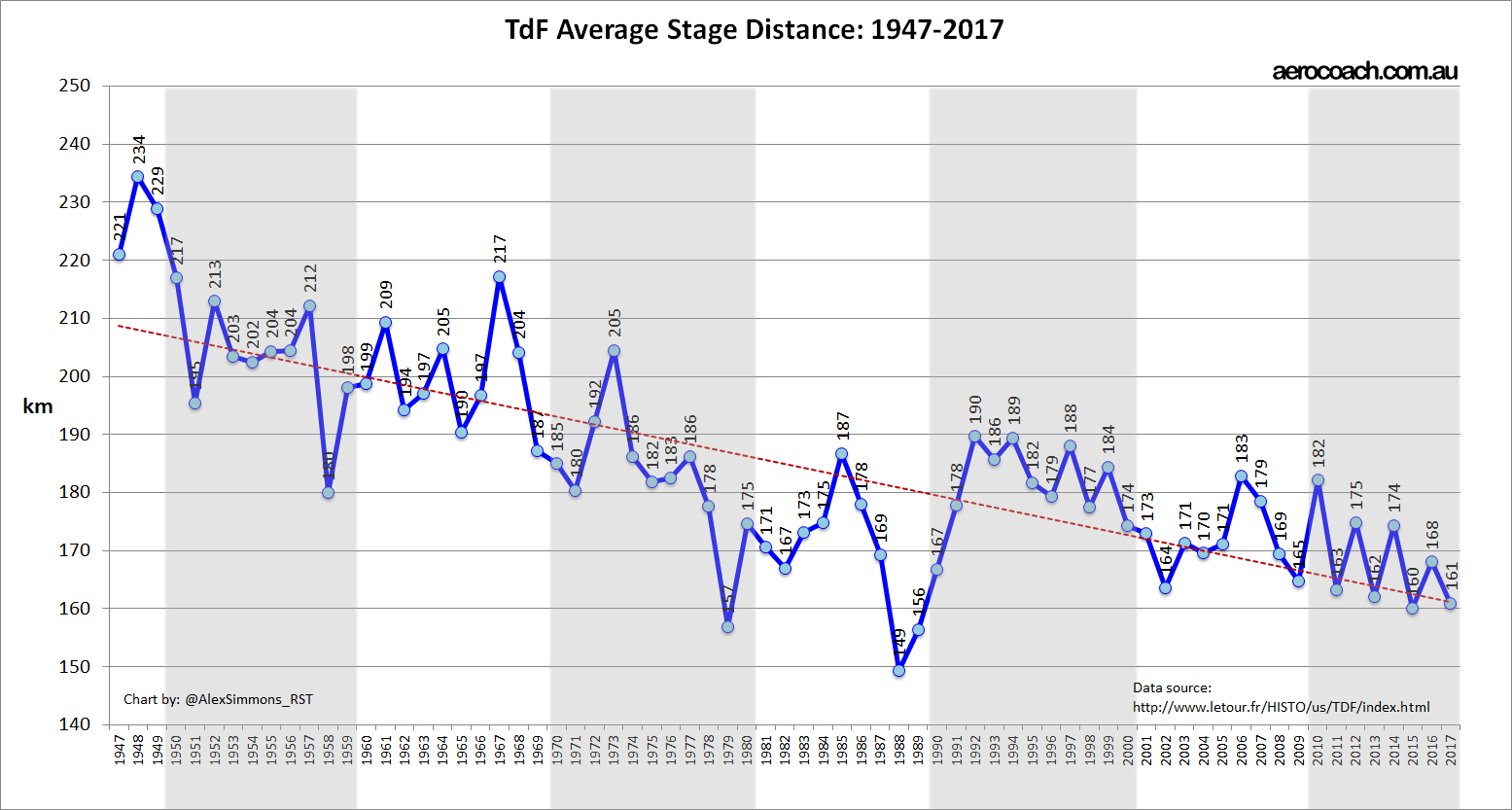
Stages have been getting shorter and faster overall, so perhaps this has an impact on the gradual drift in the winners v rest speeds.

TdF%2Bstage%2Bdistance%2Btrend%2Bchart%2B2017.jpg
 
Jul 5, 2009
2,440
4
0
Visit site
Re: Re:

Alex Simmons/RST said:
Stages have been getting shorter and faster overall, so perhaps this has an impact on the gradual drift in the winners v rest speeds.

TdF%2Bstage%2Bdistance%2Btrend%2Bchart%2B2017.jpg
Interesting thought! I just plotted the spread between groups vs average stage length and it's just a cloud of dots with no correlation whatsoever. https://imgur.com/0f8LKzr

This is really bizarre, though like most puzzles will probably seem totally obvious once it's figured out.

John Swanson
 
Re: Re:

StyrbjornSterki said:
fmk_RoI said:
ScienceIsCool said:
The big question for me is, if it's not drugs that drive speeds in the Tour, then what does?
Tactics.
Weather. Elevation gained/lost. Length of stages. Number of rest days. Number of time trials. Clockwise-versus-anticlockwise. Mood within the peloton and whether there was a strong Patrón.

But this differentiation of speeds seems interesting, especially the third peak.
+how many dominant sprinters with good team support there were... many bunch sprint stages would make the pack speed in the flat(tish) stages higher, compared to a tour with many breakaway stage winners, for which the pack speed would be lower.

Nice putting that dataset together on google docs btw ScienceIsCool. It would be even nicer to get the meters climbed in there as well, but that indeed may be a herculean task...
 
Jul 5, 2009
2,440
4
0
Visit site
I'm having troubles finding a decent source for elevation climbed per stage, or even Tour so that's going to take some time to scrape the data. Maybe I'll set up something with Python or Selenium.

The biggest problem I'm having is that there is a general consensus that certain doping products (EPO) changed the sport. There are also several other events like the 50% rule and the test for EPO that should similarly impact cycling. You'd expect to look at things like speed (average, population distribution, etc) to be affected. Because if speed isn't affected then how was the sport impacted?

So when I look at the data, I'm baffled. There's no discrete jump in any metrics in ~1992 (EPO), 1997 (50% rule), 2003 (EPO test), or 2008 (Bio Passport). Instead the only observable effect is a change in average speed that flat-lined 20 years ago (maybe EPO, but that would mean everyone is still using it). And then there's the change in distribution of speeds, but that's been changing at a perfectly steady rate since 1985!! <--- What the heck is that all about?

Also, the average Milan San Remo speed has been constant since the early 80's. This is a set course that has survived generations of tech developments, race coverage, doping, tactics, and everything else.

So as a scientist, I have to conclude that the current set of data does not support the notion that doping has affected the average or winning speeds of the Tour or classics like Milan San Remo. But that seems entirely wrong because we know PEDs affect performance!

Hypothetical responses would be that:

- We're using the wrong metric
- PED use is scarce enough that it doesn't affect the population of results
- Our model is wrong and despite all anti-doping efforts, riders are making steady continuous progress at cheating
- Other???

John Swanson
 
Re: Re:

zenoiz said:
Nice putting that dataset together on google docs btw ScienceIsCool. It would be even nicer to get the meters climbed in there as well, but that indeed may be a herculean task...
I tried with a database of climbs per tour ridden since WWII.

Well over 700 climbs and I hadn't finished the last decade. But getting data on those climbs has indeed proved to be too much for me.

If actual race routes are available then it would be a slow but doable project with current mapping systems to do that analysis.

If anyone can point me to database of actual race routes then that would help.
 
Am I missing something? In the OP, you said over the past twenty years, the fast guys are getting faster, while the slow guys are getting slower. Isn’t that what you would expect? The fast guys (and I assume these divisions are mostly created in mountain or lumpy stages that don’t end in a mass sprint) are the ones competing for overall and stage wins, and are probably getting faster at least in part due to doping, with other factors like training and technology (and even road surface?) no doubt playing a role. (All of these factors except road condition are potentially enhanced by the process I described upthread in my long post)

I’d guess the doms are getting slower, overall, because they’re used more to create fast speeds early in stages, to wear down rivals (a tactic perfected by LA, and continued by Froome/Sky), then are burned out. Stage hunters also slow down in stages they aren’t interested in, sometimes purposely losing time so they won’t be considered a threat to escape on a later stage, though I don’t know if this happens any more frequently recently than it did in the past.

You found that in the past 10-15 years, there were three different groups, fast, medium and slow. Maybe the medium is composed of a new kind of dom, one that is good enough to be a leader at other teams (again, LA’s teams pioneered the use of these, followed by Sky), but whose domestique duties ensure he won’t put up average speeds like those of the contenders.

You express surprise that there isn’t a sudden jump in speeds corresponding to the use of EPO, or other milestones in doping and anti-doping. But it seems to me that your data do support that. The third link in your OP shows a major increase in average speed from the mid 80s to the early 90s, then a slower increase from then to the early years of this century, which certainly fits with what we know about the use of EPO, though granted, it's complicated interpreting these data, given that the average results from pooling data from a fast group and a slower group.

I wouldn’t be concerned about anti-doping measures like the 50% rule and the EPO test. In the first case, I’m not sure the 50% rule would have much effect. The mean HT is low 40s, so most riders could still raise their HT a great deal; over 50%, the effect of HT on oxygenation and power starts to fall off, because of the increasing viscosity of the blood. Mostly what the rule did is favor riders with lower natural HT, as they could obtain a larger % increase in HT than riders with higher natural HT. When the EPO test was developed, OTOH, counter measures like micro dosing and blood transfusions were taken.

One finding that does puzzle me is the lack of a relationship between stage length and gap between riders. When I say I’m puzzled, I don’t mean that I would have guessed in advance of the finding that there would be a relationship. I mean I’m puzzled because your own other data and Alex’s point to a relationship. Alex’s data show a steady decrease in stage length over time, and over the last thirty years of that period, your data show a widening gap between fast and slow riders. So how can there not be a correlation?

So I looked a little more closely. According to Alex’s graph, stage length fell roughly by 7 km per decade, from 180 km around 1990 to 160 km now. Over that same period, according to your graph, the gap rose about 1% per decade, from 1.5% in 1990 to about 4% now. When I look at your graph plotting gap vs. stage length, I see some relationship: 4/5 gaps > 4% are associated with stages of < 170 km., and 12/17 gaps of < 3% are associated with stages > 170 km. The relationship is very poor, to be sure, but I think that’s just because we’re comparing two relationships, each of which has a lot of noise. There are two outliers among the points, gaps of < 2% associated with stages of < 160 km. Remove those, and you can definitely see an inverse relationship between gap size and stage length, even if the correlation isn’t particularly high.

By the way, how come Alex can post a graph here and you can't?
 
Re: Re:

Alex Simmons/RST said:
If actual race routes are available then it would be a slow but doable project with current mapping systems to do that analysis.

If anyone can point me to database of actual race routes then that would help.
On the climbing data, have you approached the authors of the 2010 paper Tour de France, Giro, Vuelta, and classic European races show a unique progression of road cycling speed in the last 20 years?

https://www.ncbi.nlm.nih.gov/pubmed/20473822

They use so-called climbing index ("...dividing the total climbed altitude by the distance") and according to the paper, they have at least some kind of database on the amount of climbs:
Tour de France profiles were integrated from 1960 (no data available before 1960) to 2008 as the total altitude climbed (m), calculated by the addition of all ascended mountain passes or summit altitudes (all categories), obtained from the sources cited above, and cross-checked with geographical sources (IGN-Institut Géographique National)...
 
Re:

ScienceIsCool said:
I'm having troubles finding a decent source for elevation climbed per stage, or even Tour so that's going to take some time to scrape the data....
Not trying to dissuade you but I don't think there's much relevance to be gained from any single factor taken in isolation, particularly because wind resistance plays such a dominant role in cycling. Power output required cubes with the doubling of resultant relative headwind. Crosswind almost always contributes to the headwind component. I don't think there's any truly deterministic means of gauging differences in rider output over the years apart powertap data. Which is certainly more practical than making riders carry altimeters and wear a wind data sensor on the tops of their helmets.
 
Aug 9, 2017
31
0
0
Visit site
I think San Remo has changed since '85. Back then, a winner like Hennie Kuiper or Laurent Fignon was possible. Later we see more and more sprinters winning, without dropping the average speed. That in itself is problematic, because if sprinters could increase that way, than why couldn't attackers?
Also a point to consider: Apart from Contador there are few cyclists now who try a long range attack. In the 90s, even Ullrich tried his hand at that sometimes.
 

TRENDING THREADS