• The Cycling News forum is looking to add some volunteer moderators with Red Rick's recent retirement. If you're interested in helping keep our discussions on track, send a direct message to @SHaines here on the forum, or use the Contact Us form to message the Community Team.

    In the meanwhile, please use the Report option if you see a post that doesn't fit within the forum rules.

    Thanks!

2010 Jerseys Thread

Page 13 - Get up to date with the latest news, scores & standings from the Cycling News Community.
Best jersey evar!

maglia_rosa02_1_220.jpg
 
Mar 10, 2009
7,268
1
0
Visit site
krebs303 said:
I downloaded it. It disappeared with da hotlink

You can see that the fabric has the same quality of the shark skin suits in the swimming world. It has the stretch qualities to facilitate high cadence riding while it also offers aerodynamic advantages given the 'sandpaper' surface. :D
 
Mar 18, 2009
4,186
0
0
Visit site
zapata said:
hm. strange idea to change it, but I guess it could be worse than red. And I think it was originally red, when it was introduced.

I think so, yes. They then changed it to the shade of purple of the Ciclamino flower
 
May 6, 2009
8,522
1
0
Visit site
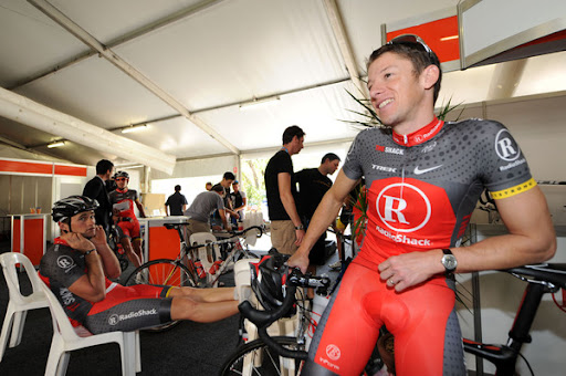
Having just watched the Cancer Council Classic, the Radio Shack and BMC jerseys look very similar, especially from the aerial shots from the helicopter.
 
Jun 16, 2009
19,654
2
0
Visit site
craig1985 said:
Having just watched the Cancer Council Classic, the Radio Shack and BMC jerseys look very similar, especially from the aerial shots from the helicopter.
+1
I couldn't pick em. I was getting excited about BMC thinking they were attacking and then I realised it was Radioshack.:mad:
 
Mar 11, 2009
3,274
1
0
Visit site
auscyclefan94 said:
+1
I couldn't pick em. I was getting excited about BMC thinking they were attacking and then I realised it was Radioshack.:mad:

So does the RS kit get better or the BMC kit uglier from a distance? :D
 
Jun 28, 2009
568
0
0
Visit site
The Sky kits are pretty bad. All black with a stupid white flap in the back that does not fit in with anything. I think I am going to start referring to them as the all blacks with a dumb white patch
 
I have thought about this over the past couple of days and have come up with the following.

Favourite Pro Tour kit = Francaise des Jeux, because its simple, clean and provides a neutral easy to spot jersey.

Worst Pro Tour kit = Liquigas, now there are a few contenders here including AG2r and Milram (looking like a cow on a bike is just wrong) but I go for Liquigas as the lime green is just too harsh for me to look at any point in time.

Favourite Pro Continental/Continental kit = Cervelo Test Team in that again like the Francaise des Jeux kit its simple and elegant, plus as seen last year interchangable colours with the seasons.

Least favourite Pro Conti/Conti kit = Due to the numbers this was a really tough one to pick but overwhelmingly and considering (if i remember correctly) that they have lost their Pro Tour status it is Footon-Servetto look a little better in the peloton, somehow! However, it still looks like someone has stood in a pile of vomit with a muddy foot, and i'm afraid that is just completely off the scale in bad kit design.
 
Aug 18, 2009
4,993
1
0
Visit site
I think it's cool that Sky is using skinsuits, rather than traditional jerseys, seems like a genuine advance, and distinguishes the kit from others, because in terms of graphics, it is conservative.
 
Jun 28, 2009
568
0
0
Visit site
Team Sky didn't look as cool in the daylight for whatever reason.
Too bad there are not any night races
I think it's cool that Sky is using skinsuits, rather than traditional jerseys, seems like a genuine advance, and distinguishes the kit from others, because in terms of graphics, it is conservative.
how do bathroom breaks work in one of those.