- Nov 16, 2013
- 27,122
- 28,348
- 28,180
Sure, if you're a time trial champion, you get a championship skinsuit, because skinsuits are for time trials and track cycling.
Where is that rule?
Aerodynamics also apply in road races.
Sure, if you're a time trial champion, you get a championship skinsuit, because skinsuits are for time trials and track cycling.
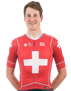
Sure, but the traditional jersey / bibs combo was designed around the requirements of road racing and still serves that function well. Eating and drinking and so forth are still a requirement. Aerodynamics apply in road races, but the TT helmets, aero bars and disc wheels don't get trotted out for a 180km road stage (and several elements of those have been legislated against), and I don't feel that skinsuits should either. The aero lids fad seems to have died down a lot, that might have been aesthetic or the benefit may have been too small, I don't know. The skinsuits definitely fail from an aesthetic point of view, especially the ones that result in deformed tricolour jerseys.
If you want to wear a skinsuit for a crit type event like the Cancer Council Classic where endurance isn't as much of a factor that's one thing, but I don't see it as having a place in classics or full road stages.
But of course with them having no pockets they're not exactly practical.
They do have the skinsuits-with-pockets option. And I suppose a sprinter could appoint a domestique as "designated food carrier".
According to Wikipedia both are acceptable and the sky blue is used by the government at timesTo fit with the Movistar logo azure/celeste they took the old flag of Puerto Rico instead of the one in use now.


Maybe i'm pedantic but for me that's a big difference.


I've never seen an ugly French national champion kit at Cofidis though.Of course this only applies to France, where I guess the sponsors are mostly trying to sell their products, but maybe the tactic of FDJ is just always have the French Champion; so that whenever viewers see him sitting in the peloton, they'll automatically think of the sponsors.
I've never seen an ugly French national champion kit at Cofidis though.

I've never seen an ugly French national champion kit at Cofidis though.

Probably. So does the Belgian federation.France could very well be one of those fedorations that actually demand prober jersey execution (in the "creating it" sense, not "killing it", coz... that would be weird).
Also, you didn't notice my Cofidis joke.
True, which is unbelievable considering how long the team exists.They've never had a French Champion. But even if they were to get it at some point, they might be "forced" - and why would you consider that a "force thing"? - to make a proper one.
Are there any images of the version that the NZ federation wouldn't allow, designed by Bennett's wife/girlfriend if memory serves.
That’s the one they allowed. Here’s the he one they didn’t:Are there any images of the version that the NZ federation wouldn't allow, designed by Bennett's wife/girlfriend if memory serves.

Jerseys most likely to get mixed up in the team laundry hamper
[Snipped]


