- Jan 3, 2019
- 2,023
- 2,943
- 17,180
Sometimes, a certain thing is so ugly it becomes pretty.
Once in while, it surpasses that theory.
Once in while, it surpasses that theory.

It's got people taking about it - and that is job done.
Hats off to Rapha/Palace and EF for doing something different; road cycling is way too conservative and stuck in tradition.
I feel cycling kits have always been pretty creative, especially in comparison to football kits which are usually very bland.


I thought the whole design intent was seizure inducement. It makes me feel a little.....twitchy. It would be hard to sit on EF's wheels looking at that.That triangle above the weird dotty-pattern is definitely an attempt at hypnotising everyone. Mark my words!


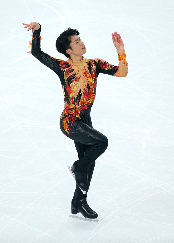


I thought the whole design intent was seizure inducement. It makes me feel a little.....twitchy. It would be hard to sit on EF's wheels looking at that.
"Small tweaks"?
")
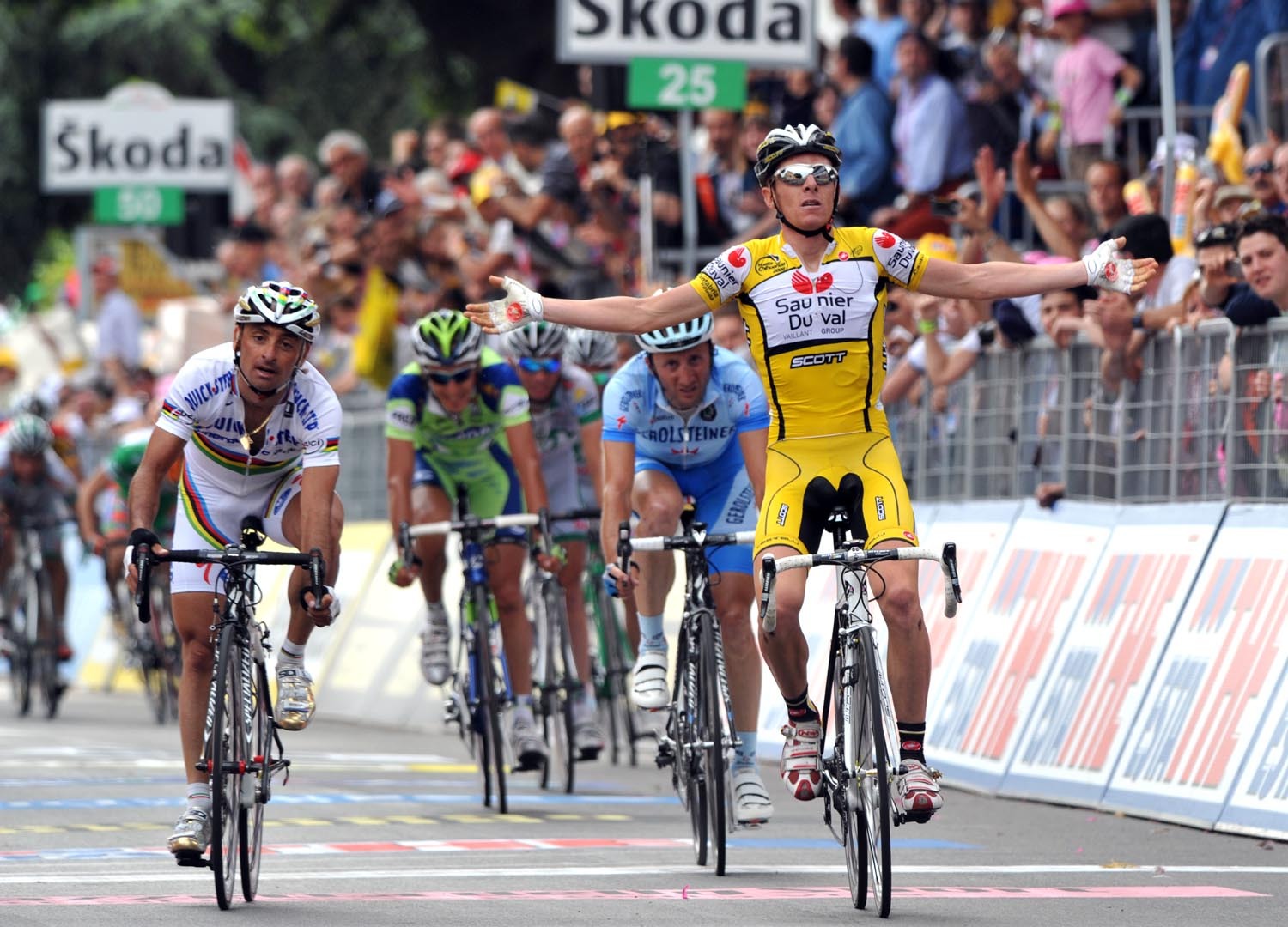
Over the years lots of teams have had to make 'small tweaks' to jerseys to avoid clashes with classification leaders though - Saunier Duval and ONCE spring to mind immediately - and they managed to do it without letting an 11-year-old try to combine every single design possible on "Create-a-Skater" mode on Tony Hawk. Also I wouldn't expect there to be any more of a clash than Lampre circa 2011, whose jersey stood unaltered, because they used a very different shade of pink. Clearly there was more to it than that, otherwise they might just have switched the blues and pinks to create an alternative jersey, and this was about the crossover and possibly Vaughters thinking outside the box for something retro now that the argyle trademark he used for years is a thing of the past.One thing I hadn't considered before it being mentioned on my TV just now is the fact that the normal EF jersey would look an awful lot like the maglia rosa. I don't know if that was why they made those small tweaks on the design to make it stand out a bit more.
Atleast it doesn't have Lidl logos on it
Over the years lots of teams have had to make 'small tweaks' to jerseys to avoid clashes with classification leaders though - Saunier Duval and ONCE spring to mind immediately - and they managed to do it without letting an 11-year-old try to combine every single design possible on "Create-a-Skater" mode on Tony Hawk. Also I wouldn't expect there to be any more of a clash than Lampre circa 2011, whose jersey stood unaltered, because they used a very different shade of pink. Clearly there was more to it than that, otherwise they might just have switched the blues and pinks to create an alternative jersey, and this was about the crossover and possibly Vaughters thinking outside the box for something retro now that the argyle trademark he used for years is a thing of the past.
I was surprised enough that ASO let Higuita's jersey stand for the Tour tbh. From the front on camera he could easily have been mistaken for the maillot jaune with a very similar shade of yellow, as opposed to Jumbo's more golden shade which is why they got away with theirs most likely.
Brian Holm just said that he approves of the jersey. Biggest shock of 2020.
Higuita's riding eventually made it clear who he was, eliminating the mistakes.Over the years lots of teams have had to make 'small tweaks' to jerseys to avoid clashes with classification leaders though - Saunier Duval and ONCE spring to mind immediately - and they managed to do it without letting an 11-year-old try to combine every single design possible on "Create-a-Skater" mode on Tony Hawk. Also I wouldn't expect there to be any more of a clash than Lampre circa 2011, whose jersey stood unaltered, because they used a very different shade of pink. Clearly there was more to it than that, otherwise they might just have switched the blues and pinks to create an alternative jersey, and this was about the crossover and possibly Vaughters thinking outside the box for something retro now that the argyle trademark he used for years is a thing of the past.
I was surprised enough that ASO let Higuita's jersey stand for the Tour tbh. From the front on camera he could easily have been mistaken for the maillot jaune with a very similar shade of yellow, as opposed to Jumbo's more golden shade which is why they got away with theirs most likely.

Team presentation apparently. Gotta love how the UCI is monitoring the important aspects of the sport.They all got fined for non compliant clothing at some point at the Giro?