- Jan 3, 2011
- 26
- 0
- 0
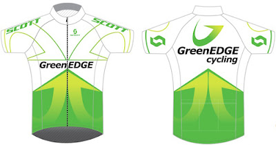
mod comment: this thread is for all posts that deal with jerseys for the 2012 season. It was split off from the 2011 season thread, so Hunter Grant's wasn't the OP, but this post was the best starting point for the split.
Team Green Edge....
http://cyclistsarenotrockstars.blogspot.com/2011/08/1122.html
Team Green Edge....
http://cyclistsarenotrockstars.blogspot.com/2011/08/1122.html