Pentacycle said:
Yeah, Saxo is the only one they got right, but the other 'grades' are all just wrong in some way.

I actually agree with most of them.
]
Saxo design is brilliant, definitely the best. No wonder it's made by Sportful.
]
Sky is actually very good, maybe not really A+ but they got it definitely right. Very modern, classy, sleek and clean. and I love that full black, to pair with a nude carbon bike...awesome.
]
Cannondale outfit is great. Could've been probably better on the front, especially on the upper part, yet they blended the shirt with the bibs awesomely. And lime green is the best freaking colour in cycling
]
BMC outfit design is coherent with their bike design, mind you I really dislike it, but at least that homogeneity deserves a +.
]
OPQS is another great kit, definitely agree with the review.
]
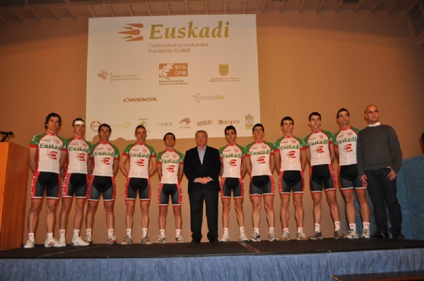
Euskaltel, they went with a more "organic" look and feel, and with that change in the fonts it looks more modern. They're the "carrots", you get what you expect, nothing great yet good overall, and one of the easiest to spot.
]
IAM strikes me as terribly bland. To me the reviewer got it wrong in this case, it sure as hell is clean and gives the corporate feeling, yet it feels like something coming from an insurance brochure. It doesn't scream, it doesn't feel fast, it doesn't feel bike racing, it doesn't feel anything. Bland, bland, bland again.
]
Europcar is great, and deserves to be amongst the top. Visually bold, with that dark elegant green underlined by those touches of lime green and yellow. Great kit.
]
Lampre is a good kit which could've been classic, and maybe it'll be in 2014 who knows. that neon pink is pure awesomeness, if they just played better with that lime green they could've got an absolute winner. In the end it's more meh than yay.
]
Lotto is definitely improved. The overall design is a little mess, but the colours are bolder and bolder and the choice of more white was good. What really makes this kit amazing tho is that yellow right arm: a bold and brilliant move. Bold is the key here, a great kit for bold riders.
]
AG2R didn't really change. The kit is something strange, which crazily works. It is unpleasant, unclassy, yet that vintage look makes it somehow work. And actually what makes it work, leaving aside the awesome argyle, is that ****ty brown. Moreover they created something you easily spot and identify. It's incredibly a yes.
]
Garmin is more or less the same, with minor changes to the argyle thing. I'm not particularly fond of it, because they could've tried something more with the argyle (I miss the old Garmin-Slipstream...), and I'm not totally convinced by the positioning of the logos. It works, but they went a little too far with the corporate design for my liking.
]
Radioshack gets worse every year: it looks like they had no idea how to change for 2013 so they put some white, changed some lines and that's it. No direction, no style. A mess.
]
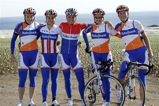
Blanco kit is plainly ridiculous. There are far better kits over at Decathlon. And that "Blanco" font is ugly as hell. Oh boy, it's Blancofail all over again.
]
Argos is another ruined kit. It could've been better if they went the bold route like yester year , what with that lime green 1T4i and bold colours. Now it's just another corporate and soulless ****. That's really a no-no.
]
Netapp is an improved Blanco kit. Still boring and cheap.