
New Jerseys - 2016 Season - TeamKits-Maillots-Tricots-Tenues
Page 11 - Get up to date with the latest news, scores & standings from the Cycling News Community.
You are using an out of date browser. It may not display this or other websites correctly.
You should upgrade or use an alternative browser.
You should upgrade or use an alternative browser.
- May 5, 2010
- 53,081
- 31,290
- 28,180
- May 15, 2011
- 45,171
- 617
- 24,680
When I asked someone on twitter (not Trek) if this jersey is the same as last year, Trek replied to me saying: "only a little changed. Same basic pinstriped design with the @Segafredo emblem added. Simple. Classy." I was very tempted to reply "Corporate. Bland. Boring." 
- Jul 27, 2009
- 6,664
- 2,553
- 23,180
Re:
Although the pinstripes look classy somehow.
LaFlorecita said:When I asked someone on twitter (not Trek) if this jersey is the same as last year, Trek replied to me saying: "only a little changed. Same basic pinstriped design with the @Segafredo emblem added. Simple. Classy." I was very tempted to reply "Corporate. Bland. Boring."
Although the pinstripes look classy somehow.
- May 15, 2011
- 45,171
- 617
- 24,680
Re: Re:
They're not wrong. The white with black is simple and classy. It's also horribly boring.staubsauger said:LaFlorecita said:When I asked someone on twitter (not Trek) if this jersey is the same as last year, Trek replied to me saying: "only a little changed. Same basic pinstriped design with the @Segafredo emblem added. Simple. Classy." I was very tempted to reply "Corporate. Bland. Boring."
Although the pinstripes look classy somehow.
- Aug 16, 2011
- 10,819
- 2
- 0
Re: Re:
It's sponsor pleasing. Pinstripes give just enough of a design element to give them a little difference from all the other black kits while not being too flashy to the point the sponsor says "that's too much."
The sponsor will be happy with a simple and clean look where their logo is predominant. And for the fans, well, it's just another bland and boring black jersey that melts in with all the others during a race.
LaFlorecita said:They're not wrong. The white with black is simple and classy. It's also horribly boring.staubsauger said:LaFlorecita said:When I asked someone on twitter (not Trek) if this jersey is the same as last year, Trek replied to me saying: "only a little changed. Same basic pinstriped design with the @Segafredo emblem added. Simple. Classy." I was very tempted to reply "Corporate. Bland. Boring."
Although the pinstripes look classy somehow.
It's sponsor pleasing. Pinstripes give just enough of a design element to give them a little difference from all the other black kits while not being too flashy to the point the sponsor says "that's too much."
The sponsor will be happy with a simple and clean look where their logo is predominant. And for the fans, well, it's just another bland and boring black jersey that melts in with all the others during a race.
Re: Re:
I feel he looked better without it, you agree?
RedheadDane said:Brullnux said:Why has Nizzolo grown a beard?!
Coz he wanted to.
I feel he looked better without it, you agree?
- Aug 18, 2010
- 11,435
- 3,594
- 28,180
Re: Re:
It certainly seems to be sponsor driven. Which is perfectly understandable when the sponsor hasn't been in cycling long. They will tend to judge the kit as garments in their own right, and will want their riders to present a clean, stylish look. It's also understandable where the sponsor is a behemoth which brands everything, everywhere, the same way. But I will admit that I find the thinking a bit odd when it comes to bike industry sponsors or sponsors with a long record in the sport. They should know that visibility is at least as important and that distinctive, immediately recognisable, jerseys are invaluable in encouraging recognition of team and consequently brand.
Short version: I am more forgiving of a sponsor like Bora doing the clean, corporate, tasteful but all too often invisible thing than I am of a sponsor like Trek.
Afrank said:It's sponsor pleasing.
It certainly seems to be sponsor driven. Which is perfectly understandable when the sponsor hasn't been in cycling long. They will tend to judge the kit as garments in their own right, and will want their riders to present a clean, stylish look. It's also understandable where the sponsor is a behemoth which brands everything, everywhere, the same way. But I will admit that I find the thinking a bit odd when it comes to bike industry sponsors or sponsors with a long record in the sport. They should know that visibility is at least as important and that distinctive, immediately recognisable, jerseys are invaluable in encouraging recognition of team and consequently brand.
Short version: I am more forgiving of a sponsor like Bora doing the clean, corporate, tasteful but all too often invisible thing than I am of a sponsor like Trek.
Re:
Much like Andy needs to tell Frank that parting his hair in the middle like that makes it look like he's on that episode of Seinfeld with the low-flow shower heads.

Brullnux said:But seriously: Nizzolo's other half/good friends need to tell him,
Much like Andy needs to tell Frank that parting his hair in the middle like that makes it look like he's on that episode of Seinfeld with the low-flow shower heads.
- May 5, 2010
- 53,081
- 31,290
- 28,180
Re: Re:
Dunno. I'll let him decide for himself how he wants to look.
But, yeah... I kinda find this Whole pro riders with beards thing kinda silly:
You shave your legs and then you... grow a huge beard?
Brullnux said:RedheadDane said:Brullnux said:Why has Nizzolo grown a beard?!
Coz he wanted to.
I feel he looked better without it, you agree?
Dunno. I'll let him decide for himself how he wants to look.
But, yeah... I kinda find this Whole pro riders with beards thing kinda silly:
You shave your legs and then you... grow a huge beard?
Armchair Cyclist
Moderator
- Mar 22, 2010
- 16,017
- 11,996
- 28,180


Re:
More importantly, why are they still featuring Frank Schleck as a team leader in the promo shots?
Brullnux said:Why has Nizzolo grown a beard?!
But anyway much the same.
More importantly, why are they still featuring Frank Schleck as a team leader in the promo shots?
- Jun 27, 2013
- 5,217
- 9
- 17,495
Re: Re:
It's a promo. It's supposed to sell. The word 'Schleck' sells.
Armchair cyclist said:Brullnux said:Why has Nizzolo grown a beard?!
But anyway much the same.
More importantly, why are they still featuring Frank Schleck as a team leader in the promo shots?
It's a promo. It's supposed to sell. The word 'Schleck' sells.
- Jun 7, 2010
- 19,196
- 3,092
- 28,180
Re: Re:
You should know by now that Zubeldia doesn't like to have his picture taken
Armchair cyclist said:Brullnux said:Why has Nizzolo grown a beard?!
But anyway much the same.
More importantly, why are they still featuring Frank Schleck as a team leader in the promo shots?
You should know by now that Zubeldia doesn't like to have his picture taken
- Jul 27, 2009
- 6,664
- 2,553
- 23,180
Re: Re:
Who!?roundabout said:Armchair cyclist said:Brullnux said:Why has Nizzolo grown a beard?!
But anyway much the same.
More importantly, why are they still featuring Frank Schleck as a team leader in the promo shots?
You should know by now that Zubeldia doesn't like to have his picture taken
- May 5, 2010
- 53,081
- 31,290
- 28,180
- Dec 4, 2013
- 13
- 0
- 8,530
- Aug 16, 2011
- 10,819
- 2
- 0
Re: Re:
Their new sponsor, Segafredo, as far as I know is new to cycling (sponsoring it). So perhaps Trek's sponsor pleasing look is more for them then themselves. Treks been around long enough and is prominent enough of a brand that they shouldn't have trouble with cyclists not knowing about them.
Or maybe the Trek people just like the boring and bland jerseys. They've had quite a lot of them.
Zinoviev Letter said:Afrank said:It's sponsor pleasing.
It certainly seems to be sponsor driven. Which is perfectly understandable when the sponsor hasn't been in cycling long. They will tend to judge the kit as garments in their own right, and will want their riders to present a clean, stylish look. It's also understandable where the sponsor is a behemoth which brands everything, everywhere, the same way. But I will admit that I find the thinking a bit odd when it comes to bike industry sponsors or sponsors with a long record in the sport. They should know that visibility is at least as important and that distinctive, immediately recognisable, jerseys are invaluable in encouraging recognition of team and consequently brand.
Short version: I am more forgiving of a sponsor like Bora doing the clean, corporate, tasteful but all too often invisible thing than I am of a sponsor like Trek.
Their new sponsor, Segafredo, as far as I know is new to cycling (sponsoring it). So perhaps Trek's sponsor pleasing look is more for them then themselves. Treks been around long enough and is prominent enough of a brand that they shouldn't have trouble with cyclists not knowing about them.
Or maybe the Trek people just like the boring and bland jerseys. They've had quite a lot of them.
- Feb 10, 2015
- 5,991
- 888
- 19,680

- Mar 17, 2009
- 472
- 7
- 9,295
The decline of Western Civilization is almost complete. The Canyon//SRAM jerseys are hideous. Taste the rainbow.
- May 23, 2009
- 10,262
- 1,460
- 25,680
Re:
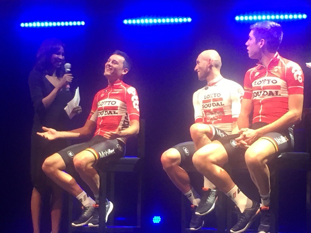
At least they'll stand out. Between all the usual suspects with dark kits and now all the teams with heavy red (Katusha, Lotto Soudal, Drapac, Androni, BMC, RusVelo, Cofidis) it's good to know that at least one team is smart enough to consider whether or not they stand out.WildspokeJoe said:The decline of Western Civilization is almost complete. The Canyon//SRAM jerseys are hideous. Taste the rainbow.
- Apr 17, 2013
- 6,510
- 452
- 18,580
Re:
I couldn't disagree moreWildspokeJoe said:The decline of Western Civilization is almost complete. The Canyon//SRAM jerseys are hideous. Taste the rainbow.
Re: Re:
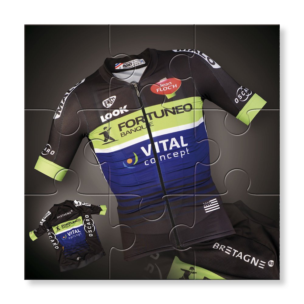
Nice kit, I take it it's the new bretagne team?
The Look even looks good in that pic with the hideously sloped top tube hidden
Alexandre B. said:
Nice kit, I take it it's the new bretagne team?
The Look even looks good in that pic with the hideously sloped top tube hidden
- May 5, 2010
- 53,081
- 31,290
- 28,180
Re: Re:
Well... Canyon//SRAM won't really need to worry about standing out amongst those teams.
Except Lotto Soudal, I guess.
42x16ss said:At least they'll stand out. Between all the usual suspects with dark kits and now all the teams with heavy red (Katusha, Lotto Soudal, Drapac, Androni, BMC, RusVelo, Cofidis) it's good to know that at least one team is smart enough to consider whether or not they stand out.WildspokeJoe said:The decline of Western Civilization is almost complete. The Canyon//SRAM jerseys are hideous. Taste the rainbow.
Well... Canyon//SRAM won't really need to worry about standing out amongst those teams.
Except Lotto Soudal, I guess.
TRENDING THREADS
-
 Itzulia Basque Country 2026, April 6-11
- Started by Dazed and Confused
- Replies: 641
-
 Ronde van Vlaanderen 2026, monument, April 5 (men's)
- Started by Krzysztof_O
- Replies: 1K
-

-
 Teams & Riders The Remco Evenepoel is the next Eddy Merckx thread
- Started by DNP-Old
- Replies: 39K
-
 Teams & Riders Tadej Pogačar discussion thread
- Started by Lequack
- Replies: 43K
-
 Milan San Remo, March 21, 2026, 298 km monument
- Started by topcat
- Replies: 1K
-
Dwars door Vlaanderen 2026, April 1
- Started by Dazed and Confused
- Replies: 392
Latest posts
-

-

-
 Teams & Riders The Red Bull - Bora - Hansgrohe team thread
- Latest: RedheadDane
-
-

Cyclingnews is part of Future plc, an international media group and leading digital publisher. Visit our corporate site.
© Future Publishing Limited Quay House, The Ambury, Bath BA1 1UA. All rights reserved. England and Wales company registration number 2008885.