- Feb 20, 2010
- 33,155
- 15,604
- 28,180
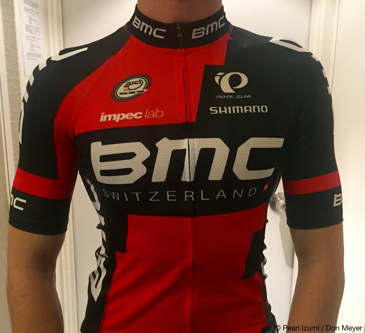
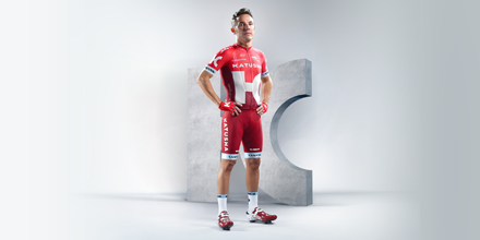
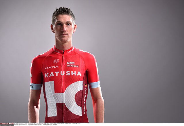
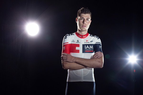
Re: New Jerseys - 2016 Season - TeamKits-Maillots-Tricots-Te
Simply because that would be the French way of writing dacha, which is obviously what that will be for Oleg.LaFlorecita said:Allegedly that's the name of Tinkov's new hotel/villa he's building in Courchevel.davebqvst said:Why does the kit say "La Datcha"?

")