
New Jerseys - 2019 Season - TeamKits-Maillots-Tricots-Tenues
Page 4 - Get up to date with the latest news, scores & standings from the Cycling News Community.
You are using an out of date browser. It may not display this or other websites correctly.
You should upgrade or use an alternative browser.
You should upgrade or use an alternative browser.
- May 2, 2009
- 2,630
- 731
- 13,680
Re:
Me too! Reminds me of the Canadian world champs jerseys that are designed to stand out in a crowd.
Now lets get the Michelton Scott team on board and add some colour.
Anderis said:I really like the new Katusha kit.
Me too! Reminds me of the Canadian world champs jerseys that are designed to stand out in a crowd.
Now lets get the Michelton Scott team on board and add some colour.
- Jan 3, 2010
- 1,381
- 213
- 10,880
Re: New Jerseys - 2019 Season - TeamKits-Maillots-Tricots-Te
I also like the vivid light blue color, as displayed in the picture above. However, that seems to be enhanced, because on all other pictures and videos it's just a bland shade of blueish gray.LaFlorecita said:Disagree. I think the colors match decently. Perhaps not the two shades of red, but the toothpaste shade of blue complements them quite well.Vesica said:The Katusha kit must be one of the worst colour combinations ever. The blue doesn't match with both reds, the bright red of the Alpecin logo doesn't match with the bordeaux red of the shorts. Could have been a very nice kit, if they had chosen the right blue and red.
- Feb 10, 2015
- 5,991
- 888
- 19,680


Armchair Cyclist
Moderator
- Mar 22, 2010
- 16,017
- 11,996
- 28,180


Bora hansgrohe

Chevrons going darker, rather than lighter, as they move away from the middle, otherwise pretty much the same. Makes the panel with hansgrohe written on it look clumsier.
Chevrons going darker, rather than lighter, as they move away from the middle, otherwise pretty much the same. Makes the panel with hansgrohe written on it look clumsier.
Armchair Cyclist
Moderator
- Mar 22, 2010
- 16,017
- 11,996
- 28,180
"I've got lots of different ideas for this year's kit, but I can't decide between them. So I'll include all of them."

Most of their riders go slowly enough that roadside fans will actually be able to read the message: educate empower inspire.

Most of their riders go slowly enough that roadside fans will actually be able to read the message: educate empower inspire.
- May 15, 2011
- 45,171
- 617
- 24,680

- Feb 10, 2015
- 5,991
- 888
- 19,680

- Mar 15, 2011
- 2,760
- 71
- 11,580
Re:
Giving the people what they want, that's for sure
Laplaz said:Nippo-Vini Fantini:

Giving the people what they want, that's for sure
- May 23, 2009
- 10,262
- 1,460
- 25,680
Re: Re:
I like it. Take away the green on the sides and it would be fantasticMore Strides than Rides said:Laplaz said:Nippo-Vini Fantini:
Giving the people what they want, that's for sure
- Mar 19, 2009
- 9,892
- 1,790
- 20,680
Re: Re:
I really like it too. Could wind up being my fave among the WT. I like Bahrain Merida's as well.the delgados said:Anderis said:I really like the new Katusha kit.
Me too! Reminds me of the Canadian world champs jerseys that are designed to stand out in a crowd.
Now lets get the Michelton Scott team on board and add some colour.
- Mar 6, 2011
- 1,677
- 0
- 10,480
Re:
Agreed. I would go as far as to say it's my favourite I've seen for next year so far
LaFlorecita said:Vital Concept kit looks cool. I'd wear it.
Agreed. I would go as far as to say it's my favourite I've seen for next year so far
- Oct 10, 2011
- 409
- 1
- 9,280
Bahrain Merida's new jersey:
http://teambahrainmerida.com/new2017/wp-content/uploads/2018/12/BAHRAIN-2019-L-0677.jpg
Much better than 2018 version, I never liked those doodles on the front.
http://teambahrainmerida.com/new2017/wp-content/uploads/2018/12/BAHRAIN-2019-L-0677.jpg
Much better than 2018 version, I never liked those doodles on the front.
- Jan 27, 2012
- 15,831
- 3,293
- 28,180
Re:
Could be a prototype of Team Brailsford to be launched in 2020........
Until then I will enjoy seeing NVF on the road.
Laplaz said:Nippo-Vini Fantini:
Could be a prototype of Team Brailsford to be launched in 2020........
Until then I will enjoy seeing NVF on the road.
- Sep 28, 2010
- 3,364
- 329
- 14,180

- Feb 10, 2015
- 5,991
- 888
- 19,680
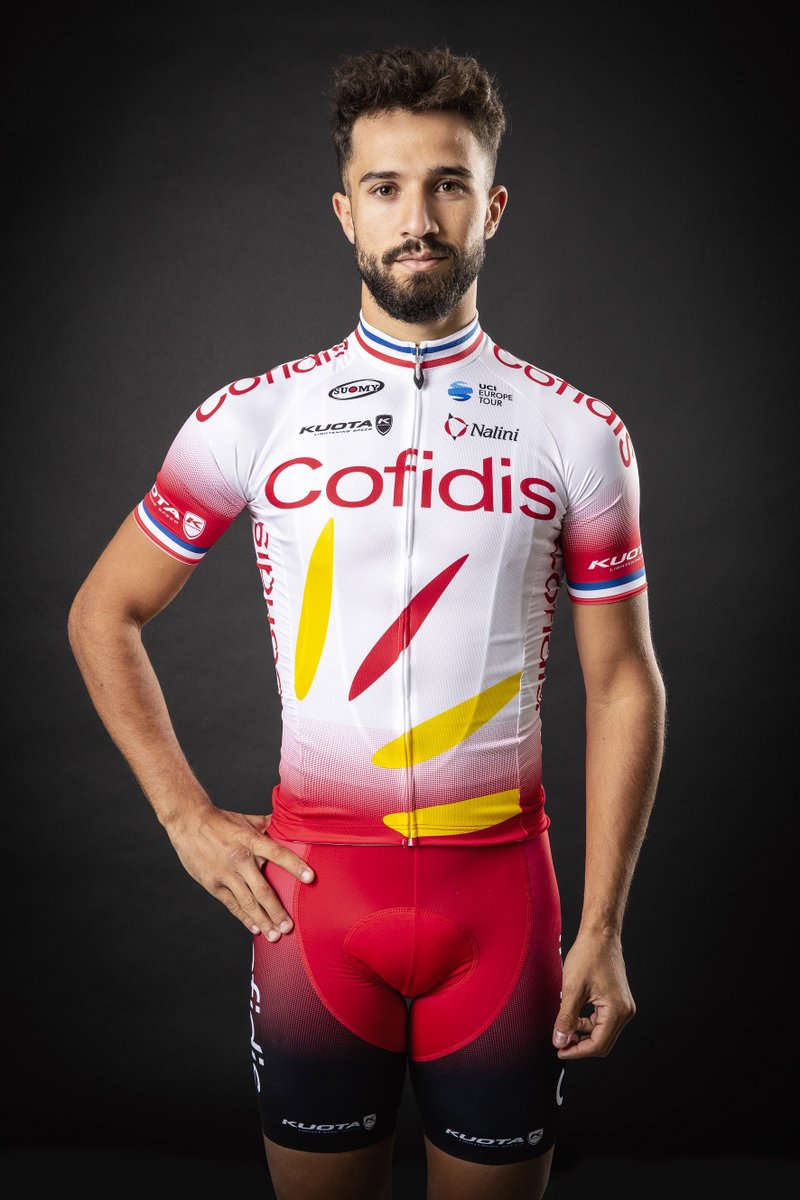
That's quite a throwback to the early years of the team (without any blue).
https://twitter.com/TeamCOFIDIS/status/1073502856609558529
https://twitter.com/TeamCOFIDIS/status/1073502856609558529


TRENDING THREADS
-
 Itzulia Basque Country 2026, April 6-11
- Started by Dazed and Confused
- Replies: 640
-
 Ronde van Vlaanderen 2026, monument, April 5 (men's)
- Started by Krzysztof_O
- Replies: 1K
-

-
 Teams & Riders The Remco Evenepoel is the next Eddy Merckx thread
- Started by DNP-Old
- Replies: 39K
-
 Teams & Riders Tadej Pogačar discussion thread
- Started by Lequack
- Replies: 43K
-
 Milan San Remo, March 21, 2026, 298 km monument
- Started by topcat
- Replies: 1K
-
Dwars door Vlaanderen 2026, April 1
- Started by Dazed and Confused
- Replies: 392
Cyclingnews is part of Future plc, an international media group and leading digital publisher. Visit our corporate site.
© Future Publishing Limited Quay House, The Ambury, Bath BA1 1UA. All rights reserved. England and Wales company registration number 2008885.