- May 25, 2018
- 2,420
- 2,609
- 17,180
it looks quite good on that picture indeed - but way brighter (and in my personal opinion, way worse) on the official ones from Bardiani:I absolutely love this

I am happy to disagree with you! It's all subjective.It's fun and colourful.
Think about how easy they'll be to spot.
It reminds me of a children's sweets wrapper from the 90s
I like both, they will be easy to spot from the helicopterBardiani is one of the ugliest jerseys I have ever seen...
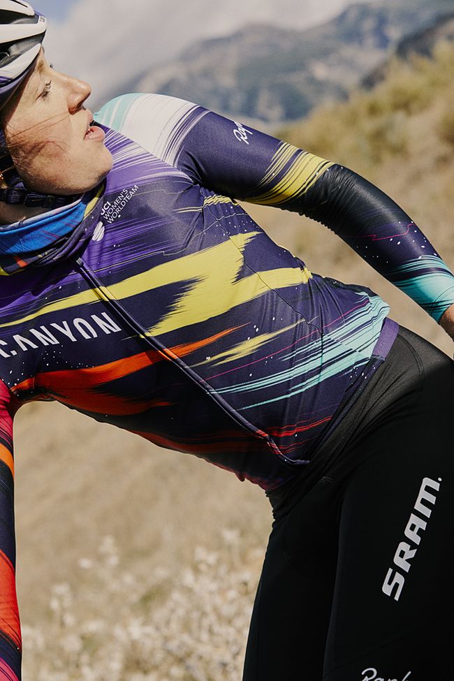
Canyon-Sram is awesome...
Has there actually ever been a jersey which was hard to spot from the helicopter?
Nice good looking and easy to recognise.Jumbo-Visma (Hema)

Has there actually ever been a jersey which was hard to spot from the helicopter?
Most likely do a switch in the colours for TdF this year. Love the superhero vibes from the pic thoughNice good looking and easy to recognise.


