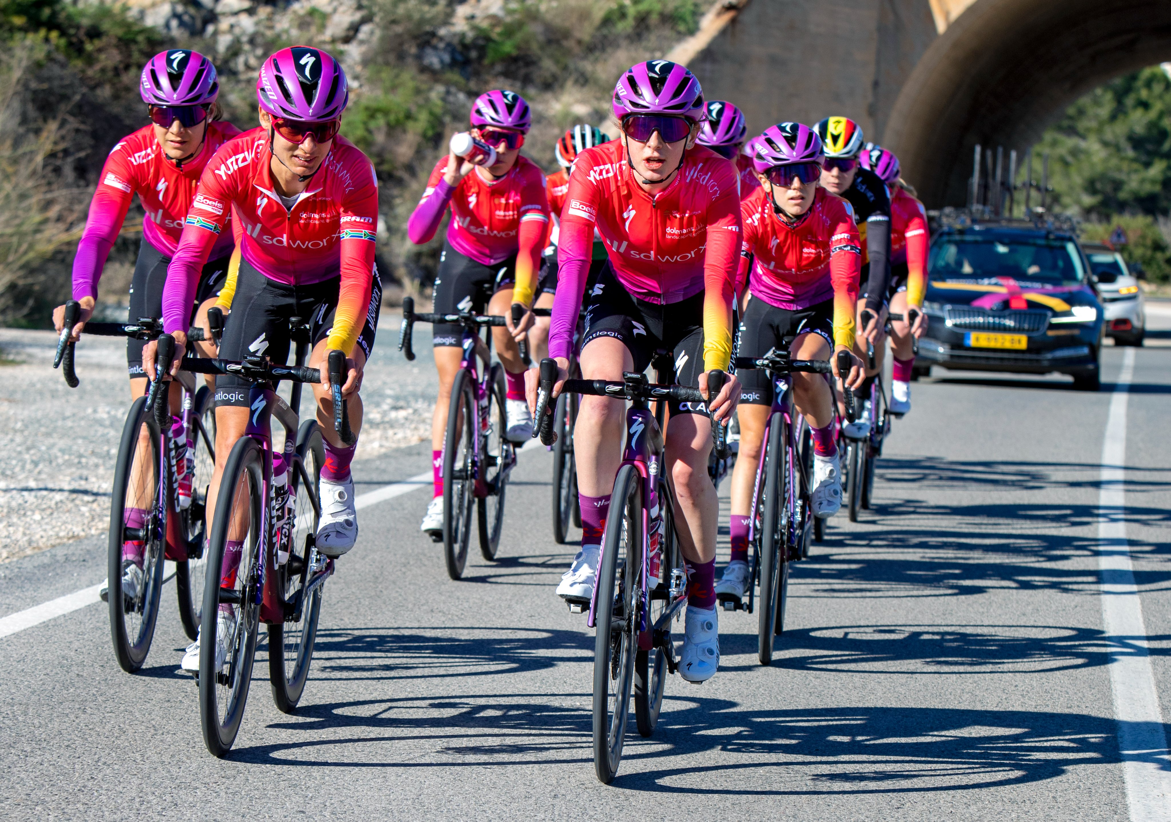
New Jerseys - 2022 Season - TeamKits-Maillots-Tricots-Tenues

Page 4 - Get up to date with the latest news, scores & standings from the Cycling News Community.
Oct 14, 2017
12,196
3,232
23,180
The Movistar kit I'm good with the color. I'm not fond of the dashes, just like I didn't particularly like the dots and dashes on the Sky kit a few years ago. At least these dashes appear to be more uniformed.
On the other hand, I really like the championship kit.
 
May 10, 2013
5,455
3,245
23,180
267701349_7054879204530001_1288485270987573750_n.jpg
I really like it. A simple design and one of my favourite colour schemes. If I weren't watching cycling already and only started in 2022, I could become a fan.
 
Aug 28, 2021
1,597
2,068
6,680
Agree.

Unzue‘s teams simply always have the prettiest jerseys. Banesto was great, Caisse was great, Movistar is great (and becomes even better year after year).

Movistar has a beautiful jersey, beautiful bikes. The team appears modern and fresh. Sadly, they have become quite unsuccessful over the last years…
 
  • Like
Reactions: Sandisfan
May 23, 2009
10,256
1,455
25,680
I really like it. A simple design and one of my favourite colour schemes. If I weren't watching cycling already and only started in 2022, I could become a fan.
Apart from the M it looks like Sky from a few years ago
 
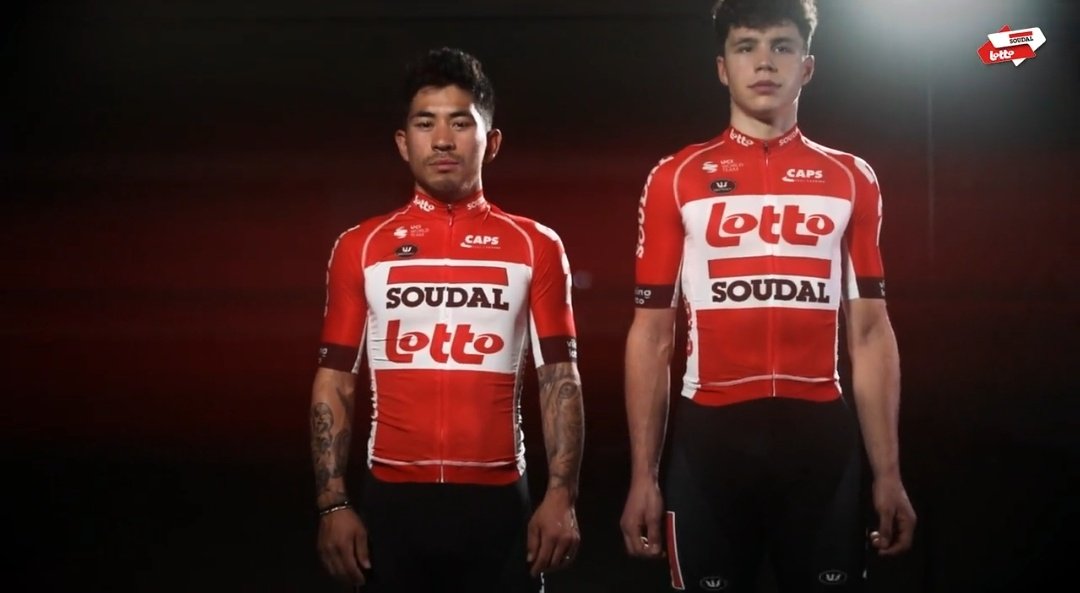
It could be understandable if the logos were of different sizes in which jersey but they appear in the same part of the jersey and with the same dimension. Not a very clear way of emphasizing Soudal's logo. I would say, looking at the pictures side by side, that the Lotto logo stands out more in each of the two versions,.
 
  • Like
Reactions: jmdirt
May 25, 2018
2,419
2,607
17,180
Lotto now with an almost identical jersey to last year. Will anyone actually release a new kit this year?

I hate this brand recognition crap
 
  • Like
Reactions: Sandisfan