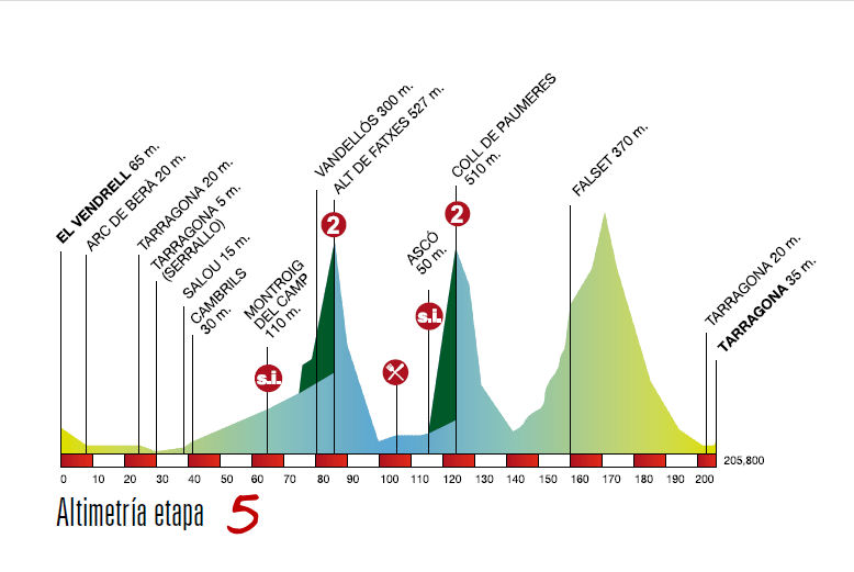
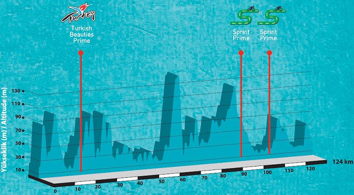
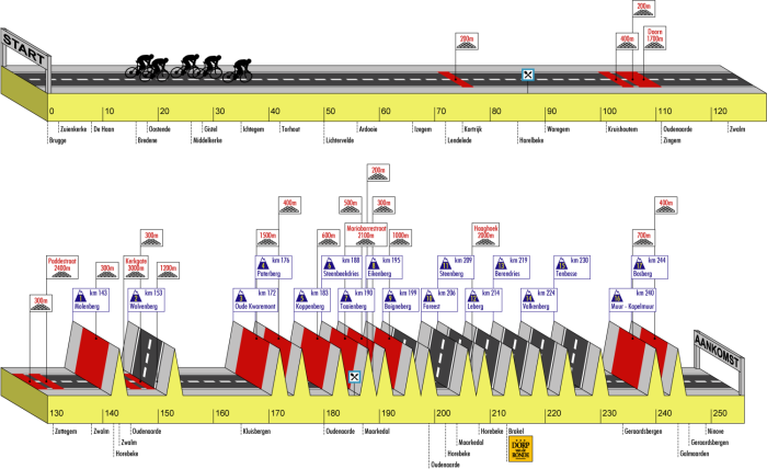
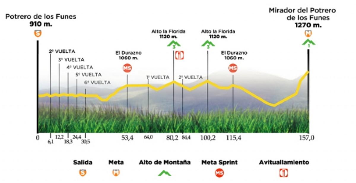
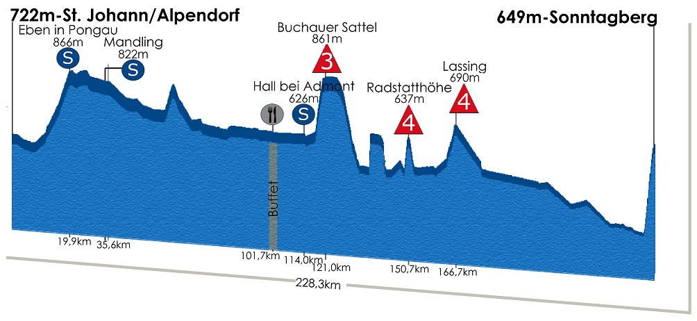
The idea of this thread is to compile all the cringeworthy profiles that race organisers use to present and promote their races. Over the years we have seen a lot of these unfortunately. So let's see how it should NOT be done.
Just to be clear, I am not talking about race design here, rather the visual side/(non)accuracy of the official profiles.
The first to start it up, is not the absolute worst I have ever seen, but one that I stumbled upon recently. The race is Grande Prémio Internacional Beiras e Serra da Estrela, a new 2.1 race in Portugal.

You would think the riders will pack some climbing equipment to be prepared for the walls, sometimes even climbing backwards. Also note the area for restocking at 1610 metres is shown at about the same height as the sprint at 710 m.
Just to be clear, I am not talking about race design here, rather the visual side/(non)accuracy of the official profiles.
The first to start it up, is not the absolute worst I have ever seen, but one that I stumbled upon recently. The race is Grande Prémio Internacional Beiras e Serra da Estrela, a new 2.1 race in Portugal.

You would think the riders will pack some climbing equipment to be prepared for the walls, sometimes even climbing backwards. Also note the area for restocking at 1610 metres is shown at about the same height as the sprint at 710 m.


