- Apr 7, 2011
- 4,895
- 491
- 16,580
Don't forget that you have to look at total KM and average km per day too. Also how many mountains were in the Tour. Just looking at average speed is missleading. Surfaces have become a lot better too.

hfer07 said:the chart itself is wrong: 2005 is the fastest TDF ever ridden at 41.68 kph....
 Shortening of stages & improved bikes no doubt helped increase the speed..... Going from steel frames and clips, to the much lighter weight bikes later on.....
StyrbjornSterki said:Another point to remember is that aerodynamic drag increases with the square of the increase in velocity. Meaning going 1% faster doesn't take 1% more energy, it takes 2% more (1.01^2). So the same gain in kph is substantially harder to come by from a 39 kph average vice a 38 kph average. Which somewhat accounts for the curve being steeper before 1956 than after 1976.
But back to the OP, what else was going on that might have caused the curve to fall off so suddenly in the mid-60s?
StyrbjornSterki said:I've been throwing some numbers in Excel, looking for trends in average speeds of the GC at the Tour de France. To moderate the impact of changes in route and other temporary factors, I used a rolling average of 10 consecutive years. My stats begin with the first season after WWII, 1947, so the first season listed is 1956.
...

Excellent Job StyrbjornSterki (Gosh that was hard to spell).StyrbjornSterki said:I kept this as simple as possible because there are a great many more variables than even the most obtuse of you have pointed out, and I couldn't possibly cover all of them unless I had Powertap data on every tour winner.
To reduce the influence of the evolution of the bicycle, I excluded all the years before HD first allowed derailleurs -- and even the first three of them -- and began with the first post-WWII race.
Relative scale between the two graphs in entirely coincidental, chosen purely
to allow as close an overlap as possible while still showing the extremes.
I'm still using the moving average function because it helps make trends more apparent, only now I have it overlayed with the raw data. And thanks to la.margna for giving me the idea to use average stage length rather than tour length.
The length of the average stage has been noticeably lower and fairly consistent since about 1980. Comparing adjacent year(s) from 1947 to 1979, there was a fairly significant correlation between the direction of change in the average length of a stage and the change in that year's GC's average speed, 73% (excuse me if my tabulations are a bit off, I've looked at this until I'm bleary-eyed). From 1980 on, with stages averaging around 175 km, there's only a 52% correlation. That's little enough to write off to pure chance. Attribute whatever significance to that you will.
The first five years I considered, average (averaged) speed was 32.5 kph and average stage length was 219 km. The five most recent years (the post-Pharmstrong era), average (averaged) speed was 40.0 kph and average stage length was 175 km. Strictly from a standpoint of aerodynamic drag, and disregarding differences in rider stature, that represents an increase in rider output of 51% and a decrease in stage length of 25%.
Remember that drag increases with the square of velocity, so going twice as fast takes (2^2=4) four times as much energy
and going just 1.4x as fast takes twice as much (2^0.5= 1.41).
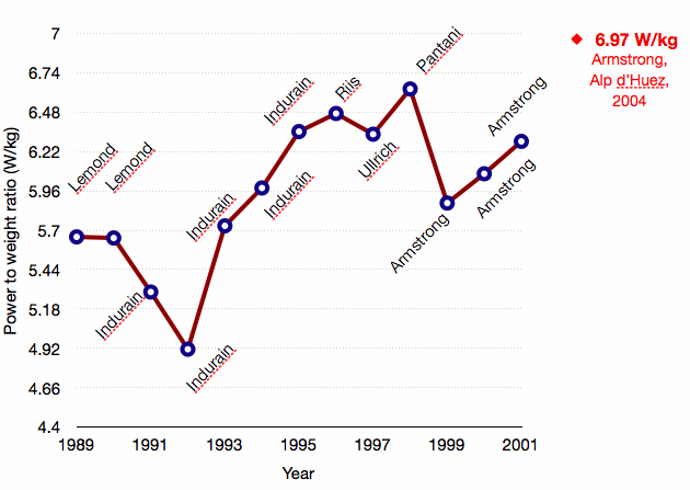
Since you guys brought them up (and I already have the raw numbers in a spreadsheet), I compared the averages for all TdF wins for Lemond, Indurain and Pharmstrong:
Rider - - - - - AvgSpeed - Avg Stage Length
Lemond- - - - 37.6 kph - - 167 km
Indurain - - - 38.9 kph- - - 185 km
Armstrong - 40.4 kph - - -173 km
Again considering aerodynamic drag alone, Indurain's numbers represent 7% more output and over 11% longer stages than Lemond's.
Armstrong's numbers best Lemond's by 16% and 3%, output and distance.
And while Armstrong's numbers show 8% more output than Indurain's, it's over 7% shorter stages.
And Comparing Pharmstrong to the post-Pharmstrong era, average speed has fallen 2% but average stage length has increased by the same (or -1.9% and +1.6%, if you want to split hairs).
These are admittedly rudimentary numbers and I'm not attributing any overwhelming significance from them. However, to my question from the OP regarding the early 60s dip, average stage length remained above 187 km from 1959 to 1969, averaging 199 km. And there appears to be more a correlation between average speed and average stage length as length approaches 200 km. So that would seem a reasonable explanation for my plateau. That and the arrival of the trade teams.
Honestly FoxxyBrown, I see a peak starting in 1990 forward. It is very clear. That's why the OP estimated an 8% increase to the first section (Indurain's Tour) and 16% to the second section. It is clear in the plot.FoxxyBrown1111 said:If i read the graphs correctly, from 1966 to 1977 the Avg-Km AND Avg-Speed got down. No one really could explain it up to now. It absolutely makes no sense (that´s more mystic than all "Epo- and Blood years" from 1990-2006).
Could it be that the doping controls started in 1967? Man if that´s true, it seems doping had at least an as big effect up to 1966 as the "Hi-TechDoping and-Blood-Years".
May Dr. Maserati can help out here.
Back to the OP-Graph. I can´t see any influence from EPO (1990+) compared to the 80´s/late 70´s. It was a steady improvement in km/h from the late 70´s to the mid 2000´s. No "special hit" at around 1990. I think to use the 10-Yr-Avg is very good, coz it includes the steady process of lighter bikes, less mountains, wider talent pool, etc. It makes a smooth transition so the numbers are not poluted.
Conclusion: Either Epo is overrated or ampethamin/steroid mixes had the same effects.
The only "true hit" (compared to the 60-70 downfall) is the decreasing speed since 2006. It indeed looks like the passport works at least so much, that it prevents catastrophic over use of doping....
Anyway, great work Styrbjorn.
...
StyrbjornSterki said:
What are your thoughts?
StyrbjornSterki said:thanks to la.margna for giving me the idea to use average stage length rather than tour length.
StyrbjornSterki said:Remember that drag increases with the square of velocity, so going twice as fast takes (2^2=4) four times as much energy and going just 1.4x as fast takes twice as much (2^0.5= 1.41).
]Polish said:Great chart Styrbjorn.
Four major parts:
1) About 10 years of Increasing speeds from 56-66.
2) About 10 years of Decreasing speed from 66-76
3) 30 years of steadily Increasing speeds from 76-06
4) Flat since 2006
The steadily increasing speeds from 76-06 are due to many things of course.
But I feel the focus on "hi-tech" recovery played a big part.
The "Needle Era" for lack of a better name.
Interesting the blip up in speed in 1990 when Greg won
And the blip down in speed in 2002 when Lance won.
Otherwise a very smooth chart.
Of course, what catches my eye - is the PEAK in 2005/2006.
Is that the limit of AWESOMENESS?
Will that 10 year moving average peak EVER be matched again?
Maybe not.
Would not suprise me in the least.
The limit of human cycling awesomeness.
+1.Teddy Boom said:Drag varies by the square of velocity, but the power required to maintain speed is the product of drag times velocity, so the power required to overcome wind resistance varies as the cube of velocity.
Interesting thread though
[edit: corrected my own square-cube error
+1.Zweistein said:The biggest tech improvements were areo bars and reduced spoke and deep dish wheels. People always prance about the reduced weight but bikes total weight has always been a small fraction of the total weight. Stripping 3 pounds off a bike isn't going to increase your climbing by 3%. Old bikes weren't that heavy. too. I have an old Colnago that is steel that weighs 18lbs. You don't need carbon, aluminium, or titanium to have a light bike.
....
Polish said:Great chart Styrbjorn.
Four major parts:
1) About 10 years of Increasing speeds from 56-66.
2) About 10 years of Decreasing speed from 66-76
3) 30 years of steadily Increasing speeds from 76-06
4) Flat since 2006
The steadily increasing speeds from 76-06 are due to many things of course.
But I feel the focus on "hi-tech" recovery played a big part.
The "Needle Era" for lack of a better name.
Interesting the blip up in speed in 1990 when Greg won
And the blip down in speed in 2002 when Lance won.
Otherwise a very smooth chart.
Of course, what catches my eye - is the PEAK in 2005/2006.
Is that the limit of AWESOMENESS?
Will that 10 year moving average peak EVER be matched again?
Maybe not.
Would not suprise me in the least.
The limit of human cycling awesomeness.


