• The Cycling News forum is looking to add some volunteer moderators with Red Rick's recent retirement. If you're interested in helping keep our discussions on track, send a direct message to @SHaines here on the forum, or use the Contact Us form to message the Community Team.

    In the meanwhile, please use the Report option if you see a post that doesn't fit within the forum rules.

    Thanks!

2010 Jerseys Thread

Page 4 - Get up to date with the latest news, scores & standings from the Cycling News Community.
Mar 11, 2009
124
1
0
Visit site
Bmc

evans2.jpg


Stock bike colors or not ?
 
Agree FDJ is still the best in the peloton. Really nice looking.

No matter what, nothing will ever top that Castorama jersey as the worst ever. It's not possible. Both RS and Astana are better than that.

I'm not too big on the Lotto kit, but like the simplicity, and that it will stand out.

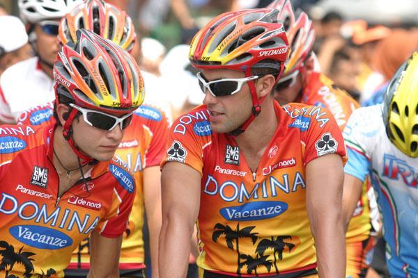
The Domina zebra jerseys at least stood out, but I liked the sunset one much better.

IMG_7539.jpg


There was a special Domina or Domina/Aqua Sapone kit that looked like this, but the colors were more subtle, a orange to brown sunset. Really nice looking, can't find a photo now.

This Domina was cool too:

026.JPG
 
Here's what the Joe Lindsay had to say about that hideous Castorama kit:

"In yet another misguided attempt to achieve “synergy” between the sport and its financial backers, the team unveiled the worst uniforms in cycling history, which attempted a kind of bib look to mimic the blue aprons that Castorama’s store staff wore...

....In 1992, the ultimate sponsor synergy was achieved when Laurent Brochard, who looks as if he should have been an after-hours stockboy instead of a pro racer, joined the team. The confluence of Brochard’s luxuriously flowing mullet and the apron look combine to make Castorama the Worst Cycling Team Uniform of All Time.

By those standards, RadioShack’s kit is positively radiant with style."
 
Jul 10, 2009
311
0
0
Visit site
Michele said:
Rumors talk about some costum bikes both for Hincapie and Evans (more than one each).
I'm sure they'll get custom paint jobs, but I highly doubt they'll get custom bikes. The cost to make monocoque molds is prohibitively expensive.

Only 1 or 2 guys in the entire pro peleton get custom bikes. One was Bennati, and there might be one other. Bennati went through tons of custom aluminum frames until they got it exactly right, and only then did they make a custom mold.

In doing some research for this post (I couldn't remember who got the custom frame) I found a guy who makes custom monocoque frames. I wonder if he'll be licensing his process to the major bike makers, and custom build frames will make a comeback.
 
Nov 17, 2009
2,388
0
0
Visit site
I'll be honest... I like the ugly jerseys.

The uglier the kits... the more interesting. All the boring white/blue kits just get old. Give me a hideous kit over a plain one EVERY time.
 
Oct 6, 2009
5,270
2
0
Visit site
kurtinsc said:
I see nothing wrong with that jersey.

Colorful, stands out, and it isn't the freaking blue/white quickstep/katusha/everyone else in the freaking universe that we see now.

To each his own. :)
The thing I remember about that kit was the shorts/leg warmers also being two sided, and when you saw a rider from the side, one was all colorful cubes and the other side view was all blue/white swirls. It took a while to get used to and realize swirly-man was on the same team as cube-man.
 
Jul 27, 2009
680
0
0
Visit site
I liked the Clas-Cajustur jerseys back in the 80s-90s.

Unzaga.JPG


They had a few variations, but that one was my favorite.

I also liked the Ariostea one with red dominating over the yellow vs. the one with more yellow. Thought the Gatorade-Chateau d'Ax one was nice, too, though that was when neon was much more popular.


/sorry for the threadjack to earlier periods.
 
Jun 16, 2009
19,654
2
0
Visit site
kurtinsc said:
I see nothing wrong with that jersey.

Colorful, stands out, and it isn't the freaking blue/white quickstep/katusha/everyone else in the freaking universe that we see now.

maybe a little too clourful but at least it stands out.