
Best and Worst National Champs jerseys
Page 78 - Get up to date with the latest news, scores & standings from the Cycling News Community.
You are using an out of date browser. It may not display this or other websites correctly.
You should upgrade or use an alternative browser.
You should upgrade or use an alternative browser.
- Jan 3, 2019
- 2,023
- 2,943
- 17,180
Designwise, I like the kit. It's bright and it stands out. But I'm a big fan of traditional champion jerseys as well, so I can't prefer this over his previous one. Also because I was so glad QuickStep brought the classic style back after several horrible versions.
Let's say I can appreciate this one for the special occasion.
Let's say I can appreciate this one for the special occasion.
- Sep 28, 2010
- 3,364
- 329
- 14,180

- Feb 10, 2015
- 5,999
- 907
- 19,680
- Apr 27, 2016
- 531
- 177
- 9,780
Horrible jersey. Basically just a plain white jersey with a couple of bits of blue. Sponsors logos ruin it.
- May 5, 2010
- 53,306
- 31,539
- 28,180
Re:
Tell that to Groupama.
Leinster said:I wouldn’t expect the Argentine champion to look any different. And the sponsor logo does still have to be there.
Tell that to Groupama.
- Mar 19, 2009
- 9,892
- 1,790
- 20,680
Re:
The blue text on green is fine. No need for a homogenous background.ice&fire said:The point of turning flags sideways makes sense when you realise that horizontal bars lead naturally to an homogeneous background colour for any written text on it. Viviani's kit is gorgeous, but blue text on green background not so much.

- May 5, 2010
- 53,306
- 31,539
- 28,180
I kept getting confused about why they were using the old Garmin colours.
Yes... I'm an idiot...
Yes... I'm an idiot...
- Feb 10, 2015
- 5,999
- 907
- 19,680

- Mar 19, 2009
- 9,892
- 1,790
- 20,680
Re:
Nice. Usually I don't like the French NC kit, but this is pretty good.Alexandre B. said:
Interesting situation - during the team presentation in Sibiu, Czech champion Sisr seemed to wear the jersey he got during the victory ceremony after the nats - as if his team version of the jersey has not yet been ready.
Polish and Croatian champions on the other hand duly showing their new jerseys:
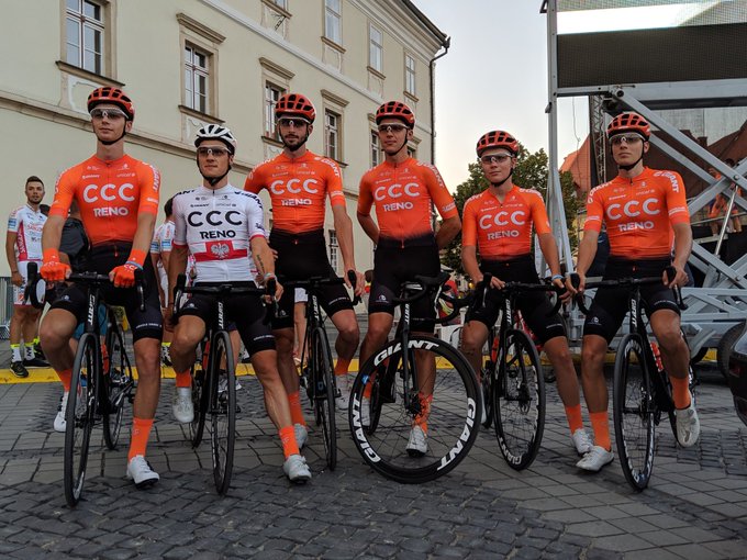
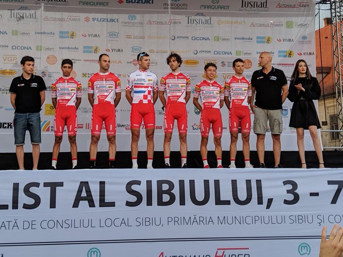
Polish and Croatian champions on the other hand duly showing their new jerseys:
- Sep 28, 2010
- 3,364
- 329
- 14,180

- Nov 16, 2013
- 27,313
- 28,632
- 28,180
I can't believe Lequack hasn't already linked to the quite funny video where Amund Jansen is handed the Danish shirt by Groenewegen :lol:
https://www.youtube.com/watch?v=rYM2mWo58FE
Remember subtitles.
https://www.youtube.com/watch?v=rYM2mWo58FE
Remember subtitles.
- May 5, 2010
- 53,306
- 31,539
- 28,180
Re:
I just love the fact that he told Danish TV2 that "A Swedish one would've been worse."
tobydawq said:I can't believe Lequack hasn't already linked to the quite funny video where Amund Jansen is handed the Danish shirt by Groenewegen :lol:
https://www.youtube.com/watch?v=rYM2mWo58FE
Remember subtitles.
I just love the fact that he told Danish TV2 that "A Swedish one would've been worse."
- May 25, 2010
- 8,863
- 414
- 18,580
Re:
Liked that one! Nice little prank.
tobydawq said:I can't believe Lequack hasn't already linked to the quite funny video where Amund Jansen is handed the Danish shirt by Groenewegen :lol:
https://www.youtube.com/watch?v=rYM2mWo58FE
Remember subtitles.
Liked that one! Nice little prank.
- May 5, 2010
- 53,306
- 31,539
- 28,180
- Mar 26, 2015
- 7,144
- 2,633
- 18,180


Re:
Such a beautiful jersey - the worlds oldest flag - and he threw it on the ground!
No more "cheap" danish beer for you Amund
tobydawq said:I can't believe Lequack hasn't already linked to the quite funny video where Amund Jansen is handed the Danish shirt by Groenewegen :lol:
https://www.youtube.com/watch?v=rYM2mWo58FE
Remember subtitles.
Such a beautiful jersey - the worlds oldest flag - and he threw it on the ground!
No more "cheap" danish beer for you Amund
TRENDING THREADS
-
 Paris-Roubaix 2026, one day monument, April 12
- Started by Lequack
- Replies: 2K
-
 Itzulia Basque Country 2026, April 6-11
- Started by Dazed and Confused
- Replies: 2K
-

-
 Ronde van Vlaanderen 2026, monument, April 5 (men's)
- Started by Krzysztof_O
- Replies: 1K
-

-
 Teams & Riders The Remco Evenepoel is the next Eddy Merckx thread
- Started by DNP-Old
- Replies: 39K
-


Cyclingnews is part of Future plc, an international media group and leading digital publisher. Visit our corporate site.
© Future Publishing Limited Quay House, The Ambury, Bath BA1 1UA. All rights reserved. England and Wales company registration number 2008885.