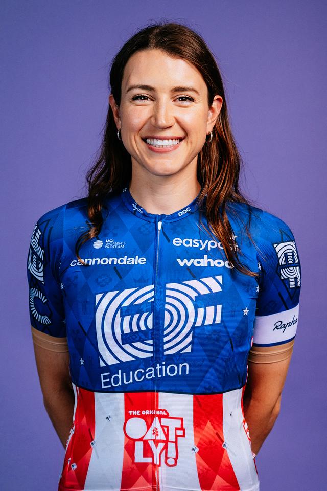
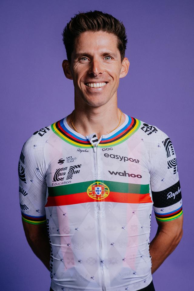
Best and Worst National Champs jerseys

Page 96 - Get up to date with the latest news, scores & standings from the Cycling News Community.

Wvv

Jan 3, 2019
1,967
2,816
11,180
filters:quality(75)


Faulkner's (and Quinn's) jersey is really nicely done! And so are the others.
filters:quality(75)
filters:quality(75)
filters:quality(75)
 

Wvv

Jan 3, 2019
1,967
2,816
11,180
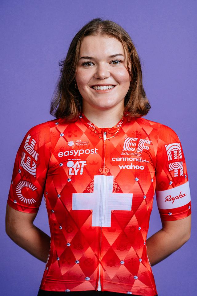
These are shocking jerseys except for the Swiss jersey. I can't remember a worse American jersey.
Why? I always like when a team implements its own specific design into a champion's jersey without disrespecting it. They did a good job in this regard, with the subtle argyle in these standout national colours. UAE, Astana, Movistar etcetera often did a much worse job.
 
Dec 27, 2015
3,869
2,299
16,680
Why? I always like when a team implements its own specific design into a champion's jersey without disrespecting it. They did a good job in this regard, with the subtle argyle in these standout national colours. UAE, Astana, Movistar etcetera often did a much worse job.
I have to agree with @yaco
The US jersey tends to be one of the most beautiful in the pro peloton. But this is just mid. Where are the stars on the stars and stripes?
She might aswell be the NC of Liberia.
 
  • Like
Reactions: yaco and Sandisfan
Sep 20, 2017
12,422
23,486
28,180
Why? I always like when a team implements its own specific design into a champion's jersey without disrespecting it. They did a good job in this regard, with the subtle argyle in these standout national colours. UAE, Astana, Movistar etcetera often did a much worse job.
The problem (in addition to the lack of stars on the US jersey that has already been pointed out) is that the argyle does not work at all with a mainly white jersey.
 
  • Like
Reactions: Sandisfan

Wvv

Jan 3, 2019
1,967
2,816
11,180
The stars are present, but I'll admit that they could've been more prominent to make it even better. And yes, the argyle works out a little less with the white jerseys. Still, I think they did a more than decent job. Their champions will be easily recognised and the designs fit in the team.

640x960


USA is more classy than last year's for sure:

sean-quinn-and-his-new-us-national-champion-jersey-v0-KTdz3UMGAdTBYf2UruXU5YJpfiGhSvy85HUvewk7esc.jpg
 
May 5, 2010
51,703
30,253
28,180
I agree with laarsland ("My eyes!" was meant in a negative sense, right?)
There's just... too much going on with that jersey!

Compare and contrast Markus Hoelgaard's:

markus-hoelgaard-2025-n2.jpg
 
  • Like
Reactions: E_F_ and awavey
Dec 23, 2015
697
694
12,180
I like my national champions jerseys clean and clear on origin country, see FDJ.

You can get away with logos if you max out on origin country like this
hhdkapvWkXbAyju9G6Z4qsAbWi_uvByswuG1MKUTQJ4.jpg


Dolven's jersey is the worst of both worlds. All the logos take the worst of the Vini Fantini-jersey without the fun color scheme (and/or Savio) to get away with it, whilst the Norwegian flag is absolutely butchered. 1/10. I'd even take a UAE-iteration over this.
 
Last edited:
Dec 27, 2015
3,869
2,299
16,680
I like it, It was about time we had a prominent team with a very busy jersey again.
I still love those Androni jersey in which Rebellin won Fleche
 
Sep 26, 2020
25,353
27,878
23,180
I personally like all designs that isn't the current UAE/BORA/Movistar/DSM way of doing it. It would have been better if the zipper had matched the colour pattern of the rest of the jersey though. However it's only the U23 jersey, so we won't be seeing it a lot.
 
  • Like
Reactions: Sandisfan and E_F_