New Jerseys - 2012 Season - TeamKits-Maillots-Tricots-Tenues-and-Exotics

Page 49 - Get up to date with the latest news, scores & standings from the Cycling News Community.
Aug 31, 2011
324
0
0
craig1985 said:
Question, does anybody think it's possible to confuse the Quick Step Omega Pharma Quick Step and the Saxo Bank teams when the camera is showing them on front-on? Because Liggett did it on stage 1 on the TDU when OPQS went to the front and he confused them with Saxo Bank.

I think the Saxo blue is quite distinctive, so in theory no. But I haven't seen the two racing side by side on tv yet, so ir could be possible. And Liggett is an idiot and has been known to get things mixed up before!
 
Mar 10, 2009
373
119
9,480
craig1985 said:
Question, does anybody think it's possible to confuse the Quick Step Omega Pharma Quick Step and the Saxo Bank teams when the camera is showing them on front-on? Because Liggett did it on stage 1 on the TDU when OPQS went to the front and he confused them with Saxo Bank.

Liggett needs no help to get confused.
 
Sep 8, 2010
1,441
0
0
galeria46757-001.jpg


galeria46757-002.jpg


Looks like somebody did better than Gianetti.
 
Jan 3, 2011
4,594
0
0
craig1985 said:
Question, does anybody think it's possible to confuse the Quick Step Omega Pharma Quick Step and the Saxo Bank teams when the camera is showing them on front-on? Because Liggett did it on stage 1 on the TDU when OPQS went to the front and he confused them with Saxo Bank.

Liggett would readily confuse FDJ with Euskatel.
 
Apr 8, 2010
1,257
0
0
Cimber said:
To many sponsors. Ofc thats a good thing for the team but it ruins the design.

But it's better than the "Serramenti PVC Diquigiovanni-Androni Giocattoli" jersey of 2009...

Thinking about it (long team names), why doesn't Nissan and Trek make a combined PR firm named Nissan-Trek so that Radioshack could be called Radioshack-Nissan-Trek?
 
Jan 3, 2011
4,594
0
0
will10 said:
It's been like that for years and years, you'll get used to it ;)

Oh I am used to it , just as have gotten used to the Rabo kit, but doesnt make it a nice looking kit :D
 
Aug 18, 2009
4,993
1
0
Cimber said:
To many sponsors. Ofc thats a good thing for the team but it ruins the design.

Beats me why more WT teams don't go the way of Androni or Landbouwkrediet. I'd suggest as a non-expert on the business side of the sport: are they pricing themselves out of the market? Or maybe big time sponsors want something like exclusivity so they're the only name on the jersey. Look at Radioschleck. Totally sterile corporate design, presumably to appeal to sponsors, and then left almost blank.
 
Jun 11, 2011
473
0
0
seeing all the kits for the first time live in the TDU, I gotta say Movistar's new kit and bike look great (except for Rojas, should be all red and yellow).
Garmin's doesn't look as good live as it does on paper.
Katusha looks better.
Vac doesn't look as bad as I thought they would (the bike does though)
Greenedge, Saxo, BMC, Radioshack, and Lampre look like dried vomit
 
Sep 7, 2010
770
0
0
CobbleStoner said:
seeing all the kits for the first time live in the TDU, I gotta say Movistar's new kit and bike look great (except for Rojas, should be all red and yellow).
Garmin's doesn't look as good live as it does on paper.
Katusha looks better.
Vac doesn't look as bad as I thought they would (the bike does though)
Greenedge, Saxo, BMC, Radioshack, and Lampre look like dried vomit

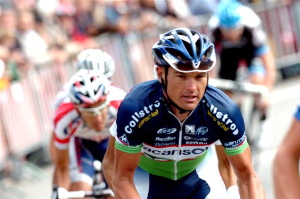
No. Saxo looks outstanding, Garmins great and BMC looks great as well - Greenedge and Shack do look like dried vomit though.
 
Nov 2, 2009
1,112
0
0
IMO:

Movistar looks better than I expected and better than on paper.
Garmin looks more ordinary than on paper and got a bit lost in the crowd.
Lampre, Liqui and BMC stand out well in the peloton. Relatively unchanged.
Love the blue colour of Omega Quickstep.
Don't mind GreenEdge.
Sky is fine, easy to pick out. Not much different to last year.
Saxo is good.


NissanShack looks terrible, really dull.
 
Aug 5, 2010
11,027
89
22,580
so contador will apparently be wearing a specialized helmet like the rest of saxo instead of a giro helmet.

did his partnership with giro end?
 
Aug 9, 2010
6,255
2
17,485
Spare Tyre said:
IMO:

Movistar looks better than I expected and better than on paper.
Garmin looks more ordinary than on paper and got a bit lost in the crowd.
Lampre, Liqui and BMC stand out well in the peloton. Relatively unchanged.
Love the blue colour of Omega Quickstep.
Don't mind GreenEdge.
Sky is fine, easy to pick out. Not much different to last year.
Saxo is good.


NissanShack looks terrible, really dull.

Pretty much agree with you word for word ST!

I still like Liqui the best..I think Lampre looks good on the road.
OPQStep is good too.
Garmin just fades on the road don't know why....
 
Sep 9, 2009
532
0
0
You can begin to see the trouble with the three blue-white-black jerseys in this photo -- particularly with the Spec helmet on two of the guys. Look to the left three; it's like a sea of nondescript blues.

OGRADY-HAAS-ESCPE-514x421.jpg
 
May 13, 2009
1,872
367
11,180
Bring Back the Zebra!

CobbleStoner said:
seeing all the kits for the first time live in the TDU, I gotta say Movistar's new kit and bike look great (except for Rojas, should be all red and yellow).
Garmin's doesn't look as good live as it does on paper.
Katusha looks better.
Vac doesn't look as bad as I thought they would (the bike does though)
Greenedge, Saxo, BMC, Radioshack, and Lampre look like dried vomit

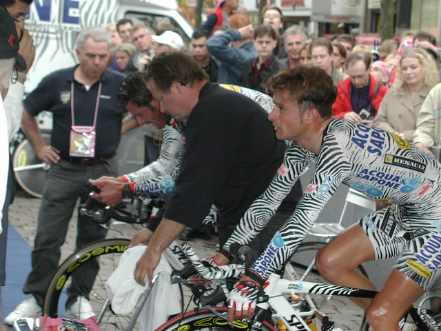
I like the Movistar strip too. Very sharp and flash w/o being gaudy. Looking at the sea of sterile, corporate-committee-designed-cycle-clothing, however, I have to think that now would be THE perfect moment for a Cavalli-designed Acqua & Sapone style kit...something gaudy but totally separate from the rest of the boring boring boring bland blue that the riders are drowning in...

87039609_dfedbb27da_z.jpg


When I found my own pro team in the next couple years, I might just copy this strip directly (after signing the appropriate licensing agreement or other legal document, of course...can't be like the pirate bay!).
 
Jun 10, 2010
19,894
2,255
25,680
filipo said:
You can begin to see the trouble with the three blue-white-black jerseys in this photo -- particularly with the Spec helmet on two of the guys. Look to the left three; it's like a sea of nondescript blues.

OGRADY-HAAS-ESCPE-514x421.jpg
This pic is pretty terrible. :\

Greenedge seems to be a prime example of a jersey designed as casual sports wear, without any regard to how it looks on a bike from the front. Instead of the green colours being emphasized, the only thing that's visible most of the time is the black upper part. The Leopard bit. Garmin similarly looks a lot better off the road, where you can actually see the Argyle.
 
May 26, 2009
10,230
579
24,080
Good point about the non-visibility from the front.

Garmin and QuickStep look quite similar because of the bright sunlight on the blue of Garmin. Saxo Bank and Vacansoleil are totally distinct from the others though.

GreenEdge kit looks worse on the bike than it did at the presentation. The black dominates.