- Oct 14, 2017
- 12,196
- 3,232
- 23,180
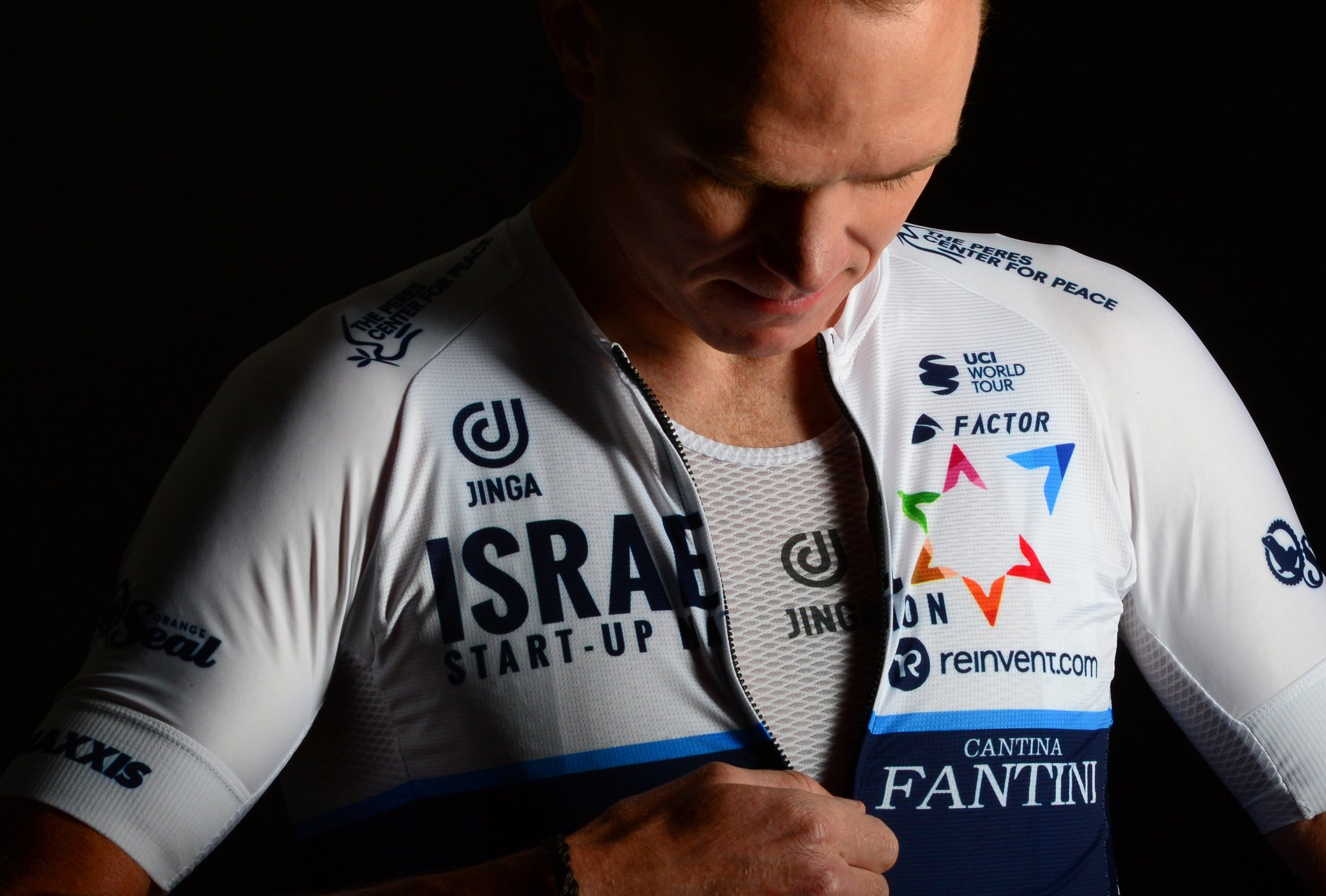
This is Movistar's kit reveal. Their kits aren't changing at all.
View: https://twitter.com/Movistar_Team/status/1344784147148140544
View: https://twitter.com/Movistar_Team/status/1344784147148140544


Love Jelle's Marble runsI think, I've seen the Jumbo, INEOS and Movistar/DSM jerseys somewhere before
True, the bike makes it better. Still could've done a better job, designing it less blank.When paired with the bike, I like the Bike Exchange look a lot:

When paired with the bike, I like the Bike Exchange look a lot:
I don't think it's that ugly, but to me it looks like something I would expect to see a women's cycling club in. If I saw a peloton of 20ish female amateur cyclists dressed like this on a sunday morning I wouldn't think anything of it. Perhaps it's the pastel-colour scheme together with the black and white.The Mitchelton-Scott jersey wasn't exactly a masterpiece, but definitely better than this total pseudo corporate garbage.
Ugly as f...ck.
Would love a Tour de MarbleLove Jelle's Marble runs
Nice colours but a bit boring other than that
Reminds me of Orica some years ago. I like it, better than some that were presented recently.
I don't think it's that ugly, but to me it looks like something I would expect to see a women's cycling club in. If I saw a peloton of 20ish female amateur cyclists dressed like this on a sunday morning I wouldn't think anything of it. Perhaps it's the pastel-colour scheme together with the black and white.
Everything but the duck was great about that jersey.But when people multi-colour their jerseys and put ducks on them, then they are not showing the sport respect.
Cycling fans can really be a drag to listen to when it comes to fashion...


Movistar: It's a great look. I like continuity in classic kits. Easy to spot--great colors--simple, sharp graphics.
EF will keep their design from last year?
I see on their website that their signings already have a photo with last year's jersey on. And their social media communication design with Nippo is in the same colors and imagery of last year.
Reminds me of Orica some years ago. I like it, better than some that were presented recently.
I think, I've seen the Jumbo, INEOS and Movistar/DSM jerseys somewhere before

Probably the only podium Movistar will get this year.