• The Cycling News forum is still looking to add volunteer moderators with. If you're interested in helping keep our discussions on track, send a direct message to @SHaines here on the forum, or use the Contact Us form to message the Community Team.

    In the meanwhile, please use the Report option if you see a post that doesn't fit within the forum rules.

    Thanks!

Team RadioShack Camp - video

Page 3 - Get up to date with the latest news, scores & standings from the Cycling News Community.
scribe said:
I haven't been following any of this. Anyone know why so many guys are still wearing Astana kits?

Yes. The contracts with Astana don't terminate until December 31. The Radio Shack contracts are effective January 1. So they ride in Astana (or former team) kit or homegrown/off-the-shelf until January 1.
 
A

Anonymous

Guest
scribe said:
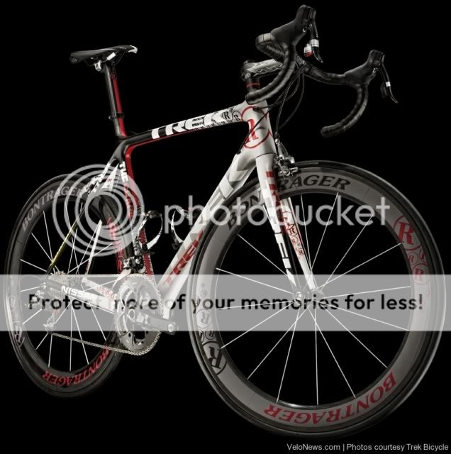
I can do without some of lingo on it. I think Radio Shack is about as strange a sponser as they come. And I generally do not like Treks. But I like that paint job.

I ride a Specialized that is all black apart from the white writing of the brand and the squiggle. I'd prefer something more funky like this.
 
A

Anonymous

Guest
Publicus said:
Yes. The contracts with Astana don't terminate until December 31. The Radio Shack contracts are effective January 1. So they ride in Astana (or former team) kit or homegrown/off-the-shelf until January 1.

I note Lance is not wearing Astana colours.
 
Jul 22, 2009
3,355
1
0
Visit site
Publicus said:
Yes. The contracts with Astana don't terminate until December 31. The Radio Shack contracts are effective January 1. So they ride in Astana (or former team) kit or homegrown/off-the-shelf until January 1.

Aha. Interesting. It almost looks like more mind-game propaganda.
 
A

Anonymous

Guest
Nice kit, nice bike, cool vid. The Shack is going to dominate.
 

Dr. Maserati

BANNED
Jun 19, 2009
13,250
1
0
Visit site
richwagmn said:
I guess it won't look that impressive to Contador then since LA is unlikely to be whizzing past him anytime soon.

The front wheel is a hideous color though. Sort of like that last jelly bean you'd never eat.
Ya - I think it is the front wheel that makes it weird.
I think the frame color is not bad - but its almost like they are trying too hard.

I will wait until I see it with the final racing kit before I dismiss it.
 
Jul 23, 2009
1,120
2
0
Visit site
Dr. Maserati said:
Ya - I think it is the front wheel that makes it weird.

With your comment I had to go back and look - certainly the front wheel stands out as the most irritating of the whole, I guess the rest could be observed without side effects but I am not sure I am going to ever like the off centered R of the Radio Shack logo. The logo stands out more than most team bikes for the branding but it is not something I find appealing visually.
 
Dr. Maserati said:
Ya - I think it is the front wheel that makes it weird.
I think the frame color is not bad - but its almost like they are trying too hard.

I will wait until I see it with the final racing kit before I dismiss it.

I think it's the over the top decals seemingly EVERYWHERE that bother me the most; the off color wheel is a close second. It reminds me of the crappy butterfly bike Lance rode on one stage last year. I would think that given the business of the bike, their kit should be as simple as possible.
 

Dr. Maserati

BANNED
Jun 19, 2009
13,250
1
0
Visit site
CentralCaliBike said:
With your comment I had to go back and look - certainly the front wheel stands out as the most irritating of the whole, I guess the rest could be observed without side effects but I am not sure I am going to ever like the off centered R of the Radio Shack logo. The logo stands out more than most team bikes for the branding but it is not something I find appealing visually.

Ha - well I went back and had another look, just in case. The large R is unwelcome - but the frame otherwise is not too bad.

One of the most 'offensive' parts of the color scheme is the black handlebar tape. Thats just wrong on so many levels.
 

Polish

BANNED
Mar 11, 2009
3,853
1
0
Visit site
favorite still Mapei Team Colors....

The Shack Team Bici is not bad I think, but still like Mapei Team Bici better
shack_bike1.jpg


mapei-1.jpg
 

Polish

BANNED
Mar 11, 2009
3,853
1
0
Visit site
CentralCaliBike said:
Your Shack Bike photo looks a lot different from the one posted here previously. Photo shop?

I stole the Shack pic from Velonews/Courtesy of Trek

Really looking forward to seeing the Astana Team Bici by Specialized.
That may be the best of 2010?
 
Mar 11, 2009
748
1
0
Visit site
the shack logo on the seat tube is wrong..! this looks like a mess.
the old Astana bikes were nicer looking.
Come to think of it even Cadels frame looked better. doh!
 
A

Anonymous

Guest
Polish said:
I stole the Shack pic from Velonews/Courtesy of Trek

Really looking forward to seeing the Astana Team Bici by Specialized.
That may be the best of 2010?

I think Specialized may try to milk the colour yellow for all its worth, like Armstrong did with his LiveStrong gear. Knowing this, that's probably why Trek and RadioShack have gone for this red look.
 
A

Anonymous

Guest
CentralCaliBike said:
Your Shack Bike photo looks a lot different from the one posted here previously. Photo shop?

thats the trek photo of how they want us to think it looks... the one i posted is the one of it up against a garage door which unfortunately shows us how it really does look..

bunch more photos here

im surprised i was three hours ahead of armstrong with the picture, and a couple of hours ahead of velonews.. i should have started a new thread as a dim exclusive.. :D
 
A

Anonymous

Guest
dimspace said:
i should have started a new thread as a dim exclusive.. :D

That's how ALL threads should be started, with:

"A (insert screen name) Exclusive"

The more I look at the bike, the more it grows on me. However, I certainly agree that the grey front wheel is a bit odd, and agree with Doc about the handlebar tape - it's so 2007:rolleyes:

White HB tape, white seat, and white rims (on both wheels) and I think that it would look sweet. At the moment, the grey seems to dull it down. Better yet, make all the grey colour, a more vibrant white and I'd sit on it for sure.

And spot on about the Rock Racing design, I was trying to put my finger on that before someone said it.

But hey, 7 pages of comments = Radioshack (the brandname) and Trek gain more exposure, which is great for them. Thats why you sponsor a team!
 
Jun 16, 2009
19,654
2
0
Visit site
Great White said:
I don't think you can seperate the brand from the rider. I think this bike's chaotic and in your face style does suit Armstrong's brand more than Contador. For Contador I would imagine a more smooth, graceful single tone, light colour style.

Great White said:
Okay but, if you saw the bike going down the road, whizzing past, the colour scheme would look more impressive. It would really stand out. That must be what people want right now.

You are so *** and screwed up in the head it's sad.Listen to yourself. Theirs seriously something wrong with you. You need help. Instead of making the bike chaotic maybe should have a picture a-s-s hole on it as itwould suit armstrong more. Or maybe a bblood red for all the blood doping he loves to do.
 
Jun 26, 2009
171
0
0
Visit site
dolophonic said:
the shack logo on the seat tube is wrong..! this looks like a mess.
the old Astana bikes were nicer looking.
Come to think of it even Cadels frame looked better. doh!
I agree with you not only bacause I'm Astana-fan:)
This colour scheme seems dirty, Astana's was much ascetic and logical