- Oct 10, 2015
- 3,117
- 1,655
- 16,680


They can't even ride 10 km's without having to eat during the ride?StryderHells said:This one from the Tour of Estonia is pretty bad

Ricco' said:Vuelta a Colombia targetting the win here.

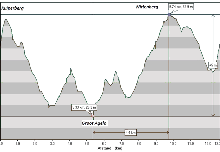
Cinemaniak said:Here's the profile of the Dutch championships from 2014 in Oostmarsum. Looking at the profile, one would expect to visit the Dutch equivalent of the alpes. Bit disappointing to see the highest they got was 69 meter
Ricco' said:Vuelta a Colombia targetting the win here.
In all honesty, they are bad but the official profiles are very different:Ricco' said:Vuelta a Colombia targetting the win here.


Indeed. Don't know how they managed to mess it up.Maaaaaaaarten said:Ronde van Drente profile should actually be:
_/\/\____________________________________/\/\/\____
tobydawq said:I have always found the Driedaagse de Panne time trial profile hilarious. Flat as a pancake, yet it looks like an Ardennes classic. I'm not sure that traffic bumps need to be represented in a profile.
I don't know how to post photos, unfortunately, but it can be seen here:
http://www.driedaagse.be/2016/parcour/rit4.pdf

Forever The Best said:I love the giant climb which climbs 5m :lol:


