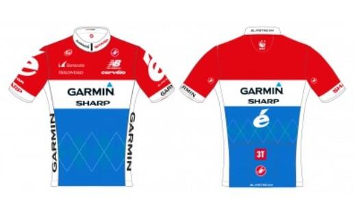
Best and Worst National Champs jerseys

Page 31 - Get up to date with the latest news, scores & standings from the Cycling News Community.
Oct 6, 2009
5,270
2
0
Afrank said:
My design looks better. And my design sucks, I just painted directly on the picture. :D

nibs_zpscf042b02.jpg

:eek:You're joking. I thought that was a very expensive professional photoshop design


:p

(By the way, I like the fluo green for the shoulders rather than boring old traditional Italian flag green. Much like Tinkoff-Saxo's fluo yellow. Nice trend to get going on the peloton. Hi Vis)
 
Aug 16, 2011
10,819
2
0
All the new jersey's posted so far have been pretty much crap, need a good one to be posted. Who would have thought it would come out of Trek. :eek:

1b86d832-2a76-4707-8673-2a4b1fdd94d5_zps12cbf1fa.jpg


There's also a new people for bikes logo on the side panel of the Trek riders jersey's.
 
Jan 24, 2012
1,169
0
0
Afrank said:
All the new jersey's posted so far have been pretty much crap, need a good one to be posted. Who would have thought it would come out of Trek. :eek:

1b86d832-2a76-4707-8673-2a4b1fdd94d5_zps12cbf1fa.jpg


There's also a new people for bikes logo on the side panel of the Trek riders jersey's.

^^ it's so simple to make it decent looking, how do so many teams **** it up
 
Afrank for Astana's new jersey designer! Lets start a petition...

May this is Vino attempt at motivation: "Nibs, what do you mean this is ***? An insult to Italy, cycling and comment decency you say?! You don't want to wear it, get yourself in Yellow then!" Said in a Kazakh accent obviously.
 
Mar 26, 2009
2,532
1
0
hrotha said:
Hopefully the feds will make it clear they're fed up with this BS and lay down strict rules regarding the design of their national champion jerseys.

Italian Cycling Federation sent out a press release clearly writen togheter with Astana PR where they praize the jersey design.

On twitter and forum, italians are going mad to both the FCI and Astana.
 
Jan 3, 2011
4,594
0
0
RedheadDane said:
Kim Plesner from the Danish site 'Veloropa' actually describes Nibali's jersey rather well; An up-side-down Hungarian flag.

Or an Iranian flag
 
Oct 8, 2012
58
0
0
screaming fist said:
The Dutch jersey is pretty much the design posted above, but the blue seems quite OK from what I could see. Still, the red Sharp stripe is a bit meh. It's certainly far from being the worst, though.

Langeveld and his management didn't agree with the design and now they changed it to this. Way better.

BrrtdC3CcAAllTf.jpg:large
 
Jun 25, 2013
381
0
0
There is something about mostly white National Champs jerseys that makes them really stand out. The Polish and Austrian jerseys are awesome: white to stand out, with badass birds of prey for flair.
 
hidache said:
Langeveld and his management didn't agree with the design and now they changed it to this. Way better.

BrrtdC3CcAAllTf.jpg:large

Yep, that's properly done now. ASTANA TAKE NOTE!!!

FDJ excellent as you would expect (if fact I don't think it has changed at all in the last 3 editions):
PIC476028920.jpg
 
RedheadDane said:
An up-side-down Hungarian flag.

You could also say the Italian flag is like a Hungarian flag turned sideways. Maybe they could have done a normal tricolore jersey with Astana green. I know cyclists don't have influence either way, but it could be that some people don't like to wear huge national symbols. Ion Izagirre from Movistar for instance.