
Best and Worst National Champs jerseys
Page 30 - Get up to date with the latest news, scores & standings from the Cycling News Community.
You are using an out of date browser. It may not display this or other websites correctly.
You should upgrade or use an alternative browser.
You should upgrade or use an alternative browser.
- Oct 23, 2011
- 3,846
- 2
- 0
- May 15, 2011
- 45,171
- 617
- 24,680
- Mar 10, 2009
- 732
- 50
- 10,080
- Jul 5, 2011
- 3,348
- 1
- 13,480

- Feb 20, 2010
- 33,226
- 15,741
- 28,180
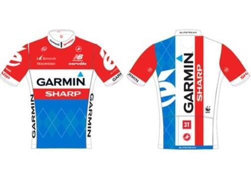
What the hell, has Movistaritis invaded Poland now?
Compare to the old CCC one from a few years back when Krzysztof Jeżowski was the champion:

Compare to the old CCC one from a few years back when Krzysztof Jeżowski was the champion:
- Aug 16, 2011
- 10,819
- 2
- 0
Geraint Too Fast said:
Da f*ck?
 I can't even tell which country this is. Did Poland change their colors to orange or something?
- Aug 16, 2011
- 10,819
- 2
- 0
Wallenquist said:
Meh, not that good. Too similar to the normal jersey. Wouldn't be able to tell it was a national champion jersey if the top half wasn't all red.
- Feb 10, 2013
- 581
- 0
- 9,580
- Jul 5, 2011
- 3,348
- 1
- 13,480
- Aug 4, 2010
- 11,337
- 0
- 0
- Mar 19, 2009
- 9,892
- 1,790
- 20,680
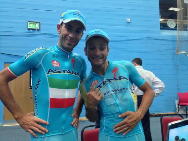
I like it, though I wish the stripes had gone all the way around and were a bit wider to make the flag a bit more prominent. I'm glad they kept the baby blue, though. Of course I also liked Pippo's nats kit quite a bit. I prefer it when they at least try to incorporate the team's current kit design with the colors instead of making the entire jersey just a copy of the flag. That said you've got to strike a balance. Movistar's are a joke.
- May 15, 2011
- 45,171
- 617
- 24,680
- May 5, 2011
- 7,621
- 288
- 17,880
- Feb 29, 2012
- 5,796
- 751
- 19,680
Afrank said:My design looks better. And my design sucks, I just painted directly on the picture.

That's a proper jersey
- Jan 27, 2012
- 15,965
- 3,481
- 28,180
TRENDING THREADS
-
 Paris-Roubaix 2026, one day monument, April 12
- Started by Lequack
- Replies: 2K
-
 Itzulia Basque Country 2026, April 6-11
- Started by Dazed and Confused
- Replies: 2K
-
 Ronde van Vlaanderen 2026, monument, April 5 (men's)
- Started by Krzysztof_O
- Replies: 1K
-

-
 Teams & Riders The Remco Evenepoel is the next Eddy Merckx thread
- Started by DNP-Old
- Replies: 39K
-
 Teams & Riders Tadej Pogačar discussion thread
- Started by Lequack
- Replies: 43K
-
De Brabantse Pijl 2026, April 17
- Started by Dazed and Confused
- Replies: 157


Cyclingnews is part of Future plc, an international media group and leading digital publisher. Visit our corporate site.
© Future Publishing Limited Quay House, The Ambury, Bath BA1 1UA. All rights reserved. England and Wales company registration number 2008885.