New Jerseys - 2016 Season - TeamKits-Maillots-Tricots-Tenues
Page 27 - Get up to date with the latest news, scores & standings from the Cycling News Community.
You are using an out of date browser. It may not display this or other websites correctly.
You should upgrade or use an alternative browser.
You should upgrade or use an alternative browser.
- Jul 27, 2009
- 6,664
- 2,553
- 23,180
- Nov 26, 2011
- 2,007
- 4
- 11,485
Re:
Have you got a picture?
TMP402 said:Adam Blythe's national champion jersey is bizarre. If not for the shorts you wouldn't know he was a Tinkoff rider from the front, and then on the back is a big Sky logo. It seems very last-minute.
Have you got a picture?
- Mar 13, 2015
- 6,554
- 256
- 17,880
Re: Re:
I have shitty quality pics from the front and back. But actually I realise now I should cut him some slack. He's riding for the national team rather than Tinkoff, so perhaps the Tinkoff national champs jersey will be better. Anyway:


infeXio said:TMP402 said:Adam Blythe's national champion jersey is bizarre. If not for the shorts you wouldn't know he was a Tinkoff rider from the front, and then on the back is a big Sky logo. It seems very last-minute.
Have you got a picture?
I have shitty quality pics from the front and back. But actually I realise now I should cut him some slack. He's riding for the national team rather than Tinkoff, so perhaps the Tinkoff national champs jersey will be better. Anyway:


- May 15, 2011
- 45,171
- 617
- 24,680
Re: Re:
I don't have much confidence, it's taking them way too long to come up with a design. Seems they can't come to an agreement with the British federation.TMP402 said:infeXio said:TMP402 said:Adam Blythe's national champion jersey is bizarre. If not for the shorts you wouldn't know he was a Tinkoff rider from the front, and then on the back is a big Sky logo. It seems very last-minute.
Have you got a picture?
I have shitty quality pics from the front and back. But actually I realise now I should cut him some slack. He's riding for the national team rather than Tinkoff, so perhaps the Tinkoff national champs jersey will be better. Anyway:


- Mar 13, 2015
- 6,554
- 256
- 17,880
Re: Re:
I agree, but at least the Addidas/Sky branding relates to the national team. When I first saw it, I thought Tinkoff were so dysfunctional he'd had to borrow one from Sky.
LaFlorecita said:I don't have much confidence, it's taking them way too long to come up with a design. Seems they can't come to an agreement with the British federation.
I agree, but at least the Addidas/Sky branding relates to the national team. When I first saw it, I thought Tinkoff were so dysfunctional he'd had to borrow one from Sky.
- Feb 6, 2016
- 1,213
- 0
- 0
Re: New Jerseys - 2016 Season - TeamKits-Maillots-Tricots-Te
While incompetence from Tinkoff should never surprise me, that is truly mind-boggling. There is no designing to do. The British federation lays out the design in excruciating detail, and it's got to look exactly that way. Literally no other team has had trouble with that. They're really, really not going to be able to *** around with a few stripes like with the rest. It has to be red and blue stripes on a white jersey - just like the picture.
LaFlorecita said:I don't have much confidence, it's taking them way too long to come up with a design. Seems they can't come to an agreement with the British federation.TMP402 said:infeXio said:TMP402 said:Adam Blythe's national champion jersey is bizarre. If not for the shorts you wouldn't know he was a Tinkoff rider from the front, and then on the back is a big Sky logo. It seems very last-minute.
Have you got a picture?
I have shitty quality pics from the front and back. But actually I realise now I should cut him some slack. He's riding for the national team rather than Tinkoff, so perhaps the Tinkoff national champs jersey will be better. Anyway:


While incompetence from Tinkoff should never surprise me, that is truly mind-boggling. There is no designing to do. The British federation lays out the design in excruciating detail, and it's got to look exactly that way. Literally no other team has had trouble with that. They're really, really not going to be able to *** around with a few stripes like with the rest. It has to be red and blue stripes on a white jersey - just like the picture.
- Sep 28, 2014
- 3,639
- 1,608
- 16,680
Re: New Jerseys - 2016 Season - TeamKits-Maillots-Tricots-Te
Not even Movistar. They are able to conform with the BC rules/regs set in place for the national jersey that Dowsett wears in the ITT's.Cannibal72 said:LaFlorecita said:I don't have much confidence, it's taking them way too long to come up with a design. Seems they can't come to an agreement with the British federation.TMP402 said:infeXio said:TMP402 said:Adam Blythe's national champion jersey is bizarre. If not for the shorts you wouldn't know he was a Tinkoff rider from the front, and then on the back is a big Sky logo. It seems very last-minute.
Have you got a picture?
I have shitty quality pics from the front and back. But actually I realise now I should cut him some slack. He's riding for the national team rather than Tinkoff, so perhaps the Tinkoff national champs jersey will be better. Anyway:


While incompetence from Tinkoff should never surprise me, that is truly mind-boggling. There is no designing to do. The British federation lays out the design in excruciating detail, and it's got to look exactly that way. Literally no other team has had trouble with that. They're really, really not going to be able to **** around with a few stripes like with the rest. It has to be red and blue stripes on a white jersey - just like the picture.
classicomano
BANNED
- May 5, 2011
- 2,965
- 0
- 11,480
- Mar 13, 2015
- 6,554
- 256
- 17,880
- Jun 10, 2010
- 19,921
- 2,324
- 25,680
Re:
As LS says, it seems designers are often more concerned with how it looks on their design document and in the official presentation than in a race.
Picture it in the peloton, with the camera moto on the front.BigMac said:It's not bad....
As LS says, it seems designers are often more concerned with how it looks on their design document and in the official presentation than in a race.
classicomano
BANNED
- May 5, 2011
- 2,965
- 0
- 11,480
Re:
Simple, classy, stylish. Love it.TMP402 said:https://pbs.twimg.com/media/Coyzu5rWIAAf_uW.jpg
- Jun 10, 2013
- 9,240
- 5
- 17,495
Re: Re:
Can't we agree? I think that's awful! :lol:
classicomano said:Simple, classy, stylish. Love it.TMP402 said:https://pbs.twimg.com/media/Coyzu5rWIAAf_uW.jpg
Can't we agree? I think that's awful! :lol:
classicomano
BANNED
- May 5, 2011
- 2,965
- 0
- 11,480
Re: Re:
Theres something seriously wrong with one of us then.BigMac said:classicomano said:Simple, classy, stylish. Love it.TMP402 said:https://pbs.twimg.com/media/Coyzu5rWIAAf_uW.jpg
Can't we agree? I think that's awful! :lol:
- Mar 13, 2015
- 6,554
- 256
- 17,880
Re: Re:
I think it's okay, but it feels a bit early 2000s. In fact here's the 2004 Olympic kit: http://res.cloudinary.com/corporate-olympics-com-au/image/upload/fl_keep_iptc,c_fit,w_460/52568528_23D30510-883E-11E5-A660005056A37760.jpg
Green and gold aren't great colours to do stuff with, though. I would consider emphasising the green more than the gold. Something like the Orica Bike Exchange kit with green in place of the blue would be the least offensive to my eyes.
classicomano said:Theres something seriously wrong with one of us then.BigMac said:classicomano said:Simple, classy, stylish. Love it.TMP402 said:https://pbs.twimg.com/media/Coyzu5rWIAAf_uW.jpg
Can't we agree? I think that's awful! :lol:
I think it's okay, but it feels a bit early 2000s. In fact here's the 2004 Olympic kit: http://res.cloudinary.com/corporate-olympics-com-au/image/upload/fl_keep_iptc,c_fit,w_460/52568528_23D30510-883E-11E5-A660005056A37760.jpg
Green and gold aren't great colours to do stuff with, though. I would consider emphasising the green more than the gold. Something like the Orica Bike Exchange kit with green in place of the blue would be the least offensive to my eyes.
- Sep 28, 2014
- 3,639
- 1,608
- 16,680
Re:
.......but it did.
Aussie kit is good, as is the dutch, however I do prefer the standard dutch team's jersey.
How hard was that? Simple design for the british jersey, as it should be. It doesnt take a month to design that....Billie said:
.......but it did.
Aussie kit is good, as is the dutch, however I do prefer the standard dutch team's jersey.
- May 25, 2010
- 8,863
- 414
- 18,580
Re:
Just realised that all 4 of them are riding for a different team. Quite unique for a dutch squad.
classicomano said:Im traumatized by this.

Just realised that all 4 of them are riding for a different team. Quite unique for a dutch squad.
- Jun 19, 2009
- 598
- 0
- 9,580
Re: New Jerseys - 2016 Season - TeamKits-Maillots-Tricots-Te
Blythe was riding for team GB, hence the weird team sky national top with Tinkoff shorts.
Blythe was riding for team GB, hence the weird team sky national top with Tinkoff shorts.
- Feb 10, 2015
- 5,991
- 888
- 19,680
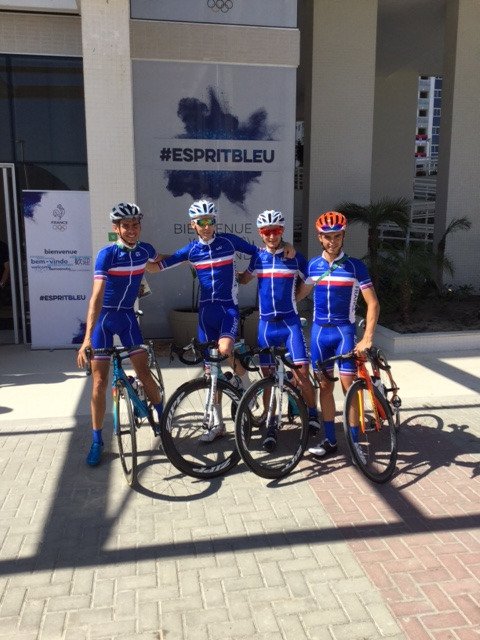
Classic design for France. I personally prefer this blue instead of the dark one of past years.


TRENDING THREADS
-
 Itzulia Basque Country 2026, April 6-11
- Started by Dazed and Confused
- Replies: 644
-
 Ronde van Vlaanderen 2026, monument, April 5 (men's)
- Started by Krzysztof_O
- Replies: 1K
-

-
 Teams & Riders The Remco Evenepoel is the next Eddy Merckx thread
- Started by DNP-Old
- Replies: 39K
-
 Teams & Riders Tadej Pogačar discussion thread
- Started by Lequack
- Replies: 43K
-
 Milan San Remo, March 21, 2026, 298 km monument
- Started by topcat
- Replies: 1K
-
Dwars door Vlaanderen 2026, April 1
- Started by Dazed and Confused
- Replies: 392

Cyclingnews is part of Future plc, an international media group and leading digital publisher. Visit our corporate site.
© Future Publishing Limited Quay House, The Ambury, Bath BA1 1UA. All rights reserved. England and Wales company registration number 2008885.


