New Jerseys - 2016 Season - TeamKits-Maillots-Tricots-Tenues

Page 9 - Get up to date with the latest news, scores & standings from the Cycling News Community.
Mar 31, 2015
10,190
4,951
28,180
Re: New Jerseys - 2016 Season - TeamKits-Maillots-Tricots-Te

luckyboy said:
CWCv7UbUwAAcH0I.jpg


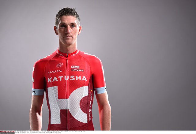
At least it's not black is the nicest thing to say about this. No design whatsoever

Apparently they took fashion advice from the designers of the new Androni kit and/or Acqua Sapone &#128528

Not good, not good at all.
 
Jun 24, 2013
3,548
1,079
16,680
atleast they dropped the hideous yellow fluo. that was beyond awful

Those with the Kremlin sky line are really so good. Shame they stopped using it
 
Dec 4, 2013
13
0
8,530
Katusha is aimin for a less 'russian' - more international profile. I am big fan of simple kits like sky, Iam and now also katusha. I think that new kit is absolutely great - apart from the red shorts. Not a fan of red shorts.
 
Jun 10, 2010
19,897
2,256
25,680
Re:

Libertine Seguros said:
I really dislike the transliteration of the team as well.

ю ≠ у

Given the "sh" they've used English orthographic norms as the transliteration standard, therefore

Катюша = Katyusha
Катуша = Katusha

The former is correct Cyrillic (and the one that makes sense), therefore the former transliteration is the right one :p

Hence why they're Katjoesja, Katjuscha etc.

They've always previously had the Russian on the jersey, so it's been in Cyrillic, but I am not able to un-see them putting such an error on their jersey. It's a small thing but it's going to bug me every time.
To be fair, it's not an error per se, just not an orthodox transliteration. An English speaker would probably read it with a [ju:))], which is a fair approximation of the original sound.

We can always call them Team Cursive Aleph.
 
Feb 20, 2010
33,066
15,280
28,180
Re: Re:

hrotha said:
Libertine Seguros said:
I really dislike the transliteration of the team as well.

ю ≠ у

Given the "sh" they've used English orthographic norms as the transliteration standard, therefore

Катюша = Katyusha
Катуша = Katusha

The former is correct Cyrillic (and the one that makes sense), therefore the former transliteration is the right one :p

Hence why they're Katjoesja, Katjuscha etc.

They've always previously had the Russian on the jersey, so it's been in Cyrillic, but I am not able to un-see them putting such an error on their jersey. It's a small thing but it's going to bug me every time.
To be fair, it's not an error per se, just not an orthodox transliteration. An English speaker would probably read it with a [ju:))], which is a fair approximation of the original sound.

We can always call them Team Cursive Aleph.
Anglophone commentary streams seem to be split but the larger number of commentators seem to favour omitting the semivowel, to my consternation.
 
Apr 17, 2013
6,494
431
18,580
Re:

Billie said:
atleast they dropped the hideous yellow fluo. that was beyond awful

Those with the Kremlin sky line are really so good. Shame they stopped using it
I actually started to like that as the season progressed. Dunno what's wrong with me :confused: :eek:
 
Mar 19, 2009
9,892
1,790
20,680
Re: New Jerseys - 2016 Season - TeamKits-Maillots-Tricots-Te

vandenbroeck_jurgen_k_670.jpg


I think that's the best Katusha kit ever. Probably my favorite Sky too, though I'm still not a fan overall. The Katusha is great, though.
 
Re:

Libertine Seguros said:
I really dislike the transliteration of the team as well.

ю ≠ у

Given the "sh" they've used English orthographic norms as the transliteration standard, therefore

Катюша = Katyusha
Катуша = Katusha

The former is correct Cyrillic (and the one that makes sense), therefore the former transliteration is the right one :p

Hence why they're Katjoesja, Katjuscha etc.

They've always previously had the Russian on the jersey, so it's been in Cyrillic, but I am not able to un-see them putting such an error on their jersey. It's a small thing but it's going to bug me every time.

Transliteration is a choice, not a matter of strict phonetics. English uses u to represent the sound ju̟ː after several consonants, including t, but never uses the yu digraph to represent it.
 
Mar 31, 2015
10,190
4,951
28,180
Saw a pic of the Astana jersey on Twitter. It is more of the same:.light blue and maybe slightly less yellow than previous years. And an advert publicising Astana EXPO 2017. No drastic change.
 
Re:

mikkelfrandsen said:
Katusha is aimin for a less 'russian' - more international profile. I am big fan of simple kits like sky, Iam and now also katusha. I think that new kit is absolutely great - apart from the red shorts. Not a fan of red shorts.
Maybe, though I note the Russian soccer team are using that raspberry red as well. Is it a national colour in some way, like the Belgian blue? (Not the cow, the cycling/football kit)
 
Aug 3, 2015
22,743
10,688
28,180
Yeah, thats a horrible jersey, really. I dont know what is up with Movistar and Katusha. :(

I like Sky's jersey. Classy as always.
 
Feb 20, 2010
33,066
15,280
28,180
Re: Re:

Armchair cyclist said:
Libertine Seguros said:
I really dislike the transliteration of the team as well.

ю ≠ у

Given the "sh" they've used English orthographic norms as the transliteration standard, therefore

Катюша = Katyusha
Катуша = Katusha

The former is correct Cyrillic (and the one that makes sense), therefore the former transliteration is the right one :p

Hence why they're Katjoesja, Katjuscha etc.

They've always previously had the Russian on the jersey, so it's been in Cyrillic, but I am not able to un-see them putting such an error on their jersey. It's a small thing but it's going to bug me every time.

Transliteration is a choice, not a matter of strict phonetics. English uses u to represent the sound ju̟ː after several consonants, including t, but never uses the yu digraph to represent it.
Most of the time there are transliteration standards though; Usually the Russian palatal vowels are written as two letters with a y preceding to split them from the "normal" equivalents:

а / я "a / ya"
э / е "e / ye"
о / ё "o / yo"
у / ю "u / yu"

e "ye" can vary, especially in names it is often omitted leaving pairs (Evgeni/Yevgeni or Ekaterina/Yekaterina for example). However "yu" for ю is pretty consistent, except when Anglicizing names (eg Юлия "Yulia/Julia" but never "Ulia"). While transliteration is not a matter of strict phonetics, there are also conventions which are not only helpful but often necessary. That's why "zh" has come into consistent usage as a way of representing ж [ʒ] when transliterating Russian names as [z] is the voiced counterpart of and in English "sh" represents the voiceless counterpart of [ʒ], despite that in various words in English "j", "g", "s" and "z" can all fulfil this function and the combintion "zh" is unknown.
 
Jul 6, 2012
443
4
9,285
Dunno what is wrong with everyone. Katusha kit is great. Love the two tones of the red used.

Only issue is the similarity to lotto being predominantly red, however their new kit might change again.
 
Mar 31, 2015
10,190
4,951
28,180
Re:

Ricco' said:
Dimension Data to ride Focus? Or maybe someone else bike? :confused:

12391975_10150573977939944_8382890248325876210_n.jpg

It seems as if they're sponsored by Cervelo on their jersey, so I imagine someone else's bike, but idk.
 

Latest posts