Teams & Riders New Jerseys - 2021 Season - TeamKits-Maillots-Tricots-Tenues
Page 8 - Get up to date with the latest news, scores & standings from the Cycling News Community.
You are using an out of date browser. It may not display this or other websites correctly.
You should upgrade or use an alternative browser.
You should upgrade or use an alternative browser.
The ISN jersey is horribly boring. Disappointing especially since it's a clear step backwards from last year.
ISN is a tough team to design for...it's an awkward name and concept to wrap your head around. Closest would be Astana, which is basically promoting Kazakhstan. (and I've always liked Astana jerseys)
I would have loved to see a real Israeli flag them, bold blue/white. As it is now, it's just lazy -- white shoulders, solid blue below the sternum. The representation of the Star of David is a nice touch, though.
- Apr 3, 2016
- 32
- 2
- 2,585
I think this one is one of the best jerseys of this season. Mostly are very awful.


- May 25, 2018
- 2,420
- 2,609
- 17,180
Movistar conti teamI think this one is one of the best jerseys of this season. Mostly are very awful.
This tweet suggests there will be a new kit:EF will keep their design from last year?
I see on their website that their signings already have a photo with last year's jersey on. And their social media communication design with Nippo is in the same colors and imagery of last year.
View: https://twitter.com/EFprocycling/status/1346113119337275392
- Feb 10, 2015
- 5,998
- 905
- 19,680
- May 15, 2014
- 417
- 3
- 4,285
It's billboard time.

How they manage to convince sponsors to add / contribute to the mess is beyond me...
- Sep 28, 2010
- 3,364
- 329
- 14,180
- Feb 20, 2010
- 33,226
- 15,741
- 28,180
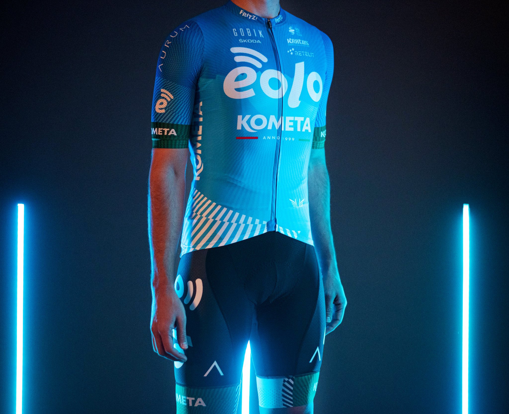
It's... beautiful. It's like a Greatest Hits album of Italian Pro Continental kits. There's a bit of ISD-NERI, a bit of Ceramica Panaria, a bit of Ceramica Flaminia, some Nippo-Vini Fantini, and all delivered with the usual subtle Savio flair while somehow still finding room for classy black shorts. Like an old Lotto-Soudal kit but designed by a six year old with a bumper pack of stickers to stick on top of their scribbling, this just screams Italian ProContinental like almost nothing before. The biggest complaint is the colours are far too subtle to put it up there in the pantheon of the greats like 2013 Vini Fantini or 2008 CSF-Navigare. It just needed an eye-bleeding additional colour as a stripe between the black and white. Maybe a garish metallic lavender, or neon green.It's billboard time.

Bonus point for a sponsor whose logos are specifically placed to be covered up by dorsals.
- Sep 20, 2017
- 13,186
- 24,661
- 28,180
The bottles on the back. Sheer perfection.It's billboard time.

- May 25, 2018
- 2,420
- 2,609
- 17,180
Please god tell me the team is now calledIt's billboard time.

Androni Giocattoli Sidermac Indumet Trecolli Piu Lauretana
- May 5, 2010
- 53,253
- 31,476
- 28,180
Please god tell me the team is now called
Androni Giocattoli Sidermac Indumet Trecolli Piu Lauretana
And in a newly implementet UCI rule, reporters shall be required to always refer to teams by their full names.
I’m disappointed—there’s still some empty white space left not filled with text!The bottles on the back. Sheer perfection.
- Feb 20, 2010
- 33,226
- 15,741
- 28,180
Androni Giocattoli-Sidermac-Indumet-Trecolli-Piu-Lauretana-Asteel-Rosti-Work Group Service-Unico Plus-Fracasso-Selle Italia-Vini Tenuta Ulisse
- May 5, 2010
- 53,253
- 31,476
- 28,180
Androni Giocattoli-Sidermac-Indumet-Trecolli-Piu-Lauretana-Asteel-Rosti-Work Group Service-Unico Plus-Fracasso-Selle Italia-Vini Tenuta Ulisse
200 Swiss franc for messing up the order!
- Feb 24, 2014
- 15,228
- 3,123
- 28,180
Nah... I'd put them somewhere on the bib's front side.The bottles on the back. Sheer perfection.
This gives some intersting ideas for mid-season makeover... Androni Giocattoli-Sidermac-Indumet-Trecolli-Piu-Lauretana-Asteel-Rosti-Work Group Service-Unico Plus-Fracasso-Selle Italia-Vini Tenuta Ulisse-style.
- Sep 2, 2011
- 2,433
- 615
- 13,680
It's billboard time.

This job is clearly done using Paint for Windows.
- May 23, 2009
- 10,263
- 1,461
- 25,680
Love it! It's nearly as awesome as the EF Giro kitIt's billboard time.

- May 2, 2009
- 2,630
- 732
- 13,680
Love it. Gives the viewer just enough time to read the names of every sponsor before a rider gets swallowed up at the end of a futile breakaway.It's billboard time.

I appreciate the transparency of the Androni et al team. They have sponsors; sponsors want us to know that they are sponsors. End of story.
I suspect for Pro Conti and below, jersey design is pretty low down on this list of priorities, somewhere below "survival" and "can we do better than Dacia for our team cars?"
I suspect for Pro Conti and below, jersey design is pretty low down on this list of priorities, somewhere below "survival" and "can we do better than Dacia for our team cars?"
- Feb 20, 2010
- 33,226
- 15,741
- 28,180
Gianni Savio is the cycling equivalent of a GoFundMe. He keeps the team afloat by signing South American wunderkinds to long contracts they'll never fulfil, pockets the buyouts if they move up, pockets the winnings if they don't, and convincing several hundred thousand Italian small businesses to contribute €10 each for the privilege of your name being there for anybody who can be bothered to read the sports jersey equivalent of that XTC album which has a long article about the purpose of an album cover on its album cover.
- Sep 28, 2014
- 3,639
- 1,608
- 16,680
Does that include pronunciation or is that another 200CHF?200 Swiss franc for messing up the order!
- May 5, 2010
- 53,253
- 31,476
- 28,180
Does that include pronunciation or is that another 200CHF?
Pronounciation is irrelevant.
- Nov 16, 2013
- 27,299
- 28,607
- 28,180
Pronounciation is irrelevant.
But spelling isn't. 50CHF for getting pronunciation wrong.
TRENDING THREADS
-
 Paris-Roubaix 2026, one day monument, April 12
- Started by Lequack
- Replies: 2K
-
 Itzulia Basque Country 2026, April 6-11
- Started by Dazed and Confused
- Replies: 2K
-
 Ronde van Vlaanderen 2026, monument, April 5 (men's)
- Started by Krzysztof_O
- Replies: 1K
-

-
De Brabantse Pijl 2026, April 17
- Started by Dazed and Confused
- Replies: 151
-
 Teams & Riders The Remco Evenepoel is the next Eddy Merckx thread
- Started by DNP-Old
- Replies: 39K
-
 Teams & Riders Tadej Pogačar discussion thread
- Started by Lequack
- Replies: 43K

Cyclingnews is part of Future plc, an international media group and leading digital publisher. Visit our corporate site.
© Future Publishing Limited Quay House, The Ambury, Bath BA1 1UA. All rights reserved. England and Wales company registration number 2008885.


