- May 5, 2016
- 500
- 81
- 9,680

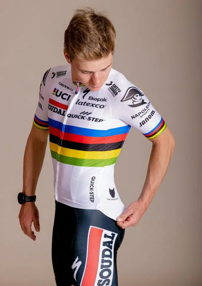
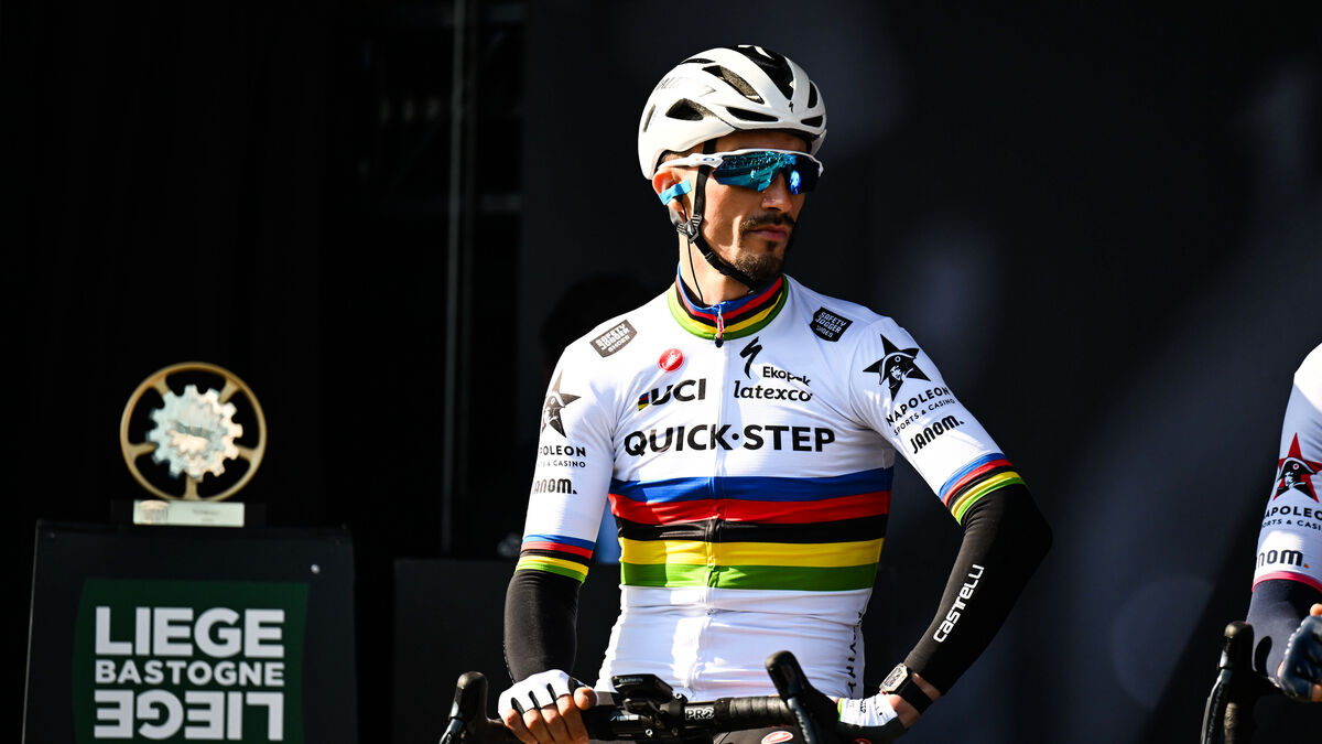
I think that might be the weakest rainbow jersey I've seen. Its elegance comes from its simplicity whereas this is the opposite - cluttered with so many sponsor logos jammed together.
That goes without saying. Maybe we'll be that lucky some day.So, you're saying an ideal rainbow jersey would be one designed by FDJ?
Cille rainbow jersey post-win interview plzkthxThat goes without saying. Maybe we'll be that lucky some day.
Yeah that's classic Deceuninck, their shirts are full of brands because cycling is all about sponsorship money unfortunately.I think that might be the weakest rainbow jersey I've seen. Its elegance comes from its simplicity whereas this is the opposite - cluttered with so many sponsor logos jammed together.
Plus the Wolfpack bit because they're trying to force that into being an official part of the team's branding (along the franchise identity lines, similar to how Vaughters used to be with the argyle, although that was just a design trait rather than an actual logo) rather than an informal nickname, kinda like if Villarreal started putting an actual yellow submarine on all their kits.Yeah that's classic Deceuninck, their shirts are full of brands because cycling is all about sponsorship money unfortunately.


More shades.
More fades of blue.
Did I make a mistake in this post? Yes.
Did I decide to keep it anyway? YES!


Deceuninck? Anyway, they work with Belgian headsponsors, so most of those brands do not have the same reach as bigger companies from bigger countries. That means more small sponsors to compensate.Yeah that's classic Deceuninck, their shirts are full of brands because cycling is all about sponsorship money unfortunately.
Strange how nobody took offense when Alaphilippe's jersey looked basically the same, with some brands swapped.I think that might be the weakest rainbow jersey I've seen. Its elegance comes from its simplicity whereas this is the opposite - cluttered with so many sponsor logos jammed together.
He's not even wearing shades in that picture!

Alaphilippe 2020 and 2021 are way better - less logos, smaller logo sizes. 2022 was already a bit of a downgrade tbf but at least the logos weere (almost) completely in black when now you have the ugly red Soudal bar, a massive Soudal logo on the shorts, an additional logo below the rainbow stripes, and more logos overall. Not everything stems from people hating on EvenepoelStrange how nobody took offense when Alaphilippe's jersey looked basically the same, with some brands swapped.
")
From what i can tell, it's the same layout as JA's 2021 jersey, just different logo's. The guy designing it can't help Soudal has a red stripe. Same amount of logos on the shoulder/sleeve as well.Alaphilippe 2020 and 2021 are way better - less logos, smaller logo sizes. 2022 was already a bit of a downgrade tbf but at least the logos weere (almost) completely in black when now you have the ugly red Soudal bar, a massive Soudal logo on the shorts, an additional logo below the rainbow stripes, and more logos overall. Not everything stems from people hating on Evenepoel
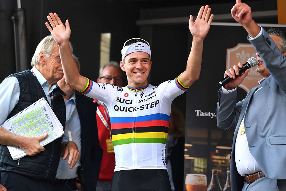

The problem here is Soudal. Especially the big red line in their logo. Seems that Soudal thinks they're more important than the team or the rainbow jersey. Quickstep is having their logo on a normal way on the jersey.