- May 25, 2018
- 2,420
- 2,609
- 17,180
When I opened the sight today I actually got a shock and thought Bernal had signed for Bahrain 


Don't give a *** it's an eyesore, and I will be graciously not holding Evenepoel not personally responsible.Maybe instead of comparing Evenepoel's jersey next year with any of Alaphilippe's jerseys, we should compare Evenepoel's jersey next year with Evenepoel's jersey this year, the one race he rode as World Champion before ending his season:
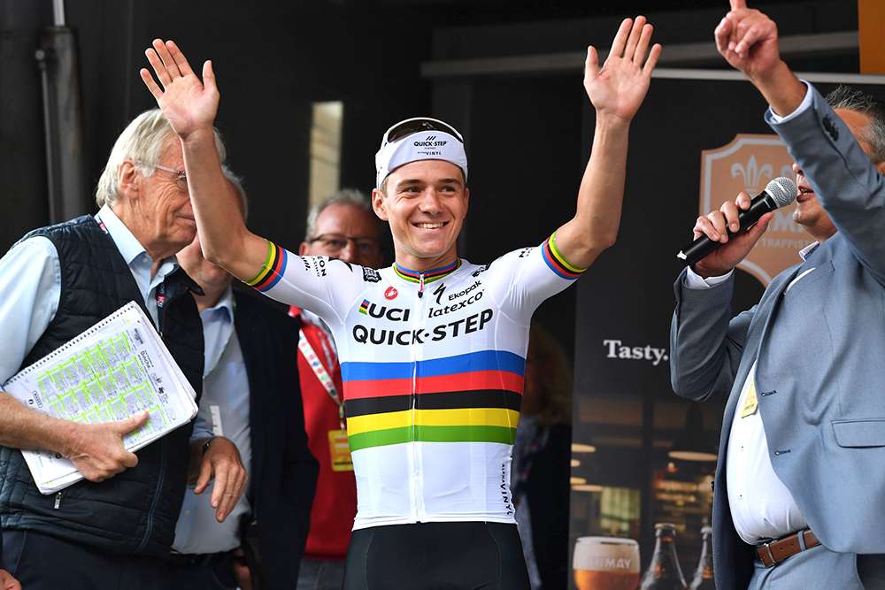
Basically the same as the one Alaphilippe wore this year.

Compared to the other beauties QS has given us, it is a downgrade.
But of course, Logic does have a point in mentioning that the person designing the jersey for next year was hindered by the Soudal logo, and more specifically by the fact that Soudal seemingly wasn't willing to compromise and have the logo slightly changed.
Notice how the Lidl logo on Alaphilippe's shoulders in both 2020 and last year was both in B&W and much smaller? Whereas it on the regular QS jerseys - as shown by the other QS rider lurking behind him in the photo from last year - is very big and yellow.
And that leads me to the subject of Brand Recognition. Some brands are recognisable by a logo/symbol, for those the colours could be changed, and the brand would still be recognised. Other brands are recognisable by a specific colour, for those changing the colour obviously wouldn't work.
Find the differences!
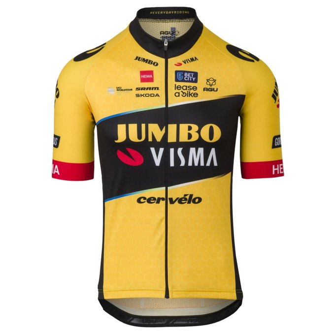
Next year:
This year:
Well, the small sponsors are different.
FADES OF BLUE!!
You need to get your eyes checked!
In the stripes separating the black from the yellow, there definitely are some fades of many colours, including blue.
They added a tiny bit of the mandatory blue fade.Find the differences!
Next year:
This year:
Well, the small sponsors are different.


Not 100% sure yet but I think I will like the Lotto kit. Although I absolutely despise anything called "dstny" or "nrg" or any such down with the kids naming.
Well I would be if I no longer looked like Barney the DinosaurHe looks so sad.
Find the differences!
Next year:
This year:
Well, the small sponsors are different.
But the whole remembering our roots thing seems weird when they don't acknowledge the Rabobank years.
I thought - why did my fingers want to write "fought"? - it was a matter of "We had some sponsor troubles, so we decided to start with a blank(o) slate!"
I need to see a rider wearing this to see what I think—it’s such an unusual color scheme.I know the old kit looked a lot like UAE's, but this is certainly quite a change.


And yet the second in that palette this year (see post 8), but they seem unlikely to race against each otherI need to see a rider wearing this to see what I think—it’s such an unusual color scheme.
Yes, very nice.I know the old kit looked a lot like UAE's, but this is certainly quite a change.
Ready to race as real coureurs in 2023
Here's a better version of the QS kit with no Napoleon and only one sponsorname in the white frame. But the Safety Jogger logos are sadly still there.


