- Sep 20, 2017
- 13,148
- 24,596
- 28,180
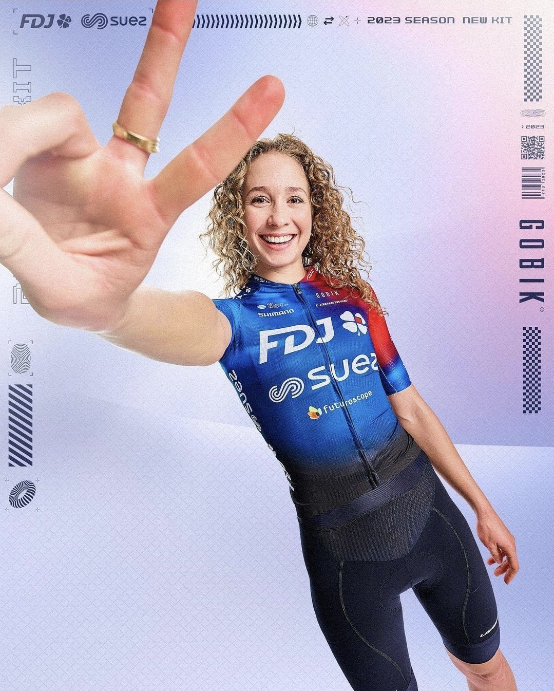
Small changes, but a clear improvement nevertheless. The red looks a lot more natural now that there's a little more of it, best men's WT kit so far IMO.
Small changes, but a clear improvement nevertheless. The red looks a lot more natural now that there's a little more of it, best men's WT kit so far IMO.
I like the kit, but I am so tired of the “Instagram arm” distorted effect fad. If you have teenage/young adult kids or friends I think you know what I mean.FDJ - SUEZ will also wear a less white kit next season, but without it being too different from the previous one.

View: https://mobile.twitter.com/FDJ_SUEZ_Fut/status/1608508150638063618
They seem to be competing with Lotto as new challengers for the “let’s just throw a bunch of sponsor logos at a jersey and see where they stick” award.And speaking of small changes, here's BORA's:
View: https://mobile.twitter.com/BORAhansgrohe/status/1608493101877760001
They seem to be competing with Lotto as new challengers for the “let’s just throw a bunch of sponsor logos at a jersey and see where they stick” award.

Que? No. Don't agree at all, I don't like it. Was better before imo, the orange-red is plain per se.
It's perfectly fine. But I loved their last classic white Francaise des Jeux jersey 2 years ago!FDJ - SUEZ will also wear a less white kit next season, but without it being too different from the previous one.

View: https://mobile.twitter.com/FDJ_SUEZ_Fut/status/1608508150638063618
They do have a lot of logos, but somehow it doesn't bother me like QS new jersey. More style to the colors and placement of logos. I think I like Bora's 22 jersey better than 23, but both are nicely done and stand out from the rest of the WT.They seem to be competing with Lotto as new challengers for the “let’s just throw a bunch of sponsor logos at a jersey and see where they stick” award.
Great jersey. Striking and good colours. Like the way the two major sponsors are well differentiated yet not cluttered.Lotto's doesn't seem bad in that regard...

Ack—sorry I got my teams mixed. Meant to make the comparison to the QS-Soudal kit like you mentioned (brain was still “Lotto-Soudal”).They do have a lot of logos, but somehow it doesn't bother me like QS new jersey. More style to the colors and placement of logos. I think I like Bora's 22 jersey better than 23, but both are nicely done and stand out from the rest of the WT.
You’re right! As I mentioned to bark, I was thinking about the new QS-Soudal kit littered with logos, but my brain regressed (this happens often) to the former Lotto-Soudal team and thus wrote Lotto.Lotto's doesn't seem bad in that regard...

It’s always a matter of opinions. On balance I think it’s better. The best got a little better.Que? No. Don't agree at all, I don't like it. Was better before imo, the orange-red is plain per se.
You’re right! As I mentioned to bark, I was thinking about the new QS-Soudal kit littered with logos, but my brain regressed (this happens often) to the former Lotto-Soudal team and thus wrote Lotto.
Orange is the new blue (HPH, Ineos, Bahrain, Cofidis, Euskaltel, Efapel...)
So, now it's gonna be all fades of shadey orange?
Like your profile pic?
That's a sunset!
I'm just waiting for the blue-and-orange stripes...

And what team would you have put their logos on that?


