Re: New Jerseys - 2016 Season - TeamKits-Maillots-Tricots-Te
Katusha kit is very nice! I prefer this one above the Kremlin-lighting bolts-fluorish-red-blue-white-kit.
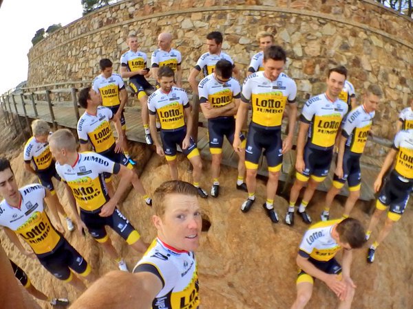
Lotto kit is boring as hell. No design, no idea, nothing, just three colours with some lotto balls.
Katusha kit is very nice! I prefer this one above the Kremlin-lighting bolts-fluorish-red-blue-white-kit.
Lotto kit is boring as hell. No design, no idea, nothing, just three colours with some lotto balls.