New Jerseys - 2023 Season - TeamKits-Maillots-Tricots-Tenues

Page 6 - Get up to date with the latest news, scores & standings from the Cycling News Community.
Sep 26, 2020
25,356
27,887
23,180
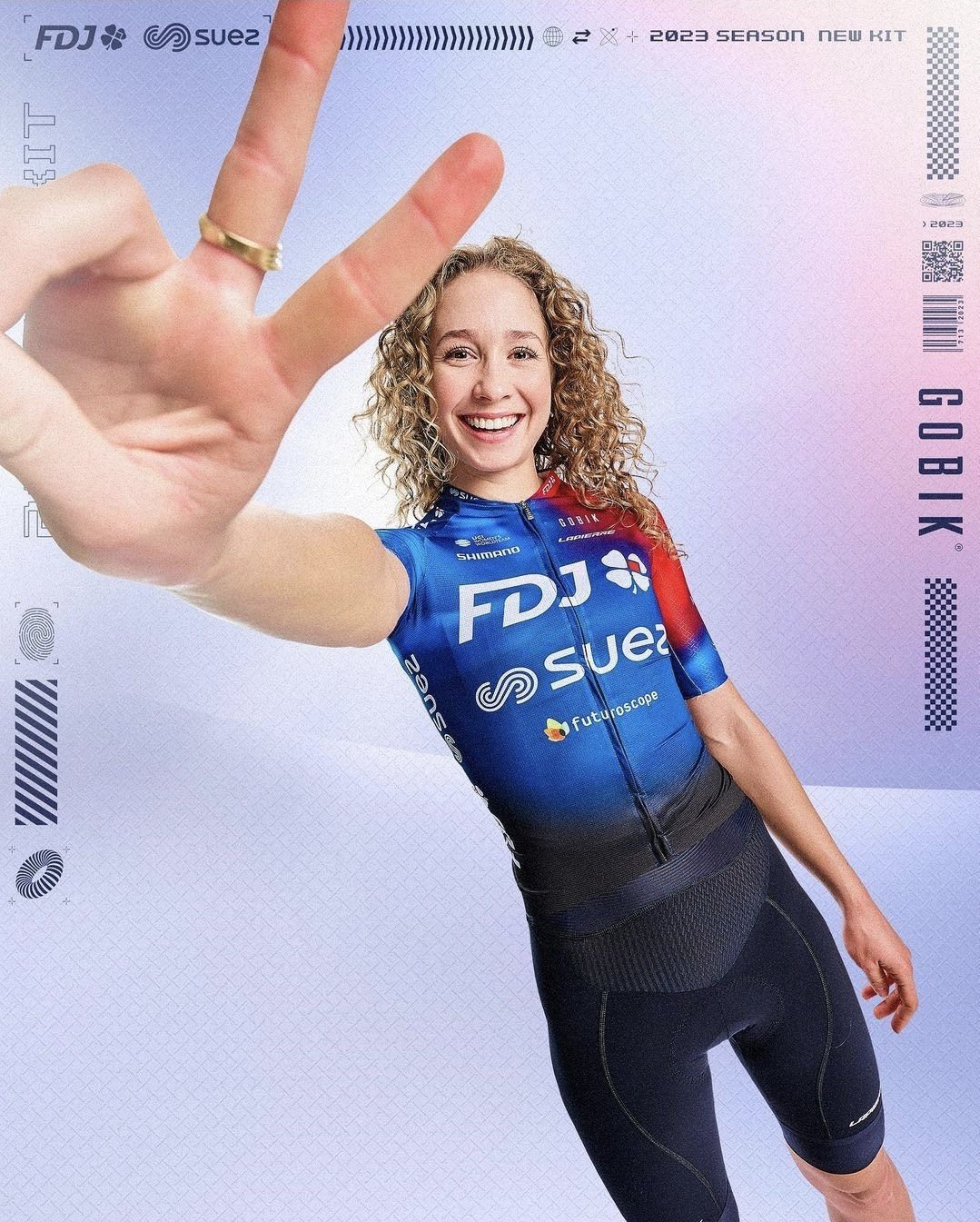
This QS kit is better than the men's QS kit.
The women's IPT kit is better than the men's IPT kit.
The women's UAE kit is better than the men's UAE kit.

I'm sensing a theme here.

I also think the JV women's kit is the better one, because it doesn't have the Betcity logos.

But it's of course all in the eye of the beholder.
 
Sep 28, 2014
3,639
1,608
16,680
TNN_2022_Portugal_CH-2762_2-683x1024-portrait.jpg
Reminds me of movistar from a few years ago when they had a big green m on the shoulders
 
Sep 20, 2017
12,428
23,492
28,180
May 25, 2018
2,419
2,607
17,180
Very obvious they designed the jersey first and only then thought about how to fit on the sponsor logos. Equally obvious from the end result why that isn't a good idea. Possibly their weakest kit ever.
Without the sponsors it would be a very nice kit but even still it's far from the worst. Definitely better than recent hair kit or dungarees kit.
 
Dec 23, 2015
698
695
12,180
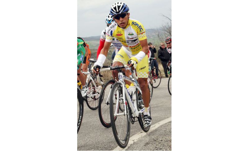
Given their propensity to do the "keys in a bowl" when it comes to any sponsor involved in cycling, it was just a matter of time before their jersey-design hit Androni Giacattoli-territory. That Napoleon-emblem on both arms is an aberration, both from a design and moral perspective.
 
  • Wow
Reactions: Sandisfan
Sep 28, 2014
3,639
1,608
16,680
That's different I suppose.
The Intermarché one is about as much as you can do with their colours and ugly sponsor logos, I quite like it.

That being said, when Intermarché and Circus are your two biggest sponsors, surely red and black is the way to go?
Nalini and Wanty appear to be so as well.
 
Shorts look good, the rest is all over the place.
Shorts are ugly with the Soudal logo on the sides imho.

I just think it's much too busy. Do they think they're Androni?
They are lacking really big money sponsors, so unfortunately they have to make due with more small ones. That's one problem to start with. Then there is the issue that the new name sponsor apparently wants to invest more, which means they expect to get more space on the shirt than the other name sponsor, regardless of how dumb/ugly that looks on the shirt. Then there is the fact that they have been "the blue team" since ages (being the main color of the QS brand), and now the new name sponsor has black and red.

Basically, the problem comes from sponsors preferring to have their name as big as possible and in their own colors on a fugly shirt, over having their name/logo a bit more discrete and modest, on a beautiful jersey.